JAX KAR WASH
A clear, consistent and memorable visual identity for a growing car wash chain who is committed to clean.
Jax Kar Wash, a rapidly expanding car wash chain with over 40 locations in Michigan and Indiana, approached BasedOn to help them create a clear and consistent visual system.
Jax's growth strategy builds new, state-of-the-art car washes in addition to purchasing existing car washes, resulting in a wide variety of formats and services across the whole business. Additionally, the autonomy given to local managers to oversee signage led to very little consistency from one location to another. They needed a unique and recognizable visual system to reaffirm the Jax brand experience with customers and set Jax apart from its competitors.
Discovery
Our team at BasedOn started by washing their cars at Jax and at competitors' locations. We noted how signage helped or hindered the process. We also took note of other customers, how they progressed through the process, and the key challenges they faced. We examined how clearer signage can help customers make quick, confident decisions, shortening lines and boosting efficiency and revenue.
To pressure-test this idea, our team examined wayfinding systems outside the car wash industry, including fast-food drive-throughs, interstate signage, large-format retail wayfinding, and public transit directional systems. With those insights, we worked with the client to develop a two-part approach: first, simplify and clarify the design system and second, introduce a more expressive personality to the brand.
Before
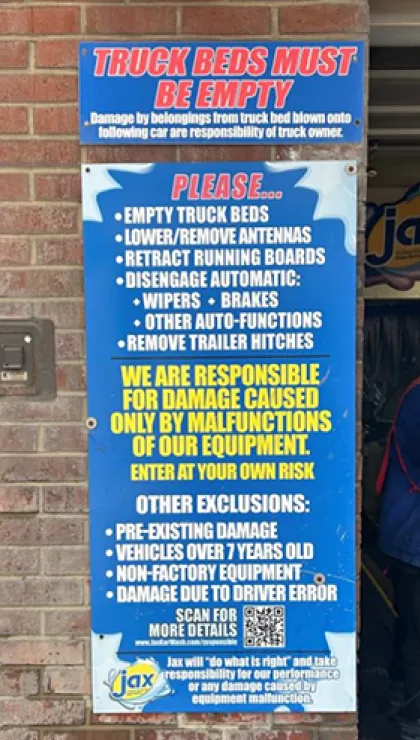
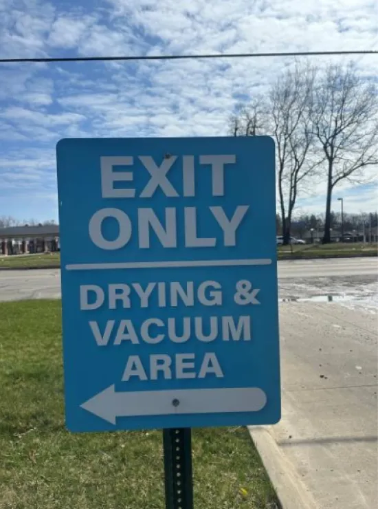
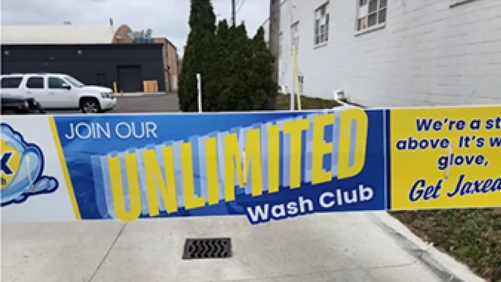
After
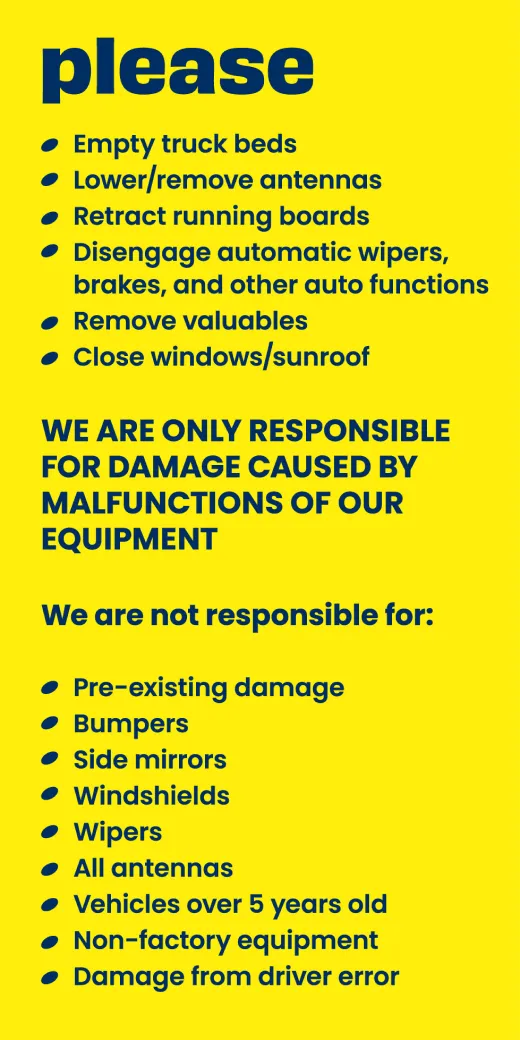

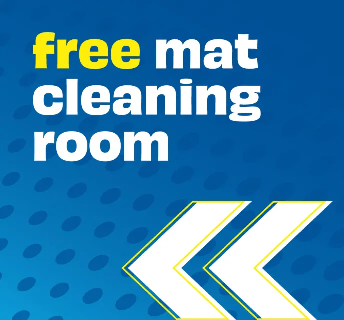

Visual Identity
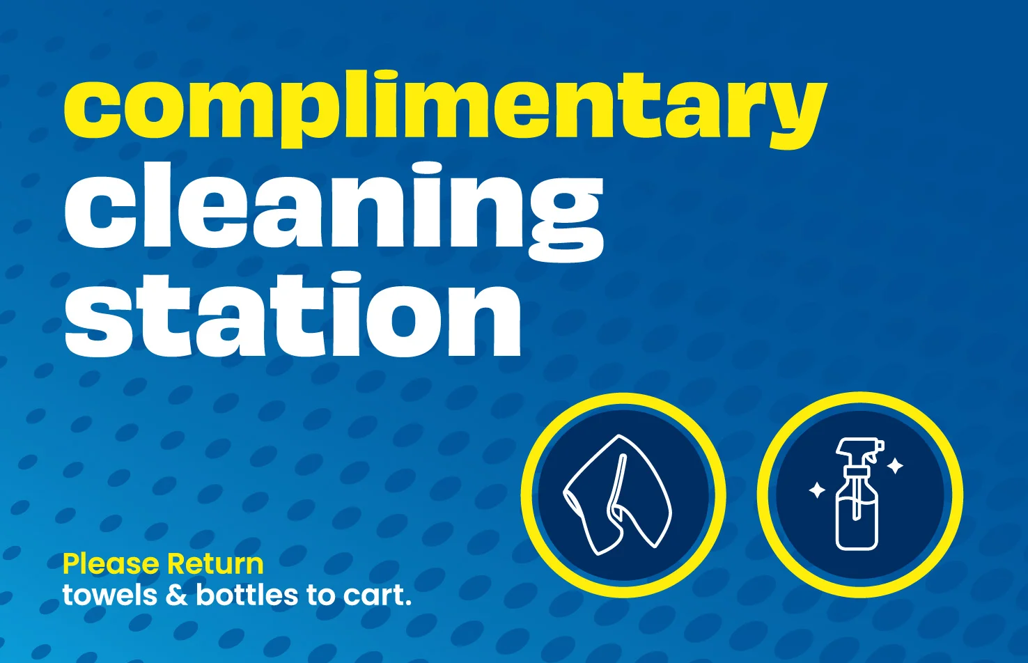
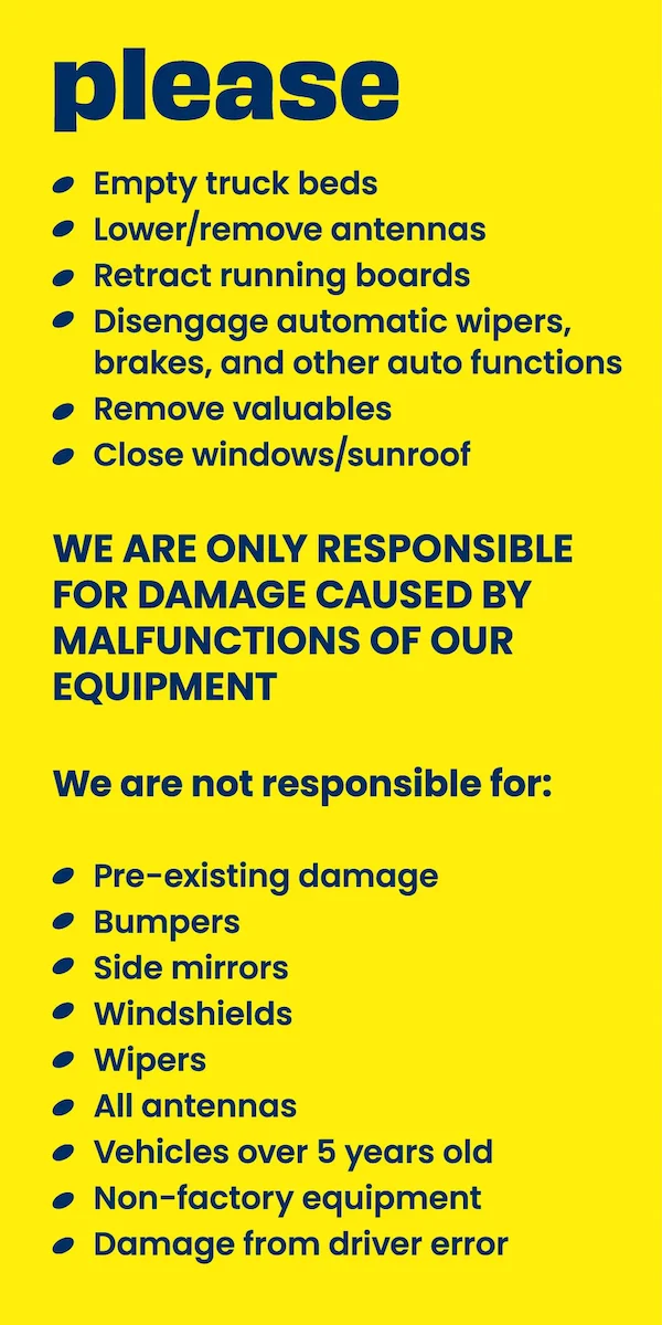
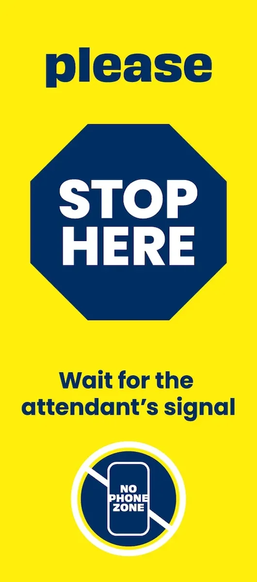
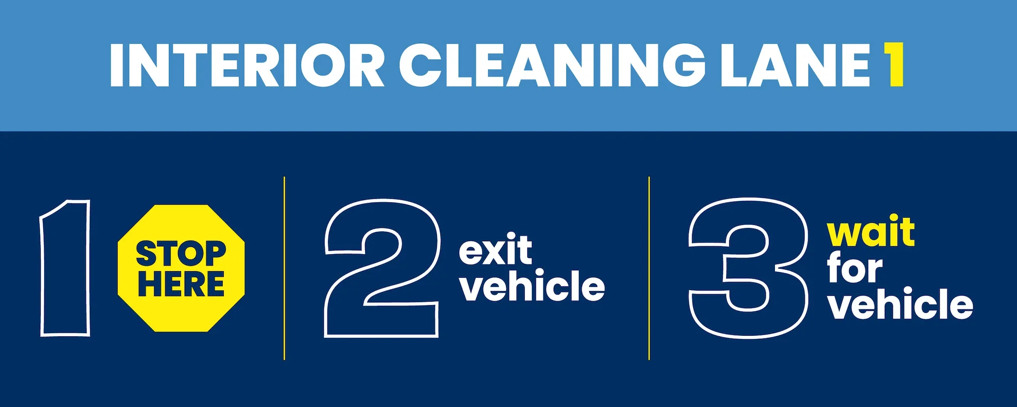
First, our designers established simplified and consistent typography and color systems using Jax's existing brand elements. We designated bright yellow backgrounds for safety signs to help customers quickly recognize important information. We also restricted the use of orange to elevate Jax's premium Unlimited Club.
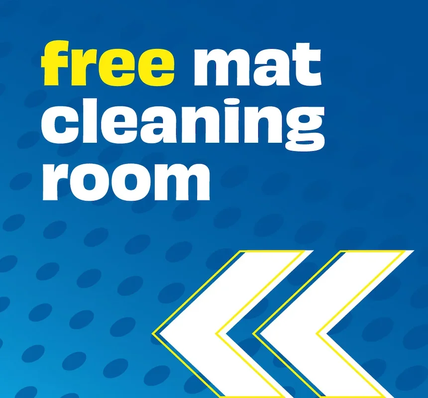
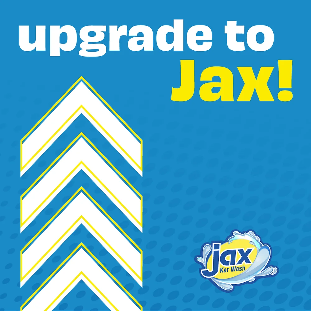
New and updated graphics such as stylized arrows and illustrated icons provided consistent forms, and extra logos and artwork were removed to help calm and define the appearance of their locations and social media posts.
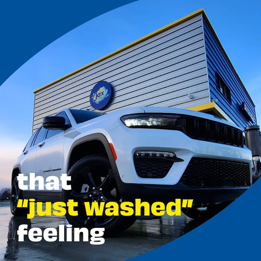
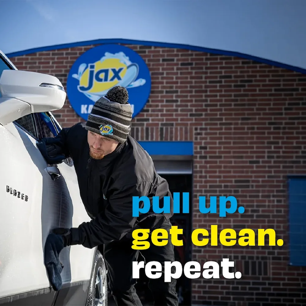
At the same time, our team also explored visual concepts to express their unique personality. The final result was inspired by Pop art and vintage comic books with bold, expressive typography and punchy dot patterns. Hints of the Jax oval were used throughout the designs to make each sign uniquely Jax. The style brought clarity, consistency and delight to the Jax experience.
Design Assets



Pattern

Colors
Yellow backgrounds indicate important safety information
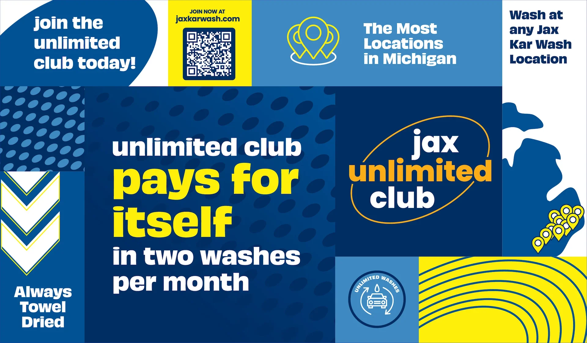
Used only for Jax Unlimited Club
Typography
Headline
Font: Obviously
Your favorite new
car wash
Body Copy
Font: Poppins
Hand towel drying, 55+ Michigan loations and more than 70 years serving Michigan drivers.
The Club
Jax Unlimited Club
One of the most significant elements of their signage system is the graphic for their Unlimited Club. We integrated the oval and text for a cleaner, elevated look, and used orange exclusively for Unlimited Club use.


Jax Unlimited Club Digital Ads
Applications
With a strong visual concept ready and the updated signage plan in hand, our BasedOn team next set about designing the signage system to create consistent applications across all locations, overseeing the design and implementation of initial sign designs in key locations. This design and implementation phase helped us validate the visual design concept, identify pressure points, and make final adjustments required for full adoption of the system.
We then developed a web-based digital signage guide, allowing local managers and corporate staff to access the design standards, key visual assets, and sample designs for reference. This enables both vendors and managers to be on the same page and to access the tools needed to create new signs, ensuring the signage guidelines and requirements would be uniformly applied across all rooftops.
The final result is a consistent and clear design identity system with the flexibility needed for the variety of location formats, social media uses, and the unique expression needed to add delight to the everyday act of washing your car with Jax.
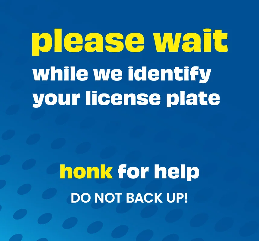


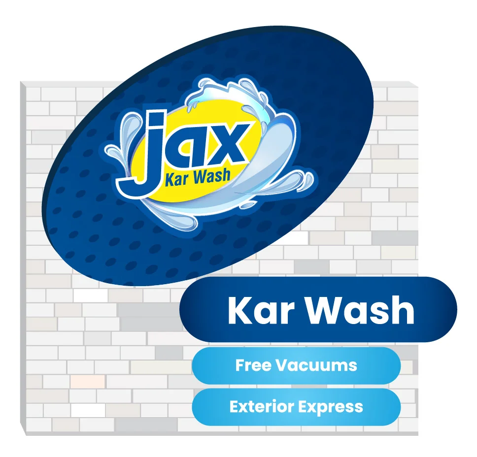

Tools to make consistent design easy to execute
Summary
What began as a conversation about new signage evolved into a visual design strategy that balances key functionality with a memorable and engaging approach, setting Jax Kar Wash apart from their competition. Customers can navigate decisions and safety with clear graphics, legible typography, and consistent components. The client has also applied this visual design approach to their website and social media posts. As they continue to serve and expand operations, the Jax Kar Wash experience is more inviting and memorable for customers, with bright colors, expressive typography, and Pop art-inspired graphics creating an effective design as clean as the cars.