Vista Maria
An evolved brand identity for a bold organization that helps girls, youth and families realize a life beyond trauma, filled with possibility.

With more than 140 years of experience caring for young people in crisis, it was time to update this nonprofit's brand identity to be forward-focused and as bold as its heart. Our team worked closely with Vista Maria leadership, exploring the complexities of healing trauma through their programs and facilities. From youth residential care to mental health treatment, foster care to adoption, we saw how this enterprise tirelessly rolls up its sleeves. We learned that not only does Vista Maria have a big heart, they have a Fearless Heart.
Strategy
Every day the dedicated staff work with youth who have seen more difficulty and experienced more deprivation in their young lives than most people will in a lifetime. Staff must ask themselves: How do you ask people not only to open their hearts and their wallets, but also their homes to help teenagers with difficult pasts? How do you talk about the tough issues, like human trafficking, to the wider community? It was our job to help Vista Maria bring their solutions to light.
This was an organization with vision and ambitious plans and they needed an identity that had plenty of room to grow and that could attract greater funding to their efforts. Our discovery phase covered on-campus interviews with residents, staff, family and board members, supported by archival research, to fully understand the organization's history and impact.
Brand Idea
A Fearless Heart
Originally established by the Sisters of the Good Shepherd as a residential home for girls and women in need, Vista Maria's approach has broadened to include trauma-informed care, family engagement, and independent living. Vista Maria never shied away from a challenge and would do anything for these youth. It became clear that—like their founding sisters—they embody the spirit of a pioneer, ready to forge their own path.
Brand Pillars
- We Protect
- We Encompass
- We Embolden
- We Empower
The brand pillars are a framework that both clarifies their complex program offering and inspires all who engage with the organization, including clients, families, staff, volunteers and supporters. To protect, encompass, embolden and empower, became the basis for all their impactful messaging.
Verbal Identity
Above all, this is a heart story. Compassionate people helping endangered and disenfranchised youth build a brighter future. And so we speak from the heart. Not in the same “soft, caring, non-profit talk” that all the other organizations use, but in a forthright, genuine and bold voice. Language now reflects Vista Maria's can-do spirit, determination and unflinching courage.
We created a verbal identity that took this vitality and created messaging that would energize and engage all their audiences. Instantly, Fearless Heart became a message that everyone could identify with. From youth to staff to donors, everyone could see themselves in this idea and feel emboldened, empowered and optimistic for the future.
Vista Maria is a place for girls, youth and their families to realize a life beyond trauma and ignite a life of possibility.

We are Vista Maria, a community of fearless hearts.
Visual Identity
Before
After
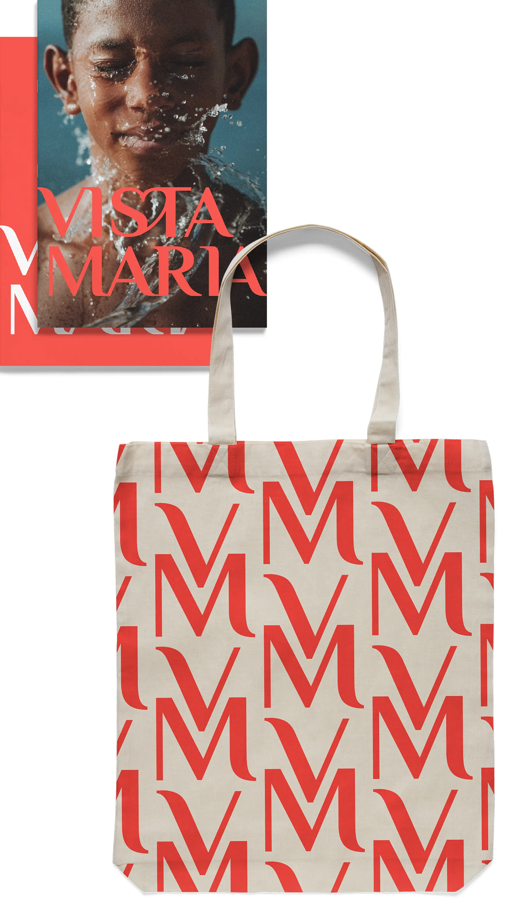
The biggest shift in the visual identity came from creating a new brandmark with a strong, limited palette. The lettering was inspired by the handwritten entries in their archive's hundred-year-old ledgers, listing the young women who lived and went to school there. The heart shape surprisingly emerged organically—an apt and undeniable nod to the warmth and compassion of Vista Maria. The open linework of the heart, a subtle, welcoming cue, makes the brand instantly approachable to those facing difficult challenges, while signaling the organization's intentions to donors and volunteers who want to support this uplifting and visionary place.
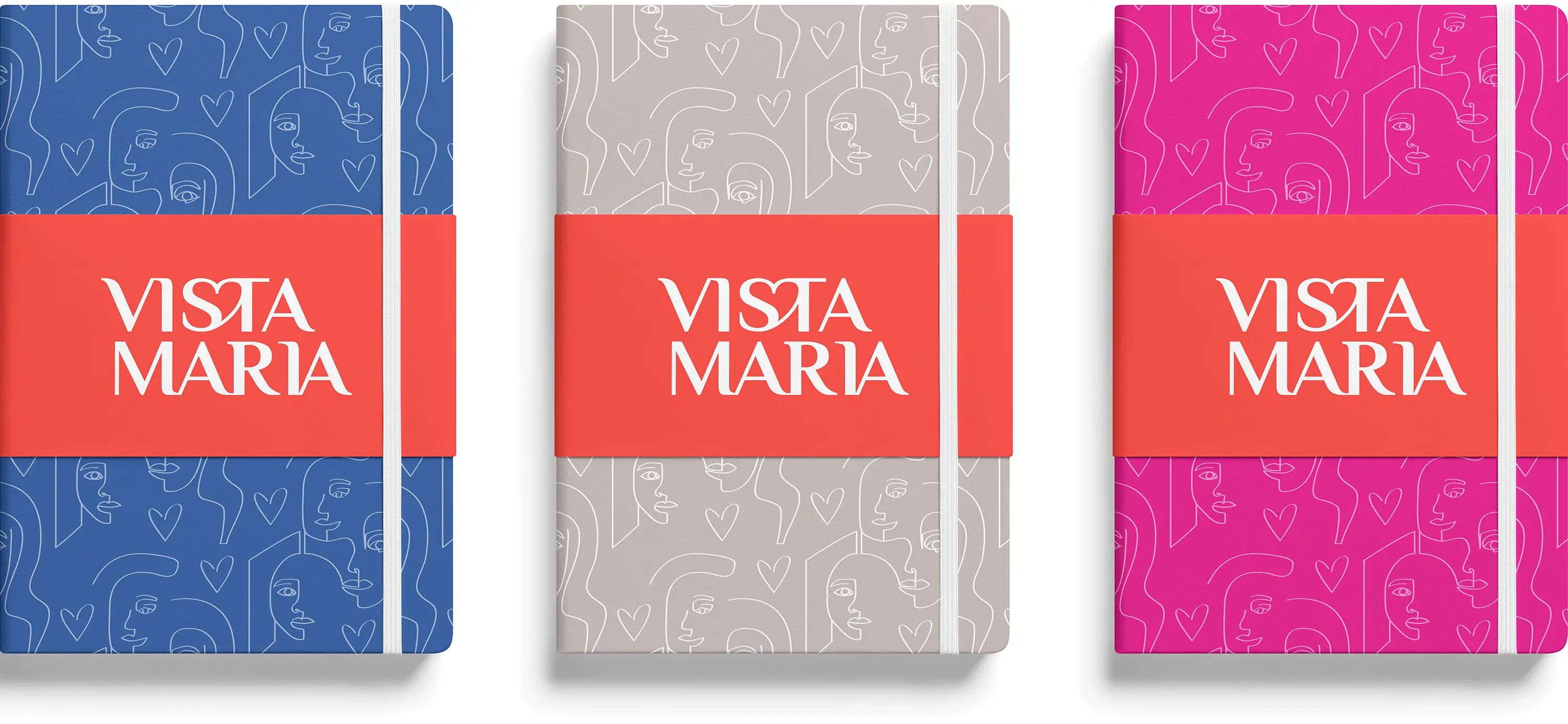
Our team changed the brandmark's colors from blue and yellow pastels to a vivid red, bringing all the vibrancy and dynamism of the organization to life. We intentionally chose to forego the usual primary “youth” colors to be more impactful and signify empowerment. We created the bold “faces” motif to answer the challenge of limited images on hand. For privacy reasons, Vista Maria cannot always use people's images. So, line graphics were developed to signify the participants and keep the humanity story in focus. Along with the heart, this dynamic graphic element is highly successful and has found its way onto swag and more.

Our hearts are strong, steadfast and bold
Seeing every person's worth.

“Defining or re-envisioning your brand is sensitive, personal and impactful. Frankly, I didn't want just any firm because there are many stakeholders with many viewpoints that need to be included. We put off our rebranding work until we found the right partner that would see us clearly and embrace our rich history because it is part of who we are and shapes who we will become. Our experience with BasedOn helped us to define our brand in a way that respects the past and emboldens the future. Implementation of the new brand has been easy because the process helped us to become aligned.” — Angela Aufdemberge, President and CEO


Summary
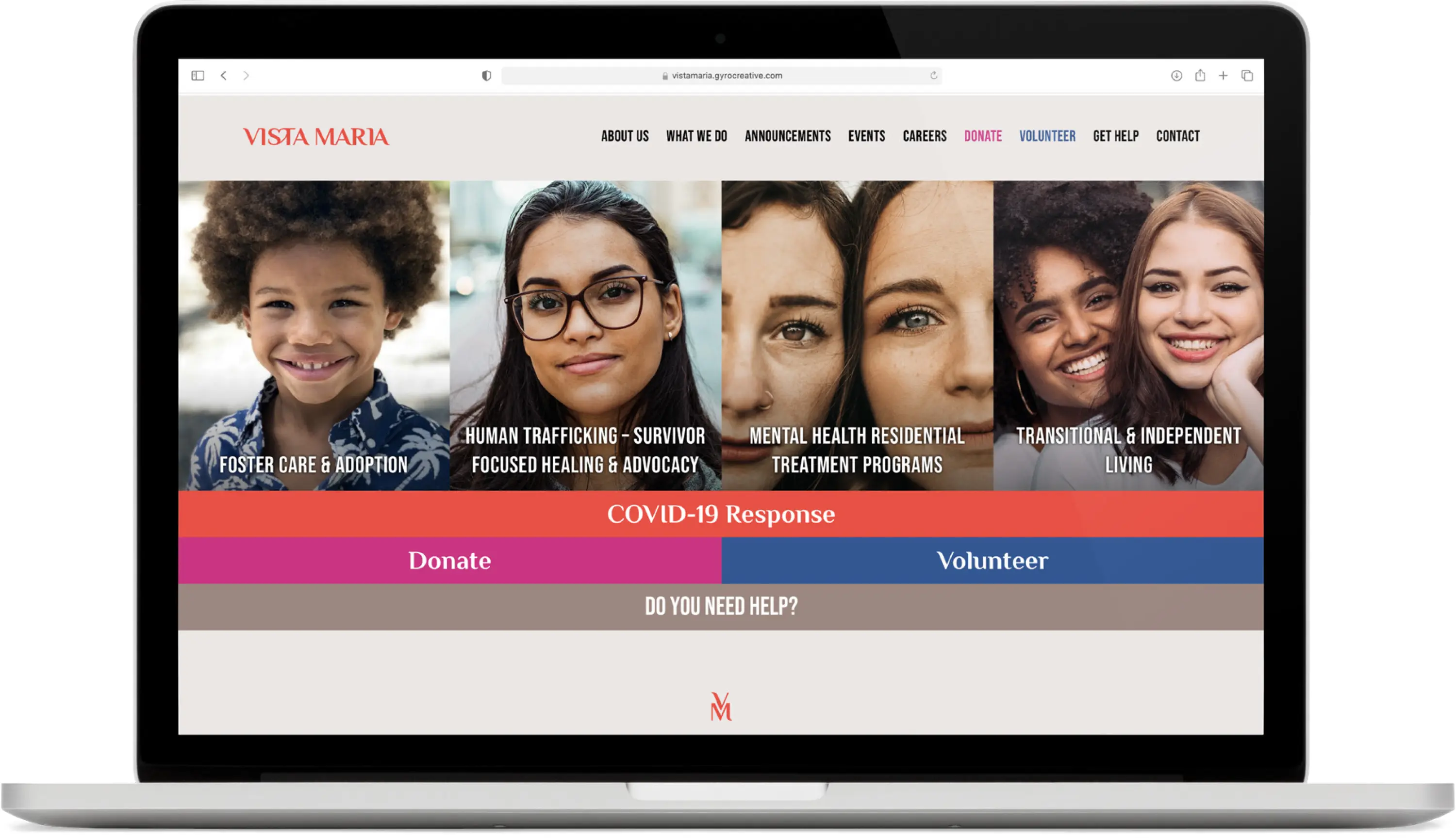
Working with Vista Maria continues to be a rewarding experience. The organization is made up of incredibly hard-working, compassionate people who are also passionate about embracing their new, re-envisioned identity. We also overhauled their website to better convey their impact and allow them to easily update opportunities for people to get involved. Through this rollout process, both teams found the identity worked in all directions equally well: participants, internal and public facing. As a look, a voice, and messaging, Vista Maria brings everybody in. Now everyone is empowered to have and to be A Fearless Heart.
