Teach Michigan
An impactful new approach to teaching goes statewide to make Michigan the best place to be an educator.
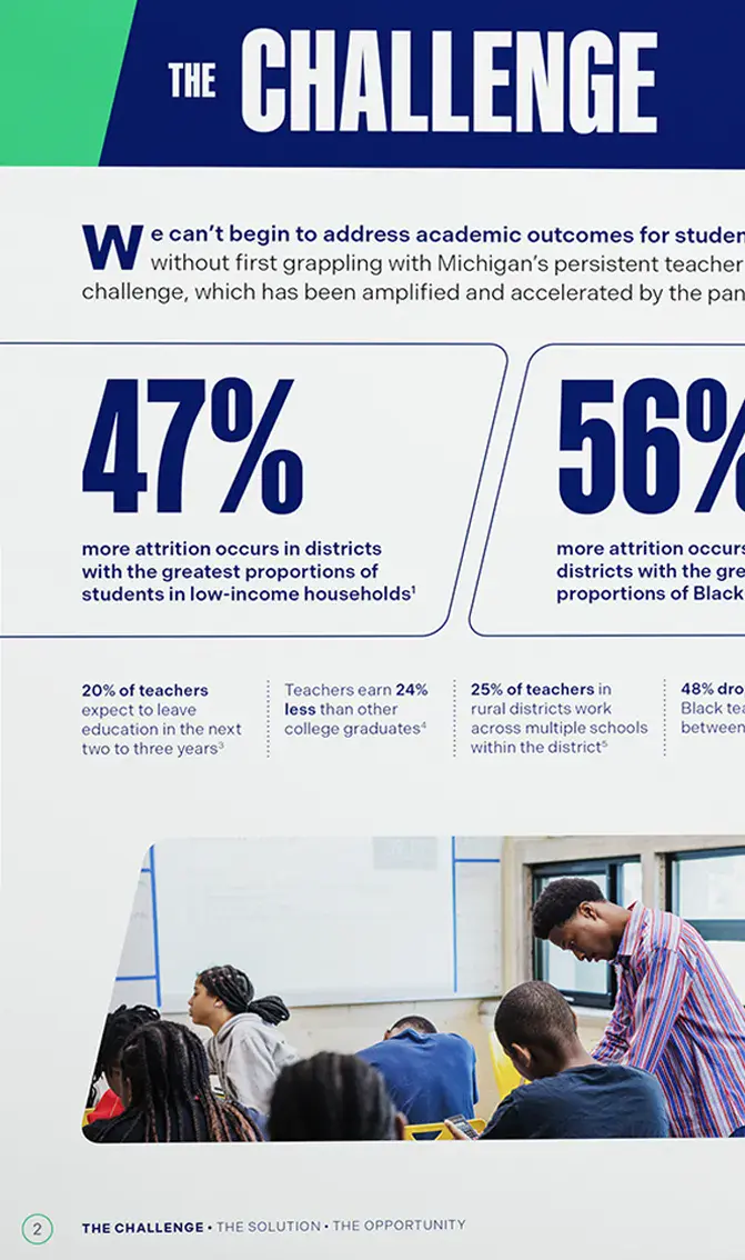
TeachMichigan is a five-year statewide initiative investing in the retention and development of high-impact educators working in under-resourced schools across Michigan. Originally developed—and now powered by—Teach For America Detroit, TeachMichigan currently operates in six communities reaching 250 educators and impacting more than 92,000 students in Title 1 schools. TeachMichigan needed a voice and a look as strong as their commitment to this once-in-a-generation opportunity to impact the education system.
Strategy
In establishing their brand, TeachMichigan had three concrete goals: elevating the status of educators, fostering collaborative innovation, and promoting active equity in education. Building a strategic framework around this cornerstone, we developed a brand identity further inspired by what we learned through one-on-one interviews as well as their core vision: "Making Michigan the Best Place to Be an Educator." This became their brand idea, supported by four pillars that put their values into action: Bold Respect for educators; Leading Innovation; Collaborative Strengths; and Active Equity.
TeachMichigan’s bold, optimistic, determined and collaborative personality shines through in every interaction you have with their team, and so we designed their verbal and visual expressions to match their distinctive personality.
Brand Idea
Make Michigan The Best Place To Be An Educator
Verbal + Visual Identity
With only five years to effectively implement their pilot program across the state, TeachMichigan’s voice and messages needed to be as focused and impactful as their drive to make Michigan the best place to be an educator. Their brand voice captures this effectively by being consistently confident, knowledgeable and energetic. Now identifiable with this engaging voice and a clear brand narrative, TeachMichigan is able to put strong brand messaging and values-based stories effectively to work towards their mission.
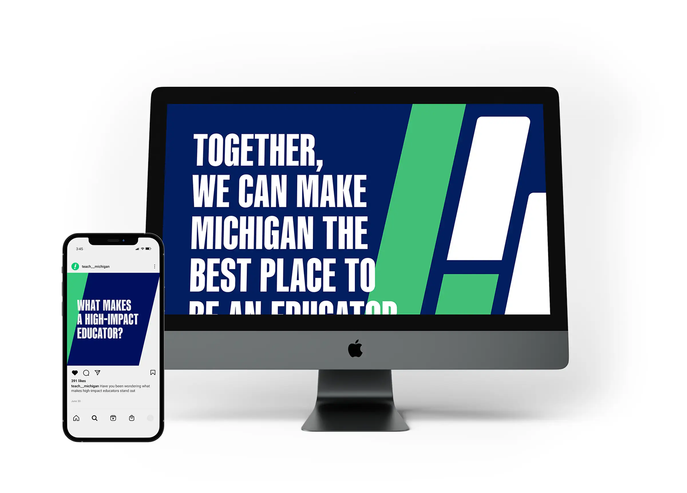
We created a visual identity shaped by four key principles: direct, forward, friendly, and larger than life. These principles inspired our design while allowing flexible executions over time. Their visual language powerfully communicates the imperative need for their vision and strategies to take root across the state.
- Before
- After
The Visual Elements
Our team designed TeachMichigan’s brandmark to match their ambitious vision and energy. Upright bold and rounded letters convey both their friendliness and directness. Their name is joined by the icon: a forward-leaning exclamation point designed like a pencil making a mark. The icon serves as a shorthand for the brandmark and conveys education, impact and progress.
The angle and shape of the exclamation point inspired a flexible set of shapes, set at the same 13 degree angle, that are used in a variety of ways. They add color, serve as frames and textboxes, create forward motion, and add line detail to both online and print displays.


Summary
TeachMichigan’s once-in-a-generation opportunity to change the trajectory for Michigan’s educators needed a bold and impactful identity. One that embraced their determination and optimism as they launched their statewide initiative to retain, elevate and attract high-impact educators. With the creation of an attention-getting visual identity, TeachMichigan was able to launch their website and put a social media plan into play, generating awareness and support. Paired with strong and inspiring brand messaging and a narrative that outlined TeachMichigan’s way towards success, this hard-working team has a collective presence that will keep focus on prioritizing our public schools’ most valuable assets.
