Pure Flavor
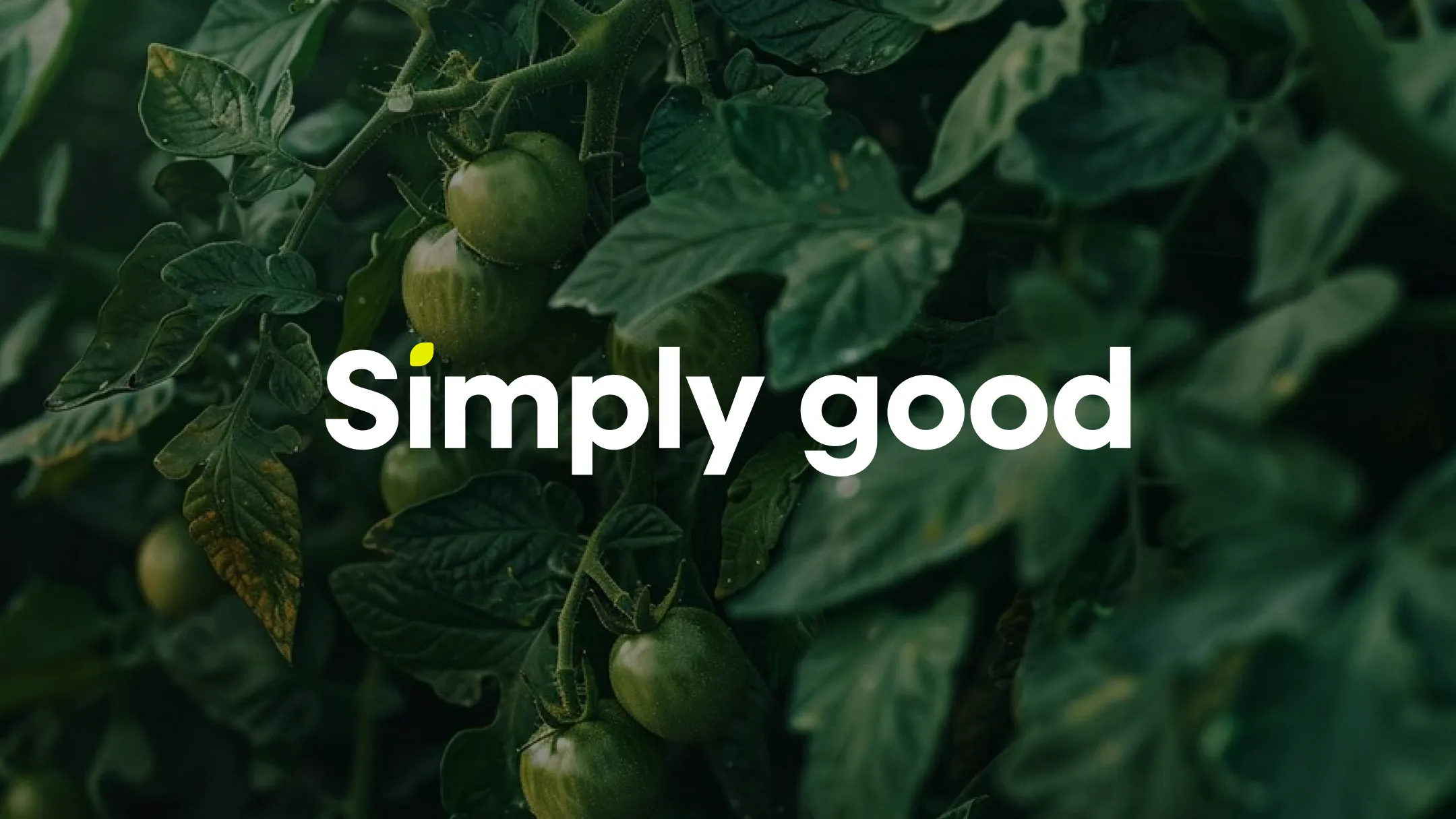
Simply Good / A Modern Identity
for a Greenhouse-Grown Brand.
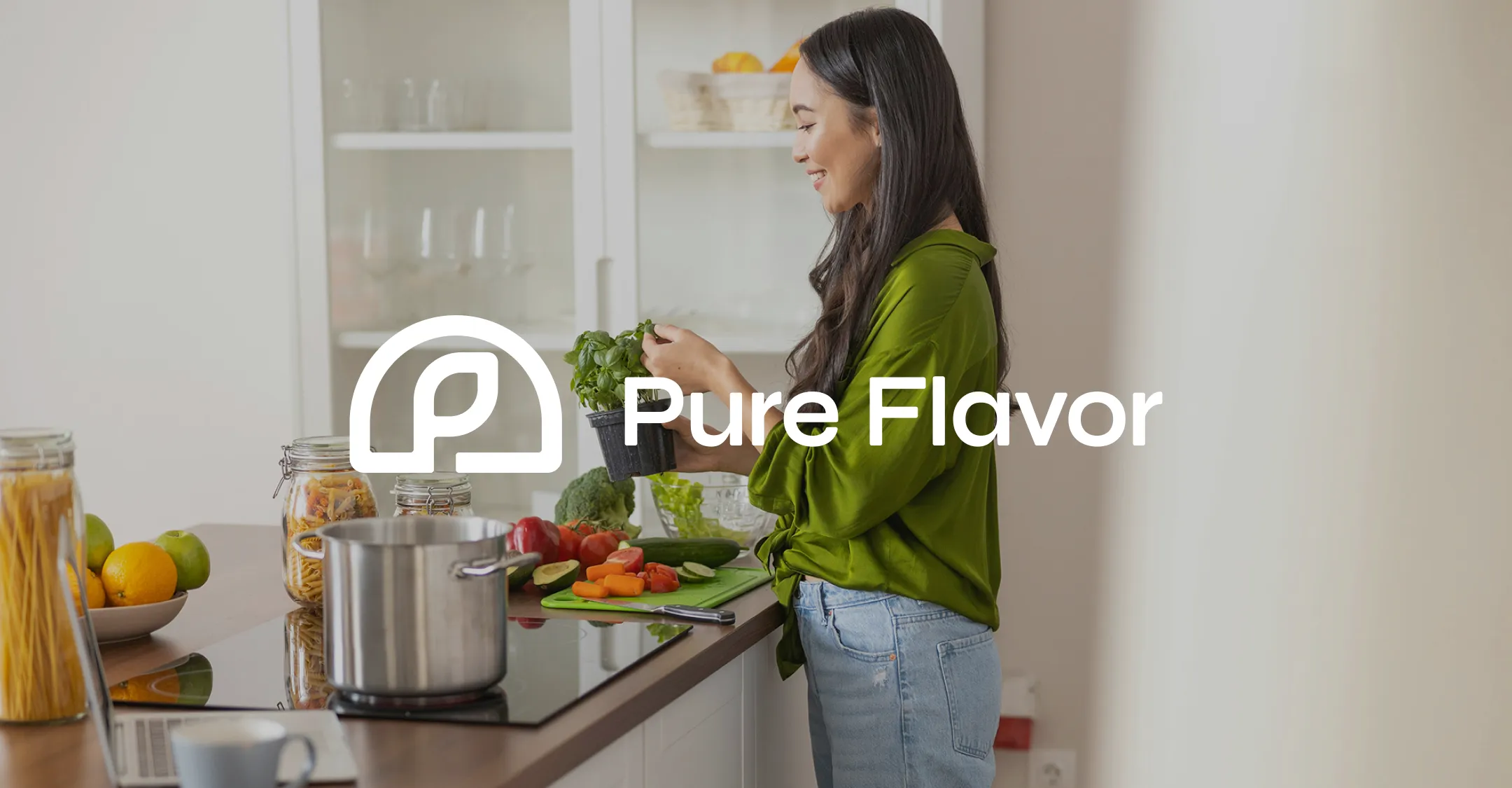
When a team of seasoned marketers set out to redefine how their produce brand shows up in market, they weren’t looking for strategy, they already had one. As one of North America’s leading greenhouse growers of tomatoes, peppers, cucumbers and berries, Pure Flavor® came to BasedOn with a strong foundation: a clear positioning, defined pillars, and a simple, powerful brand idea, Simply Good.
Their promise is straightforward: to make eating healthier surprisingly easy, growing fruits and vegetables with care and always with integrity. Their path to good growth is guided by passion, accountability, trust, and humility; values that are as consistent as the produce they grow.
CHALLENGE + APPROACH
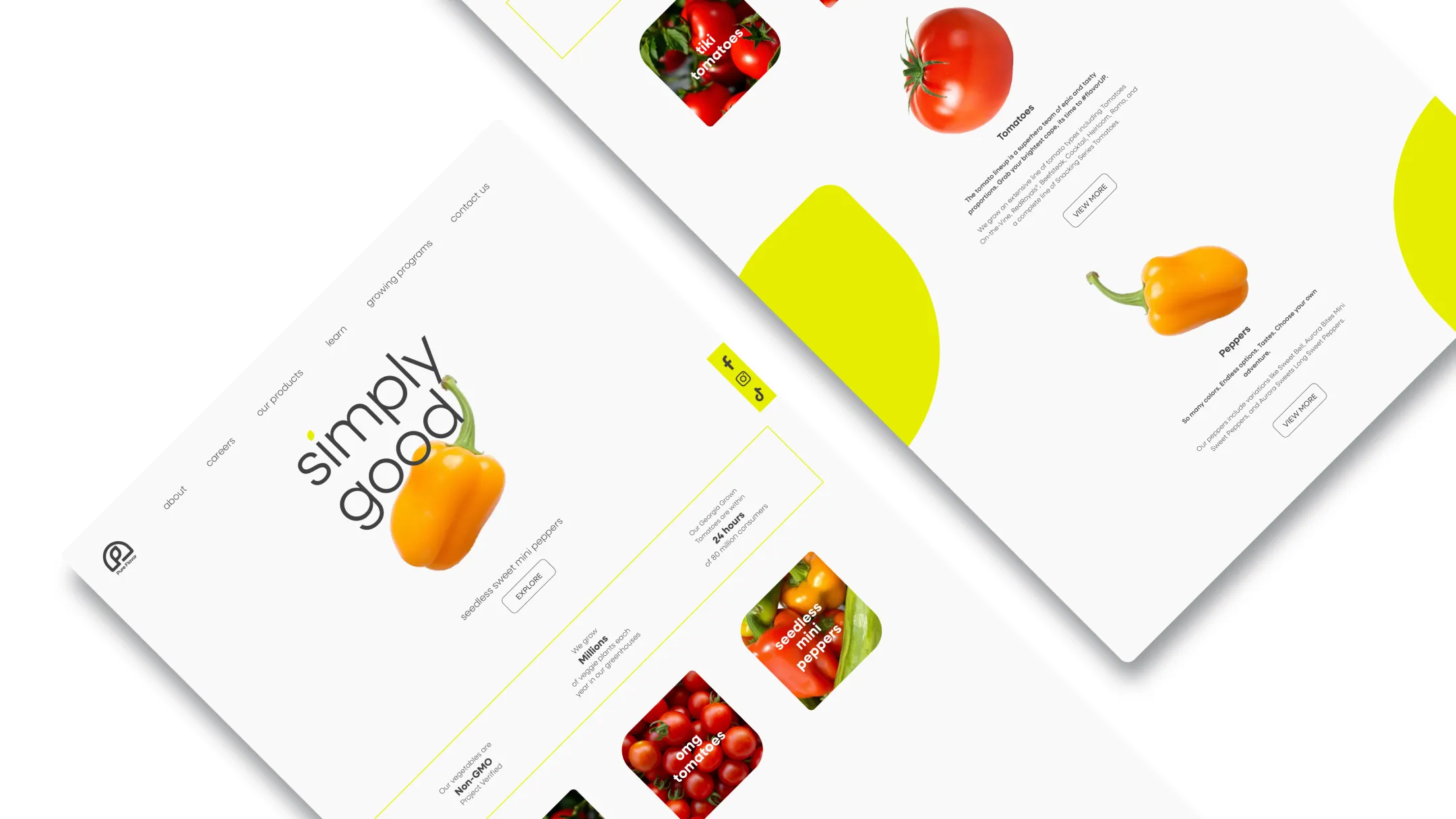
In a category crowded with noise and color, Pure Flavor wanted to express something quieter but stronger. BasedOn’s challenge was to design a visual system that embodies the brand’s promise of Simply Good; clean, modern and refreshingly honest. We focused on purity of form and clarity of communication, creating a visual language that feels open and light, yet confident and enduring.
DESIGN SOLUTION
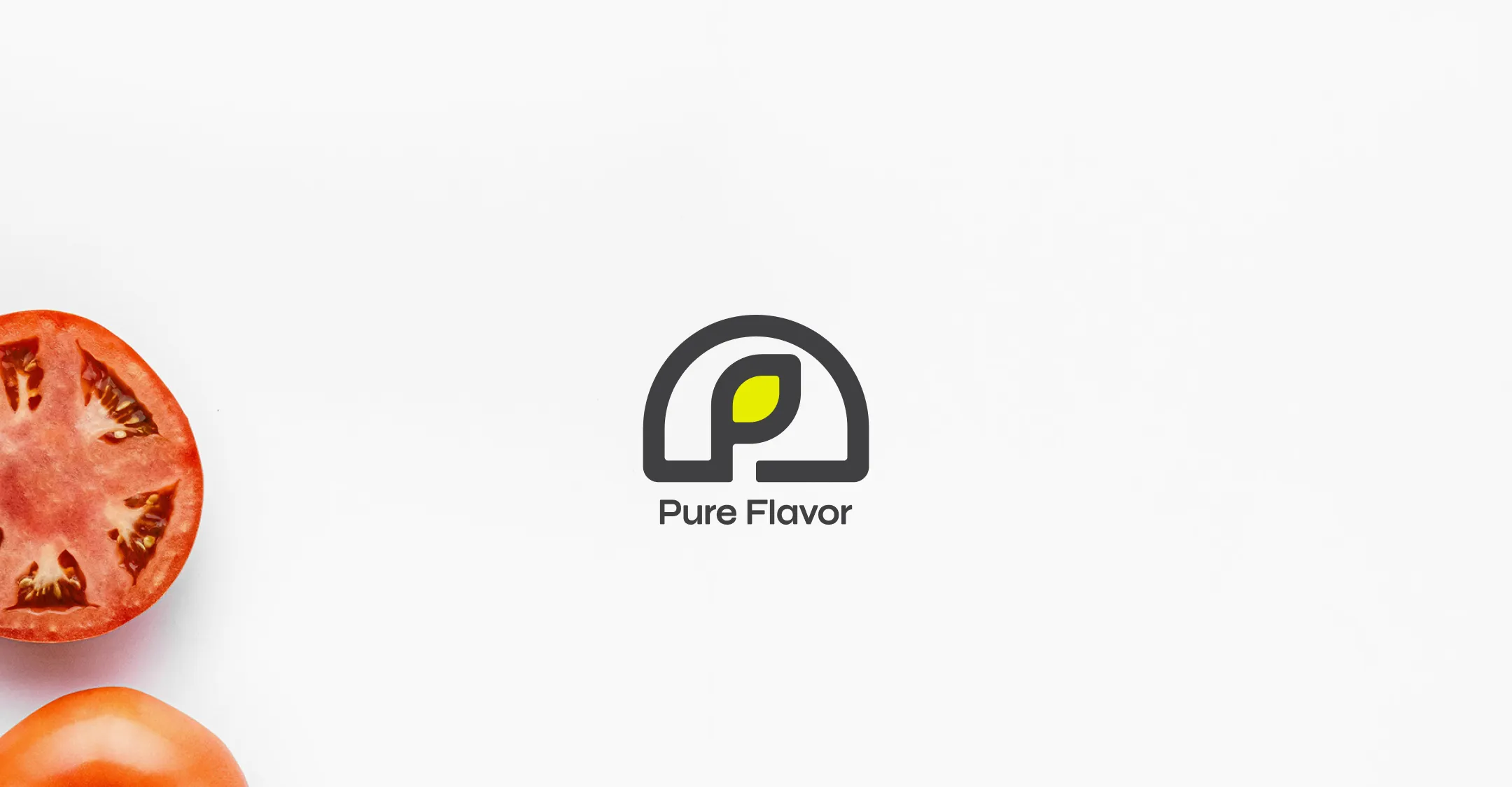
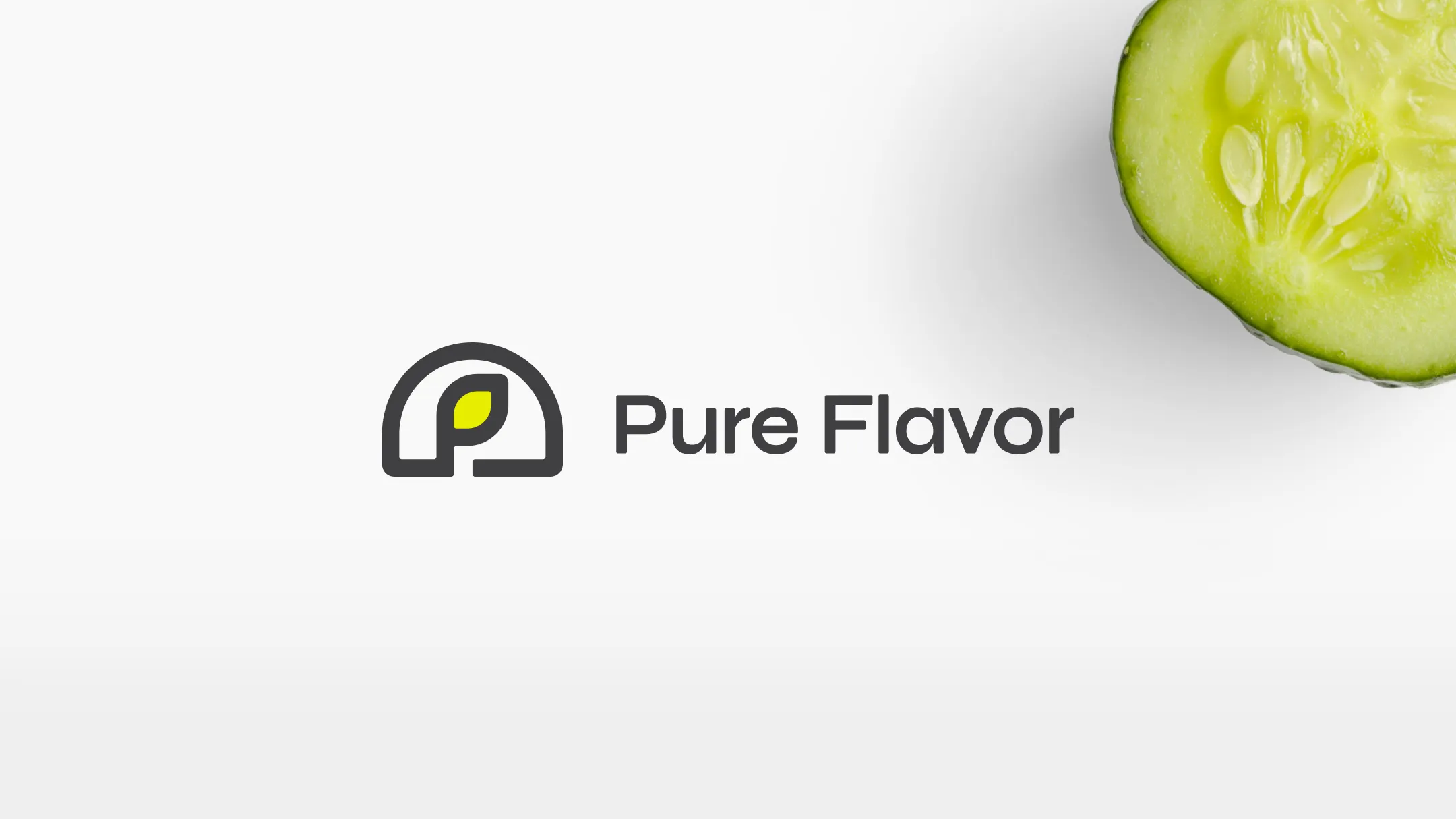
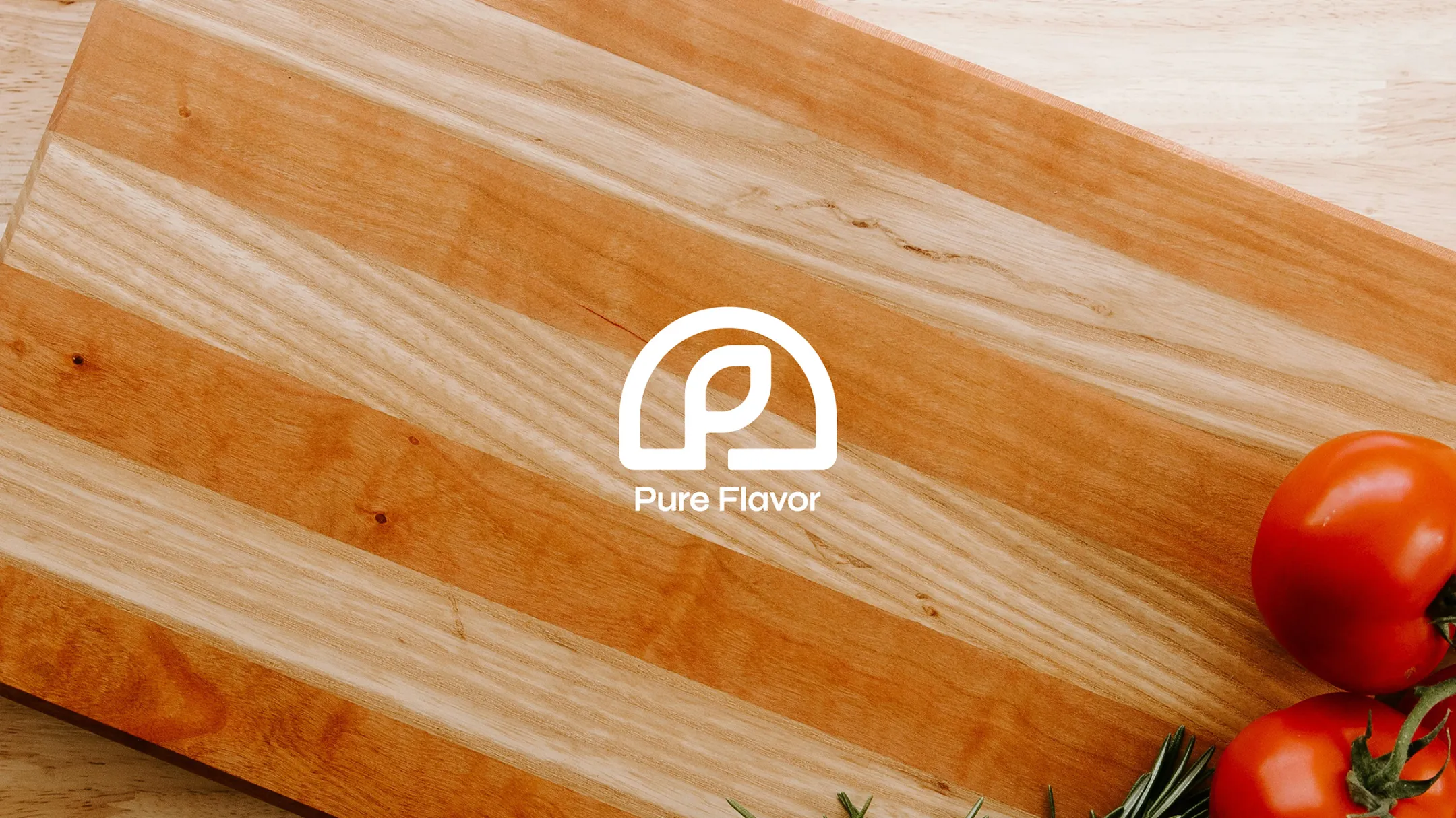
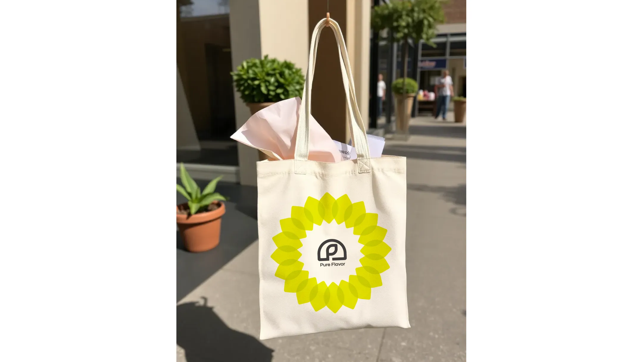
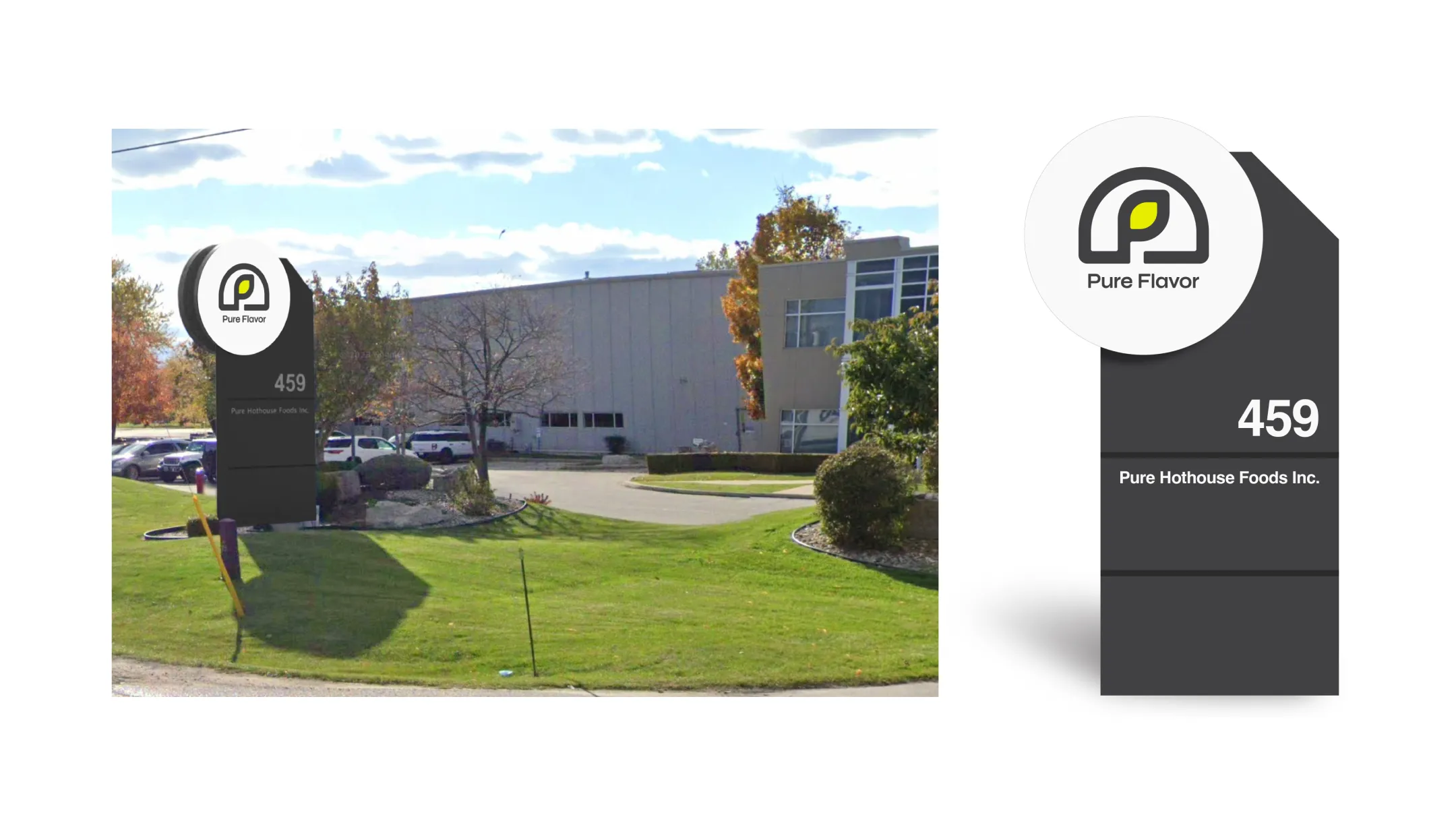
The new visual identity begins with a mark that embodies both purpose and place. Inspired by the protective arc of a greenhouse and the natural form of a leaf, the symbol reflects the purity and care behind everything they grow. Simple and minimal, it serves as a quiet emblem of good growth, anchored by a clean, modern wordmark that reinforces confidence and clarity.
-
 Before
-
 After
After
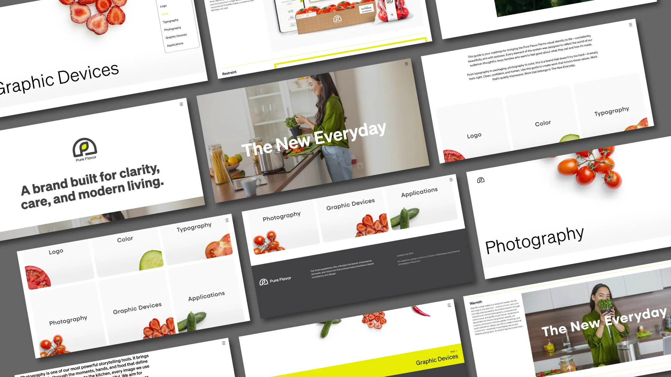
Color
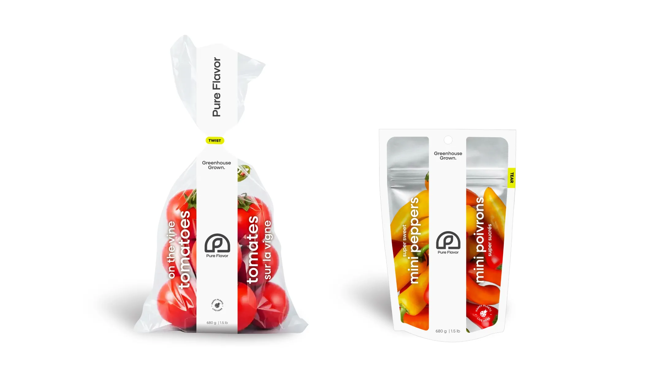
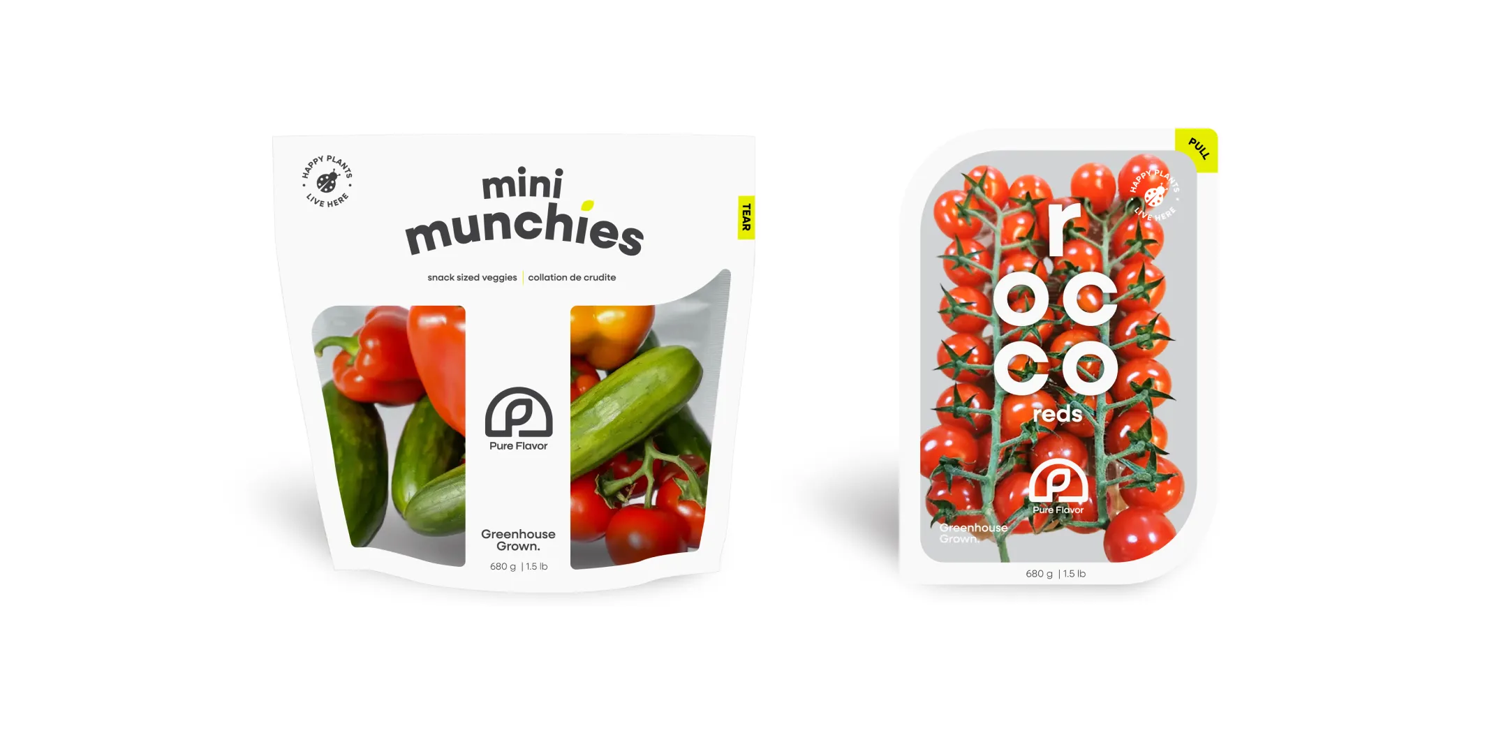
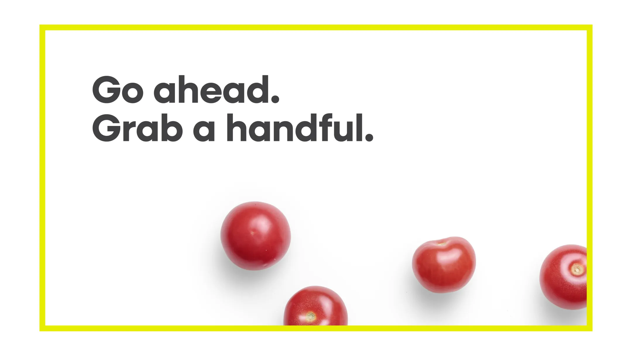
The color palette is built on restraint. Led by white space, anchored by charcoal and energized by chartreuse, the system feels bright yet grounded, allowing produce, photography and storytelling to take center stage. Each tone plays a role: white conveys purity and openness, charcoal brings structure and sophistication, and chartreuse introduces light, vitality and optimism.
Typography
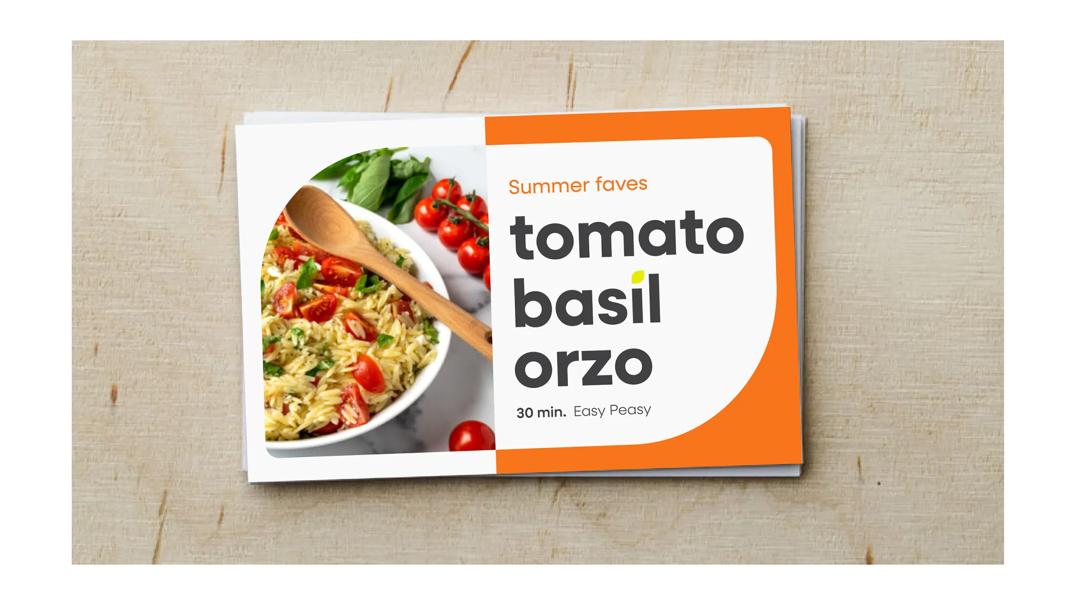
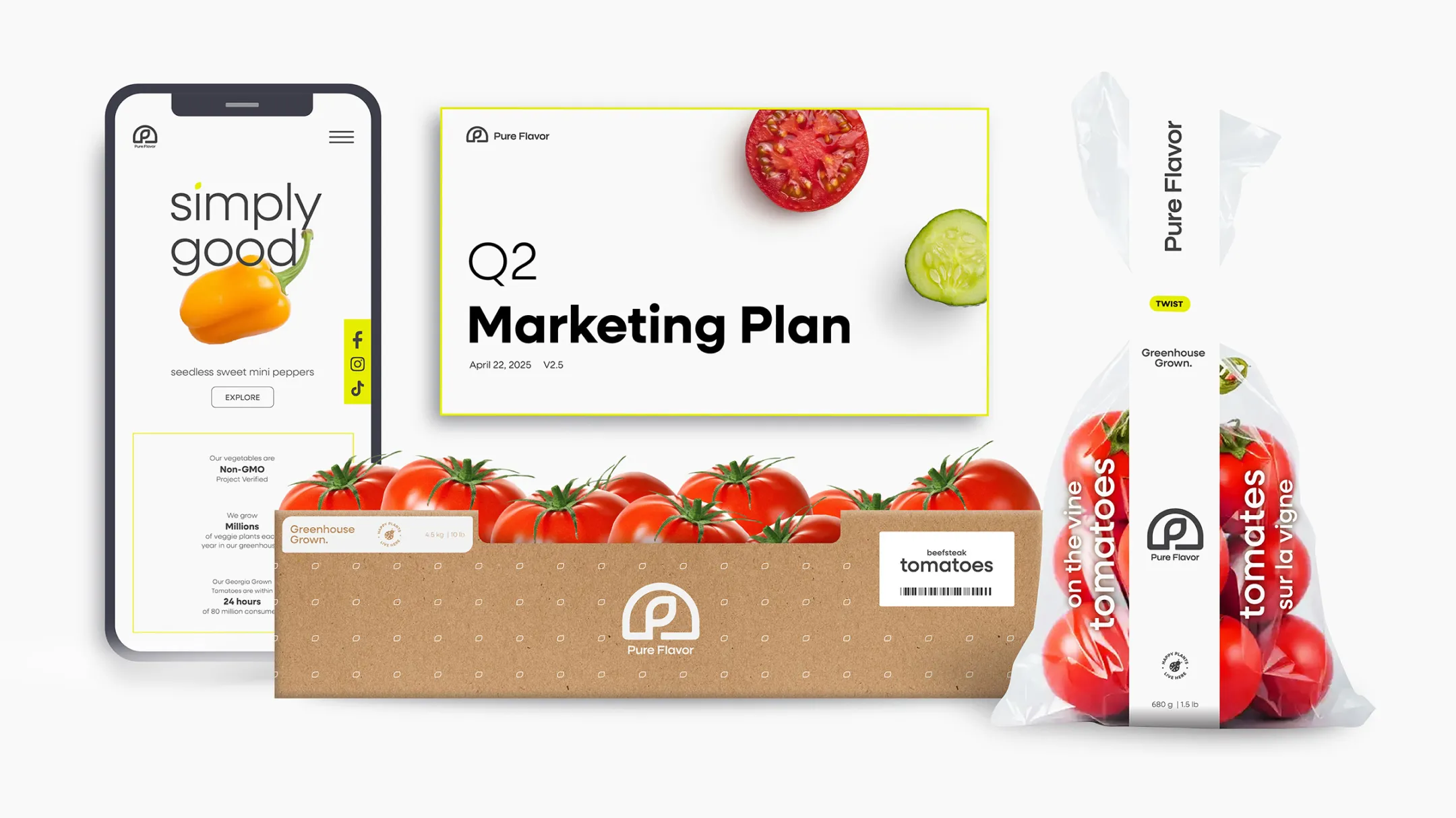
Typography continues the story of balance. Using Neulis Sans, a modern sans serif that ties geometric clarity to human warmth, the type system brings structure to storytelling communicating with both strength and subtlety across every medium.
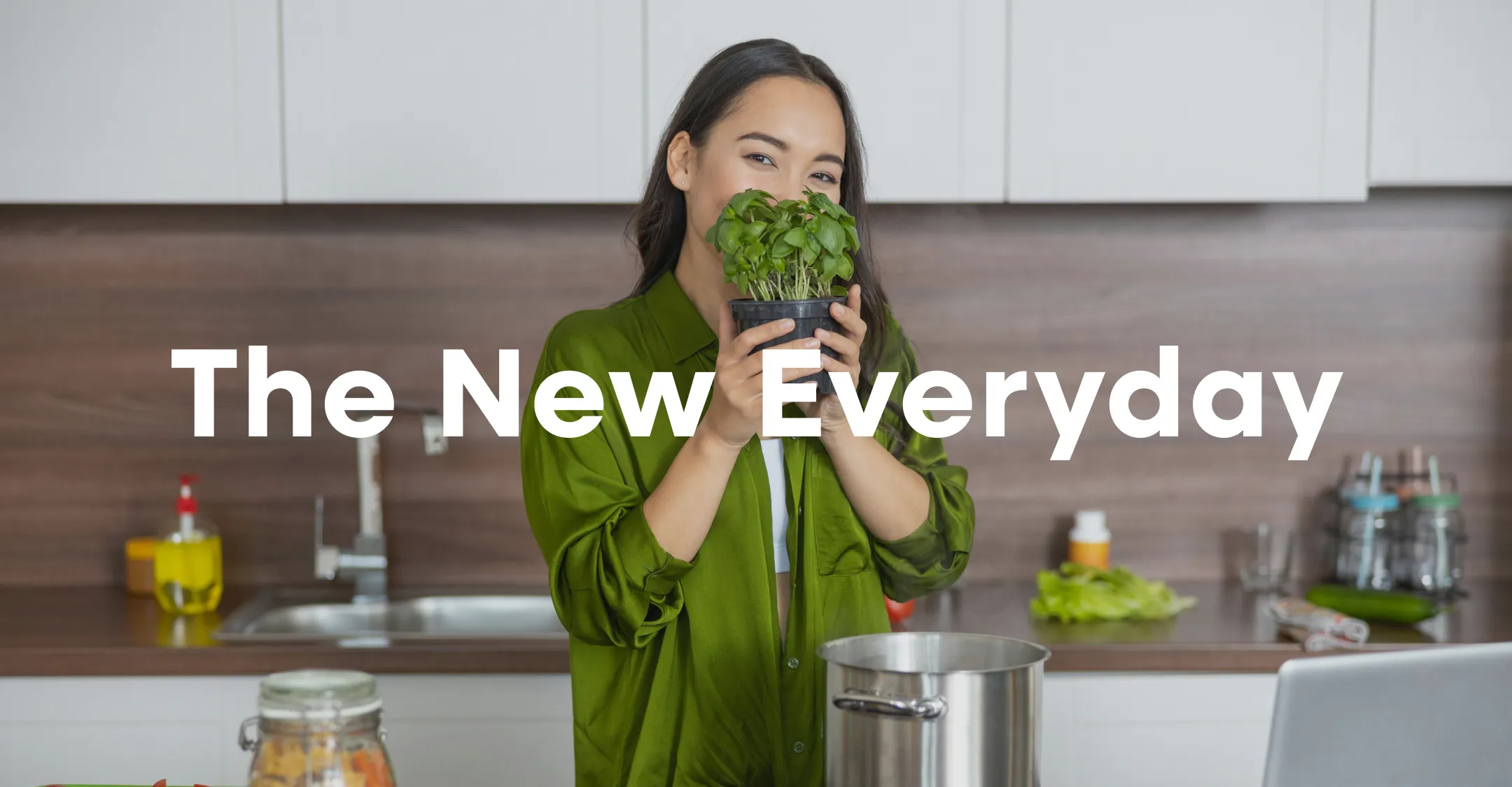
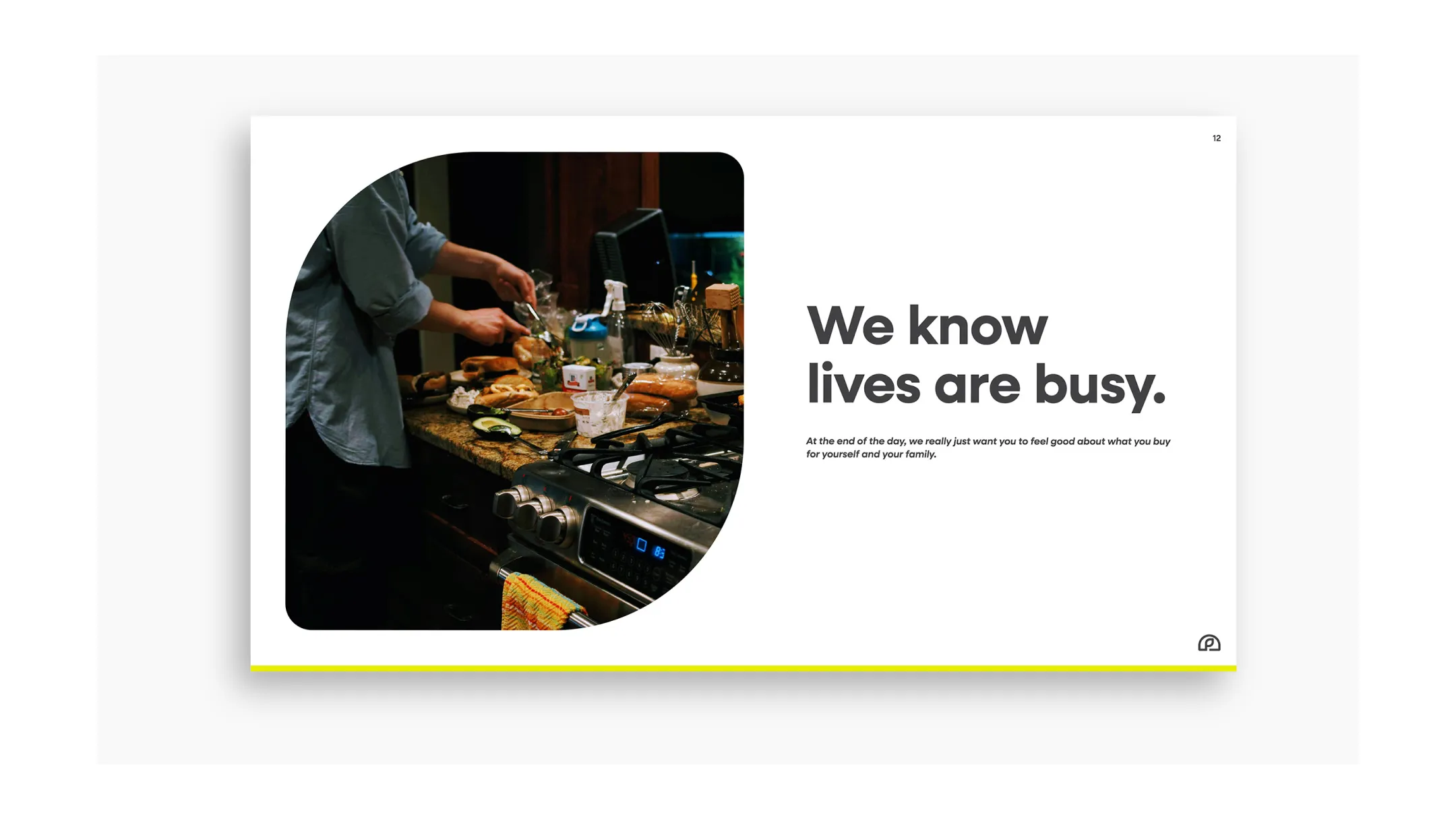
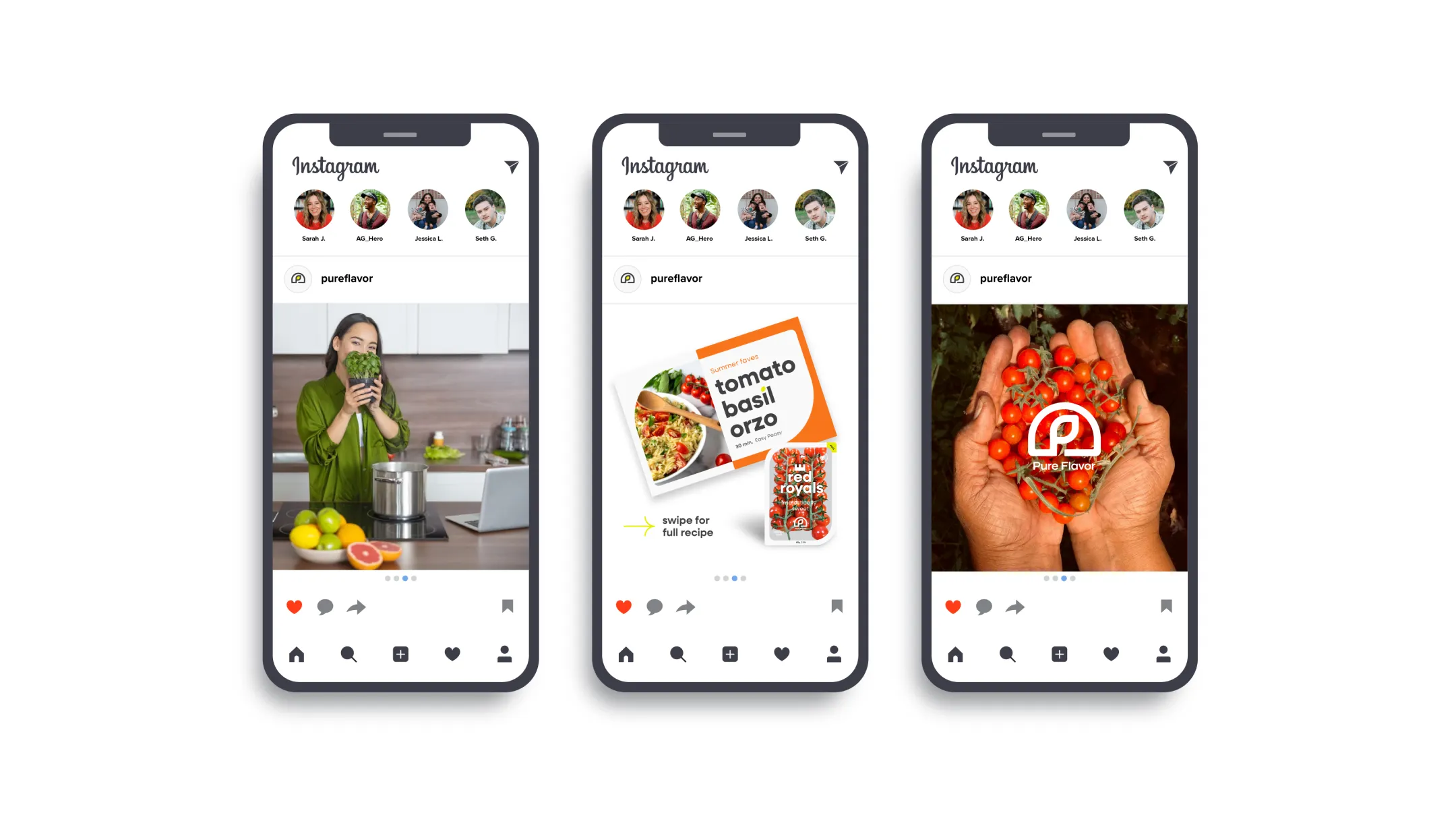
Photography expresses the brand’s humanity and craft. From the greenhouse to the kitchen table, images capture real people, real food, and the quiet beauty of daily moments. The tone is warm, natural, and editorial, focused on authenticity over perfection, light over artifice. Within this framework, produce becomes the hero. Close-up photography celebrates texture and integrity; crisp, honest, and appetizing without over-styling. Isolated product shots, set against true white, create rhythm and clarity across packaging, digital and promotional layouts, reinforcing transparency and consistency.
The visual system was designed for flexibility and longevity. We created packaging concepts to inspire their in-house team as they expand into new product lines, and applied the brand across apparel, digital platforms, trade environments and sales tools. Every touchpoint, from recipe cards and social media to the online digital identity guide, was crafted to demonstrate how Simply Good can live seamlessly across contexts while retaining its freshness and focus.


The result is an identity that feels lush yet structured, modern yet timeless. A brand that protects what’s pure, celebrates what’s real, and grows with quiet confidence, just like the produce it represents.
“Working with BasedOn was a truly collaborative experience from start to finish. Their approachable style and deep understanding of our strategy and customer came through in every step of the process. They embraced our existing strategy in a thoughtful, thorough way and built upon it seamlessly. Their organized processes and smooth transition points made the work feel effortless, and their walkthrough presentation style told a clear, well-crafted story from beginning to end. The result was a strategic and creative solution that felt perfectly aligned with who we are and where we’re going.”
— Julia Shreve, Marketing Director
Cortney Walker, Sr. Brand Manager
Candice Cottingham, Creative Manager

Summary
What began as a clear strategy evolved into a confident, cohesive expression of who Pure Flavor truly is. Together, we transformed Simply Good from a guiding idea into a fully realized identity, one that unites their values, purpose and visual presence under a single, timeless system. The new design elevated internal alignment and brought renewed energy to their marketing and sales teams. It clarified their voice in a competitive category and positioned them for future growth within both retail and consumer markets across North America.