Michigan Humane
New name creation and an evolved Brand Identity engages the community and benchmarks thought leadership for the world at Michigan’s top animal welfare not-for-profit.
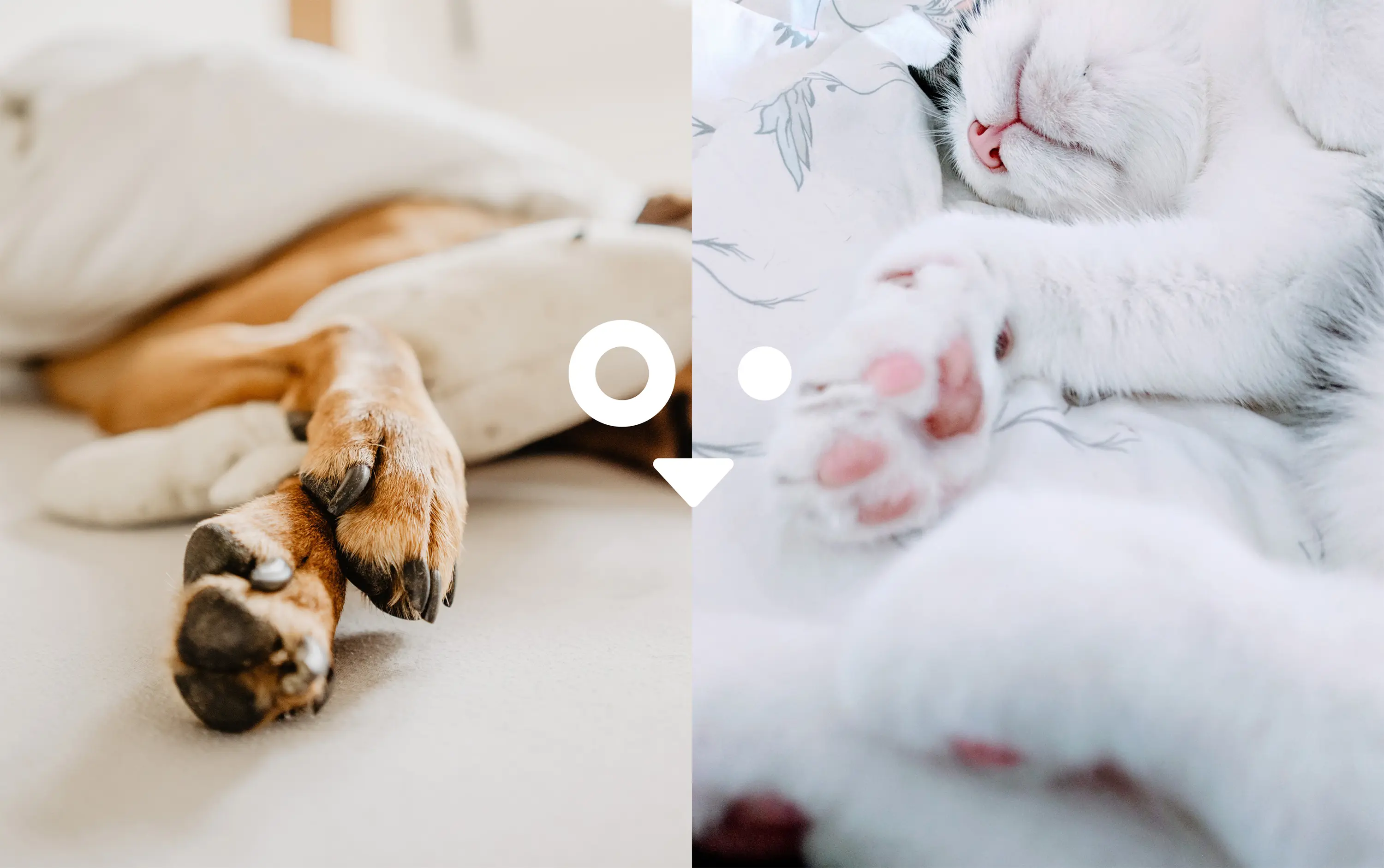
Animals are so much like us. Or are we like them?
Michigan Humane believe there is a symbiotic relationship, and leaned on BasedOn to weave this through brand strategy and related visual and verbal symbols. This origin story starts shortly after the Civil War, which devastated the country’s male population. Women, with their limited rights, found themselves alone and fighting for survival alongside the plight of abandoned horses. Both found safety and refuge at this early welfare outpost. Today, Michigan Humane remains a place of hope and action. Sharing deep roots in Detroit and Michigan, our creative studio was engaged by Michigan Humane to modernize this historic brand with a new brand identity. The output: attracting more ongoing support in the form of donors and volunteers for this noble and humane cause.
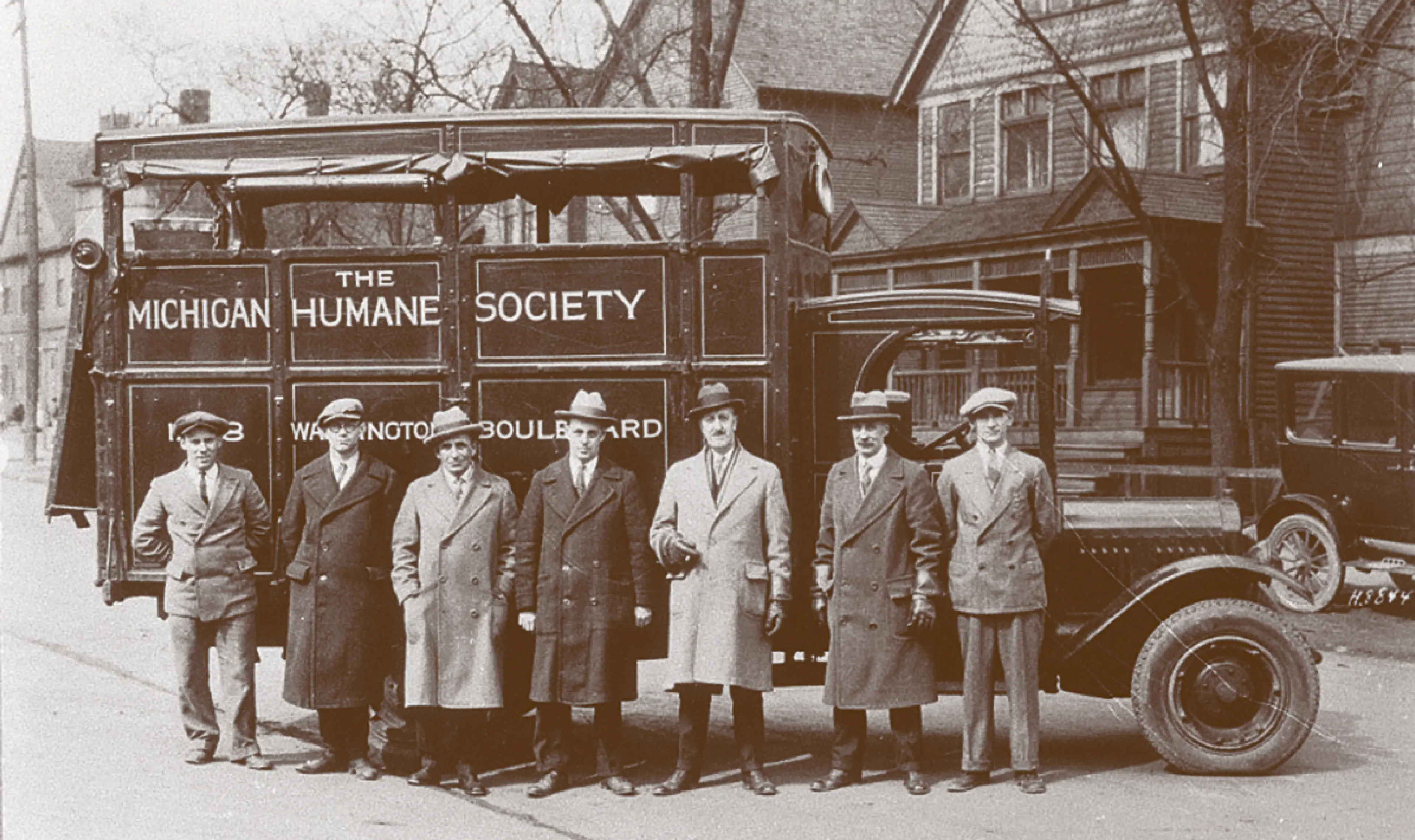
We are a community of passionate animal experts, donors and volunteers who share the belief that all lives are valuable.
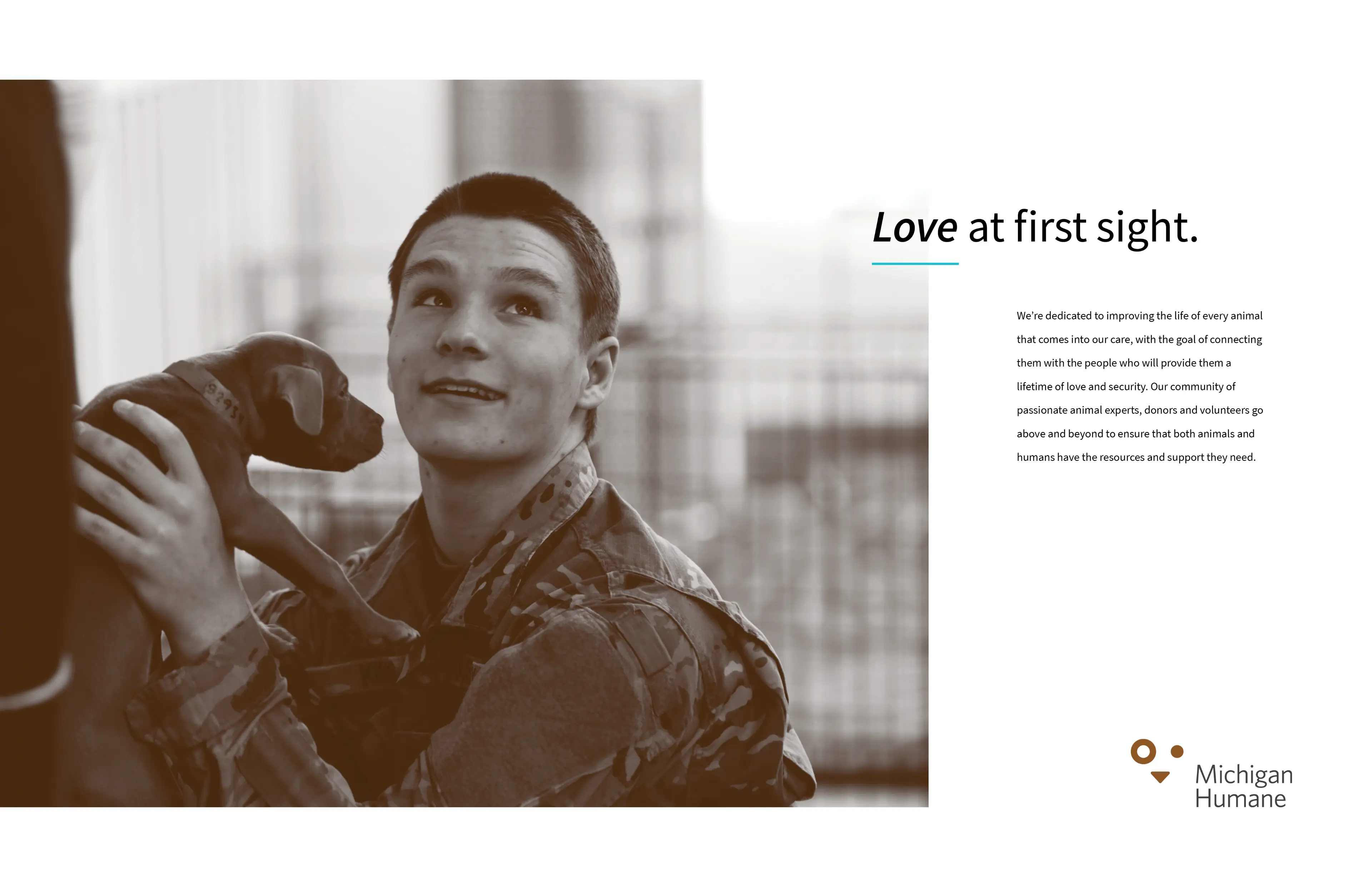
That every animal—and person—deserves to be treated with respect, kindness and consideration. Since we were founded in 1877 we have been committed to this cause—ensuring that both animals and humans have the resources and support they need.

Strategy
The challenge was to revive the organization’s original values, shift perceptions from being shelter-based, and bring attention to the breadth and depth of the not-for-profit‘s work. Michigan Humane wanted to be known as thought leaders who understood the relationship between people, pets and the community. BasedOn strategists used a series of exercises based on archetypal thinking. Michigan Humane aligned strongly around “Everyman” traits, making it necessary to infuse the brand with feelings of accessibility and belonging.
For research, we developed and disseminated a quantitative survey across hundreds of employees, stakeholders, community partners and donors; solicited input during community events; performed an international benchmark audit; conducted interviews with board members and leadership; toured facilities, and accompanied the cruelty investigation and rescue teams.
Brand Values
- We are Passionate
- We are Collaborative
- We are Humane
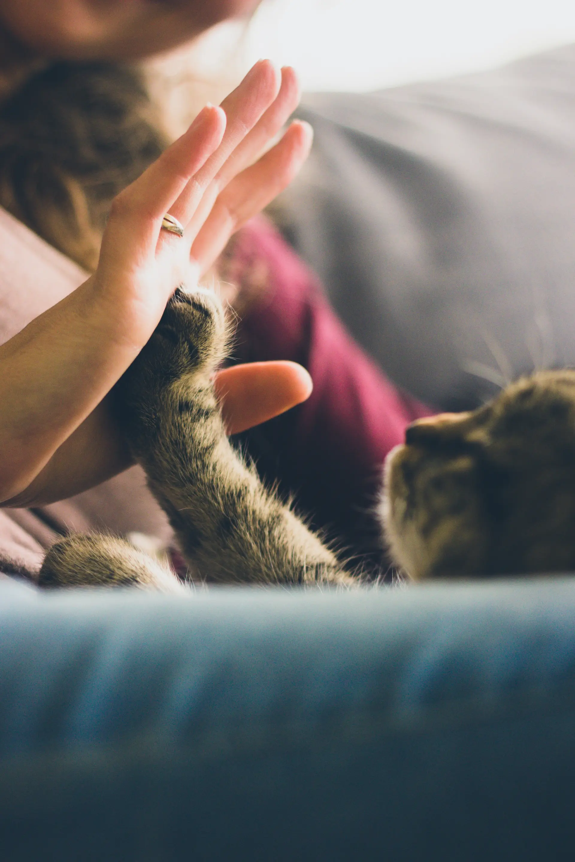
“Working with BasedOn was a fantastic experience. They were able to take an idea and turn it into something real. The resulting identity is one that we have embraced and is present in everything we do. It has changed who we are and has dramatically improved our relevancy and impact in the community.” — Matt Pepper, CEO
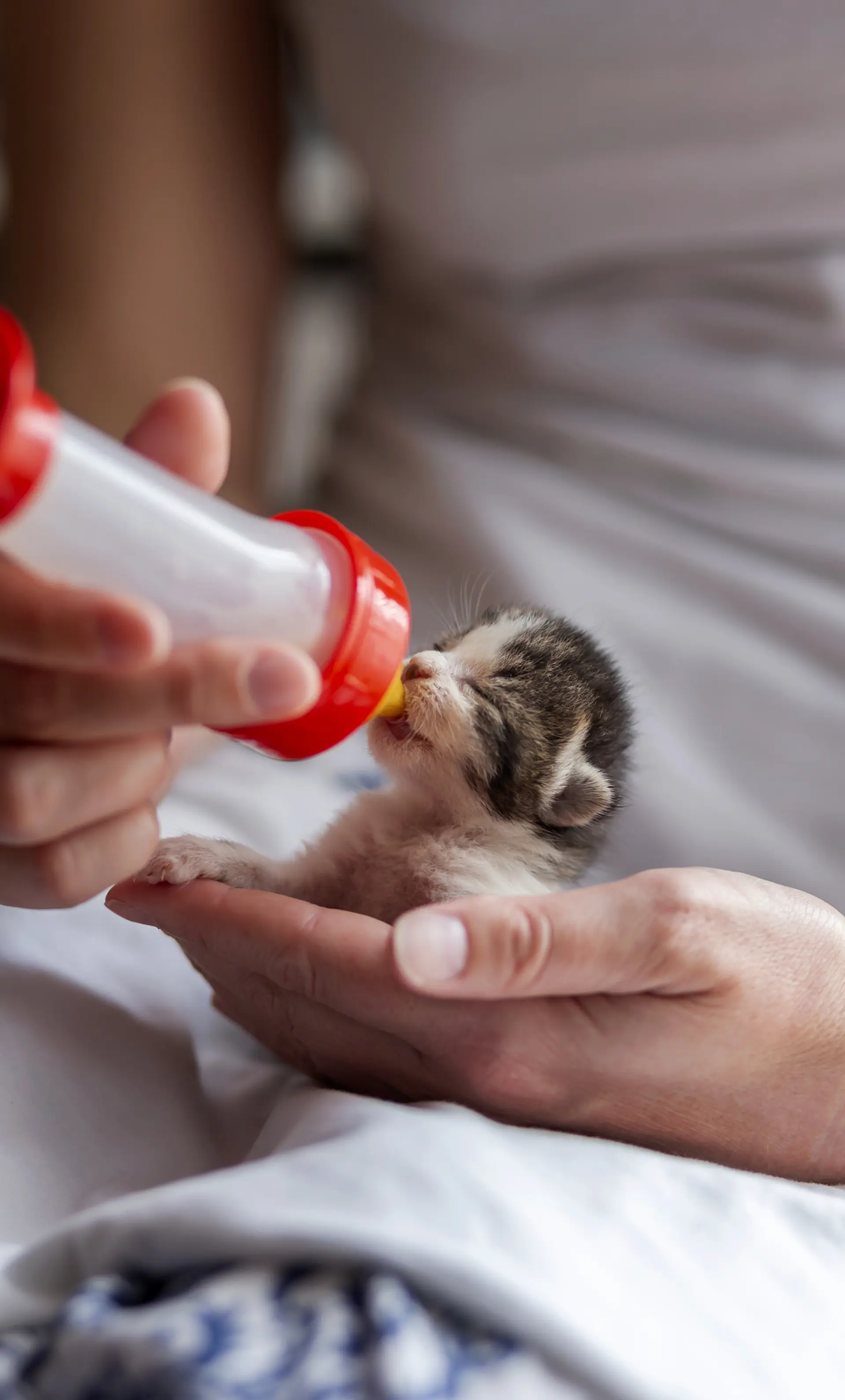
Boots On The Ground
Our team was committed to experiencing what the client faces every day. And, we went deep: from “ride-alongs” with the Cruelty Investigation Unit that answered community distress calls and the Michigan Humane Rescue Team that was able to bring animals in for care. Our Co-Founder and Creative Director, Angela Topacio-DiDio, even donned a bullet-proof vest and set out with the crew to experience a day in the life. These were difficult visits. Seeing the intertwined lives of people and their animals and the delicate balance that presented, reinforced the importance of their animal welfare education endeavors.
Brand Idea
Michigan Humane is a place where
everyone is safe and loved.
What's In A Name?
From our strategy sessions, we discovered that the client's “Everyman” archetype suddenly found itself at odds with the last part of their historic name: Michigan Humane Society. In the context of this archetype and client objectives, the word “society” seemed exclusive and outdated.
So, we focused on the brand value of being “Humane.” And “Michigan” was of course essential as both a location and defining the community. Michigan Humane. Clean, simple and clear.
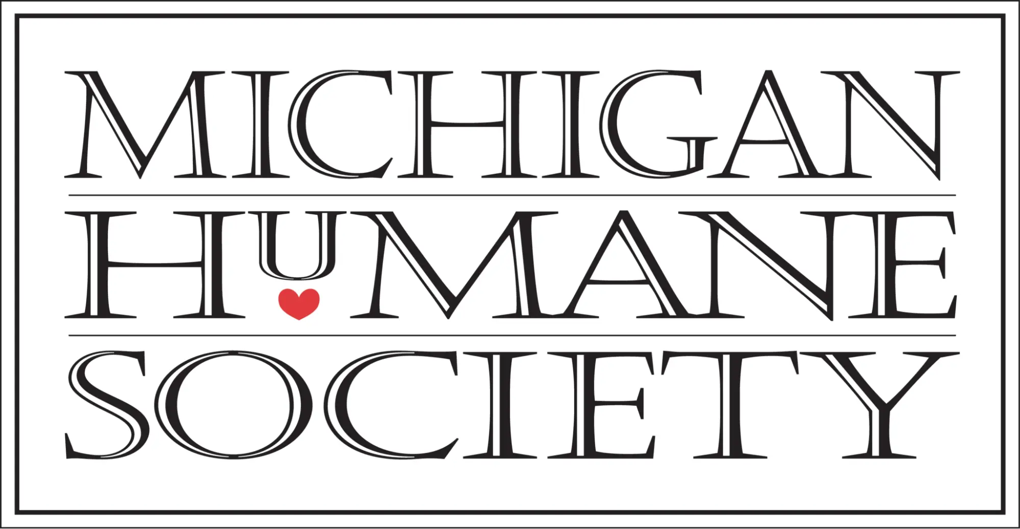
Before
After
Visual Identity
A Brandmark Comes To Life
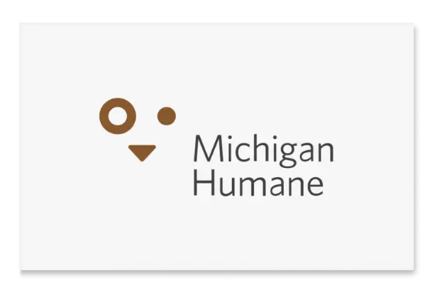
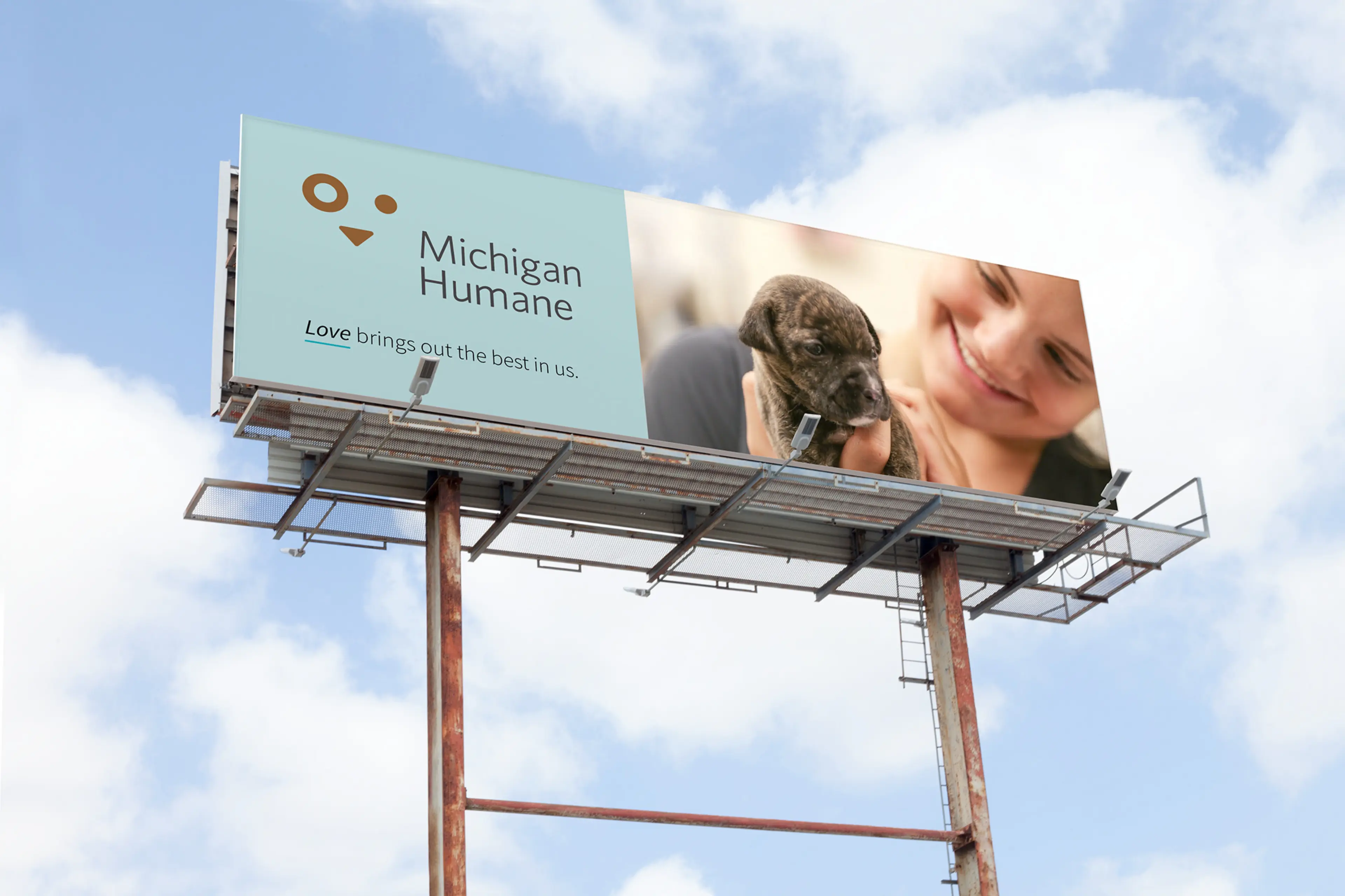
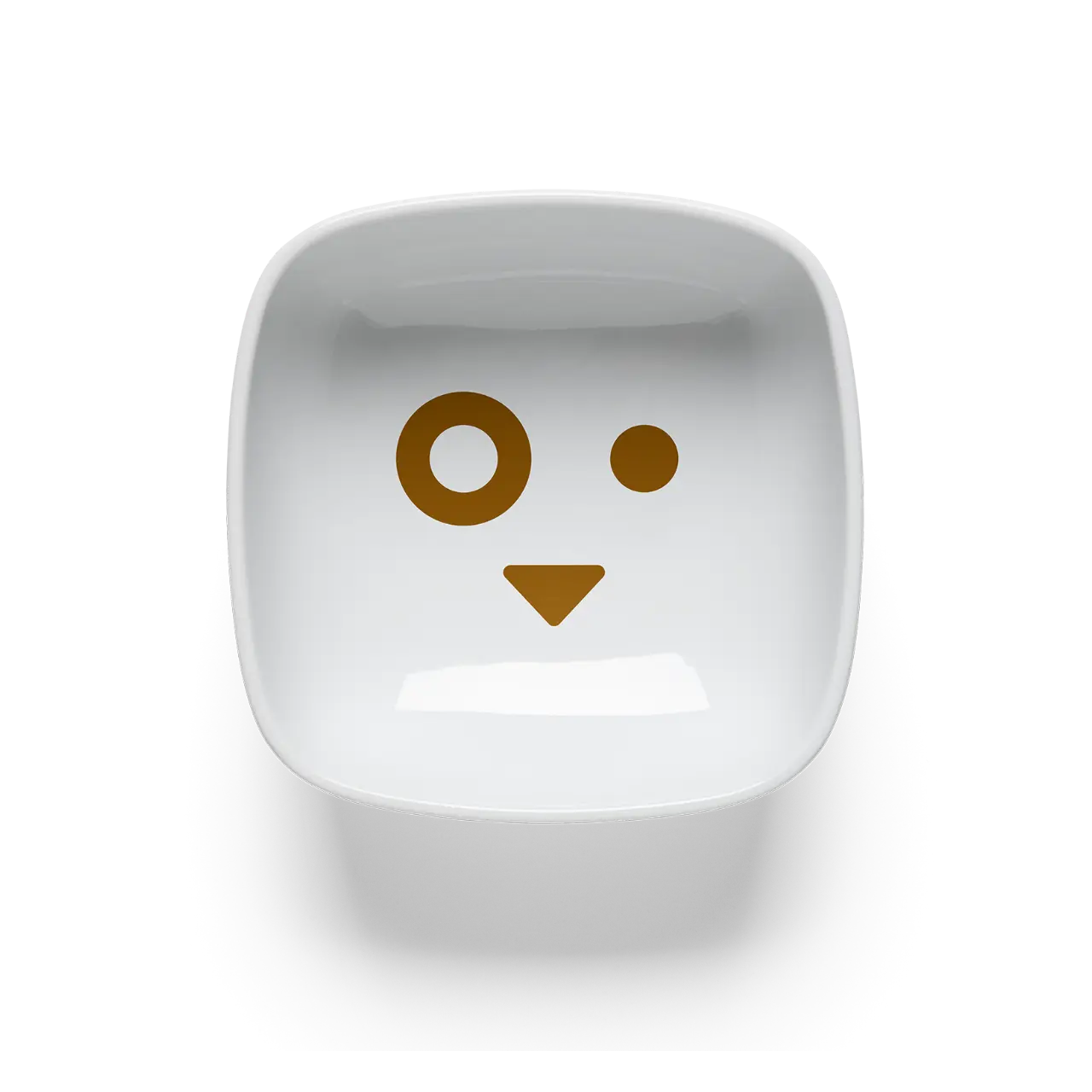
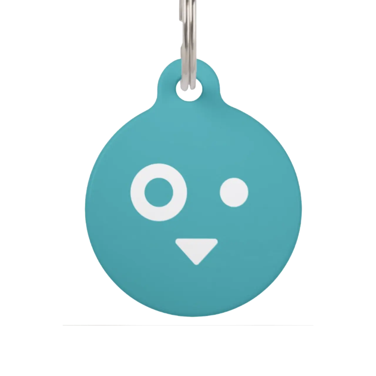
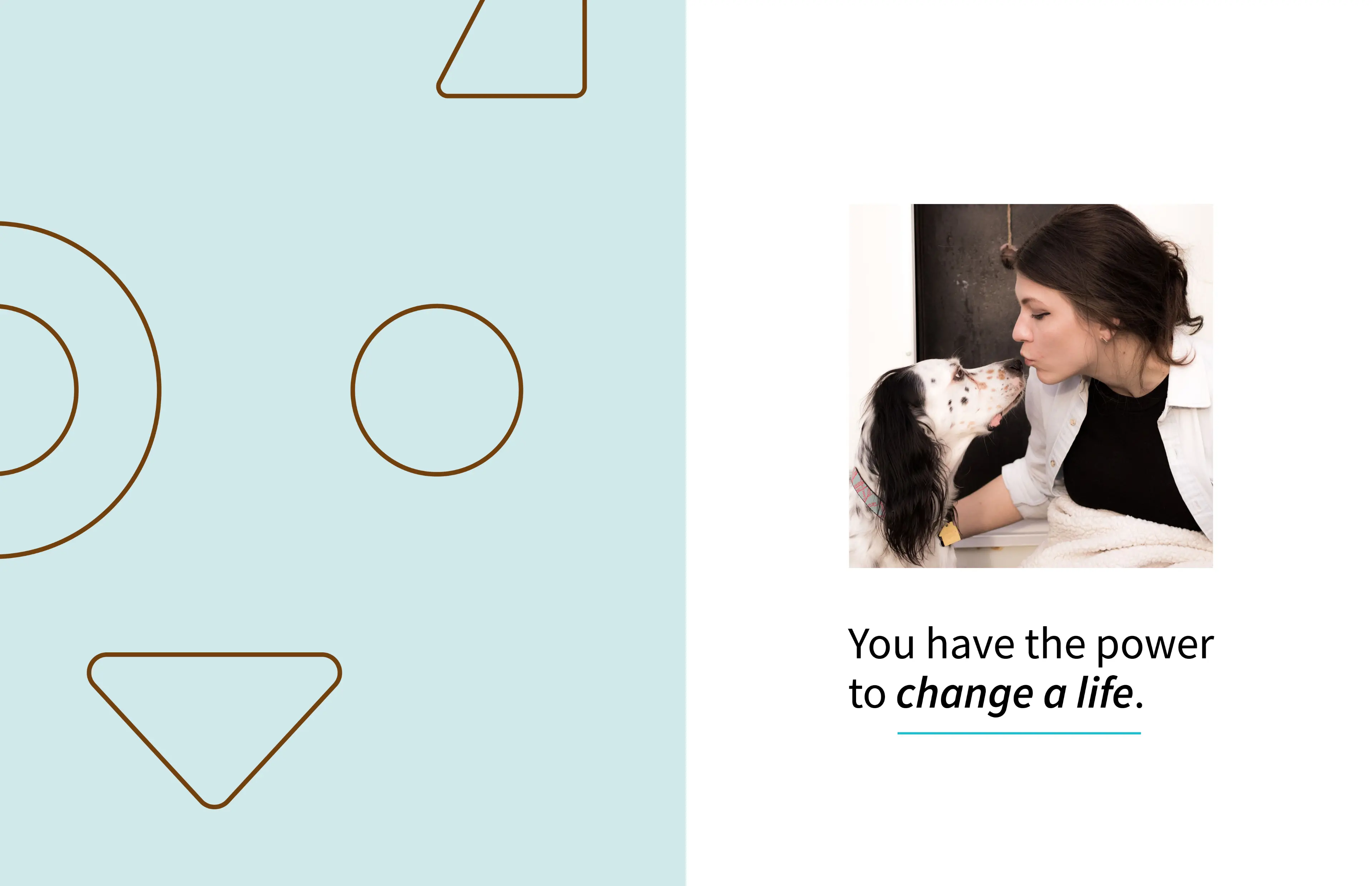
The brandmark had to be broad enough to represent other types of animals Michigan Humane could care for, beyond cats and dogs. It had to be dynamic, engaging and full of personality. And it had to be approachable—where the imperfection that connects us all is celebrated and can be seen in the slight asymmetry of the design.
Color was also important. Brown was specifically used in a range from light to dark, representing humanity. It was also known to be a true “Everyman” color, creating feelings of equality and accessibility.

Verbal Identity
Telling Their Story
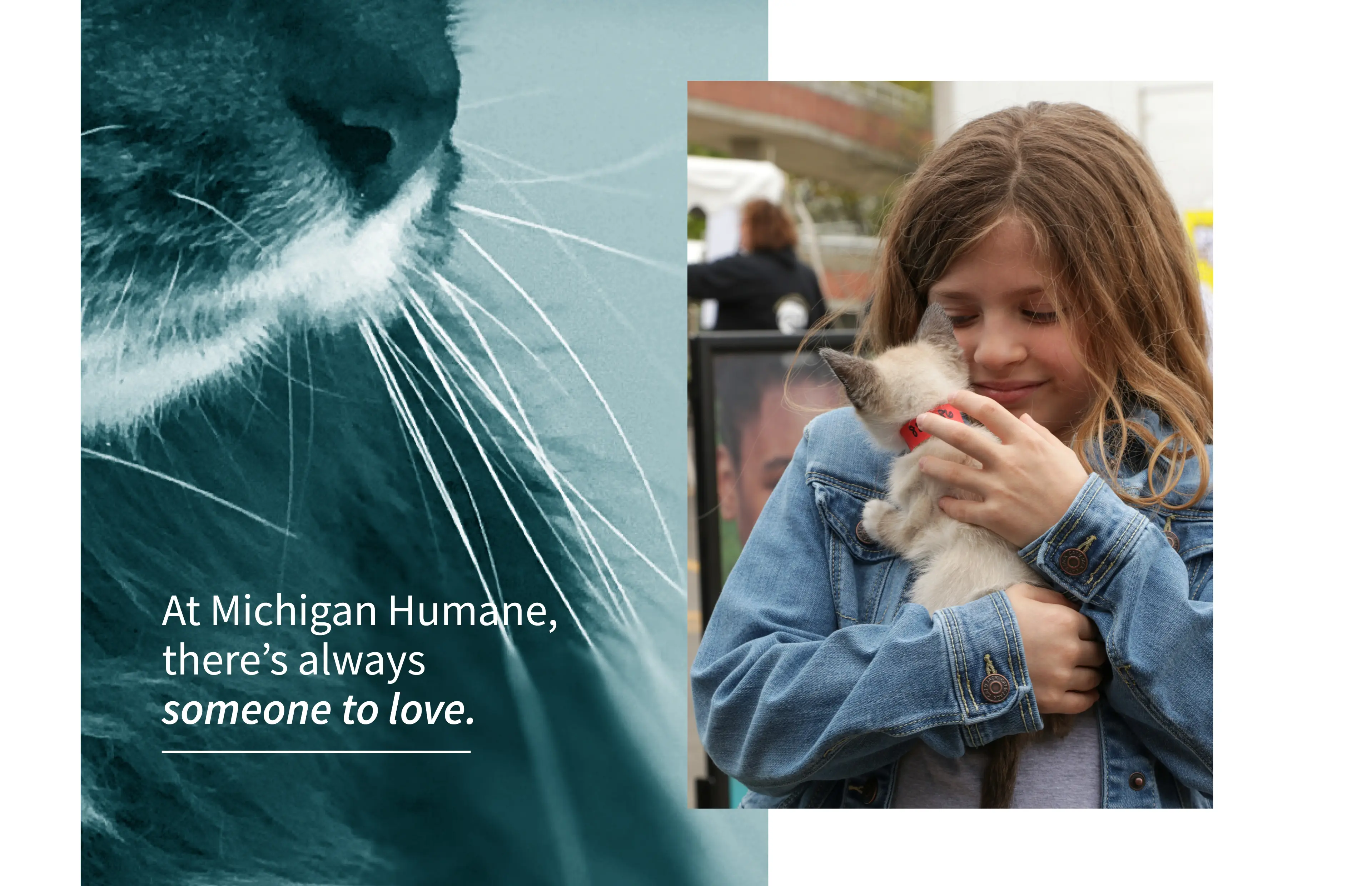
Connecting the past and present would be important. But we also had to update its image. Our verbal language became that bridge. By using language that is accessible, clear and warm, Michigan Humane is positioned to cover difficult topics with truth and compassion, and handle issues in a non-threatening, non-judgmental way. Speaking from a place “beside” people and meeting them where they're at offered the chance to make the greatest change of all.
“Never above you,
never below you,
always beside you.” — Michigan Humane

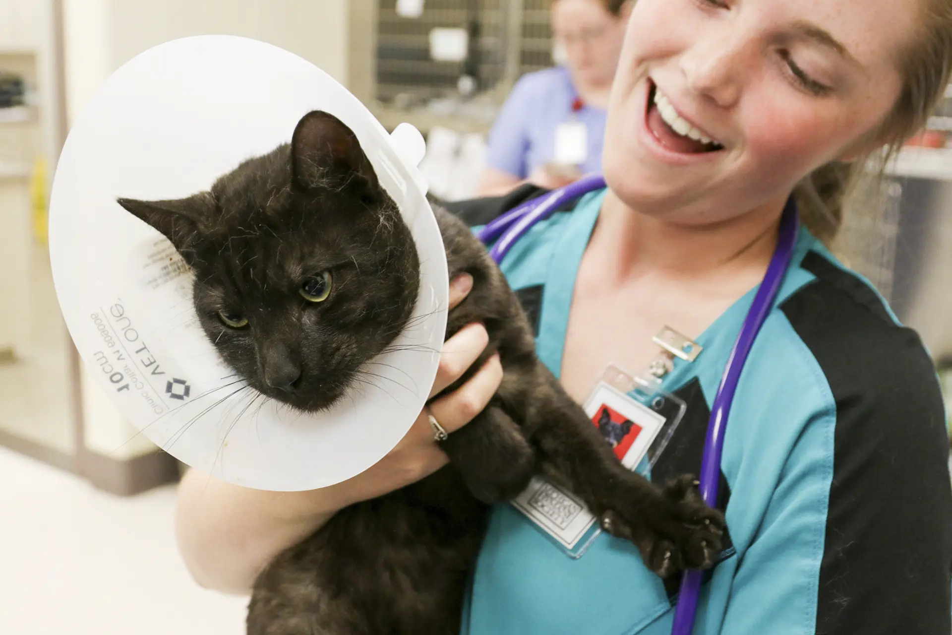
Today, as the oldest and largest non-profit animal welfare organization in the state, we're dedicated to improving the life of every animal that comes into our care, with the goal of connecting them to the people who will provide them a lifetime of love and security.
Summary
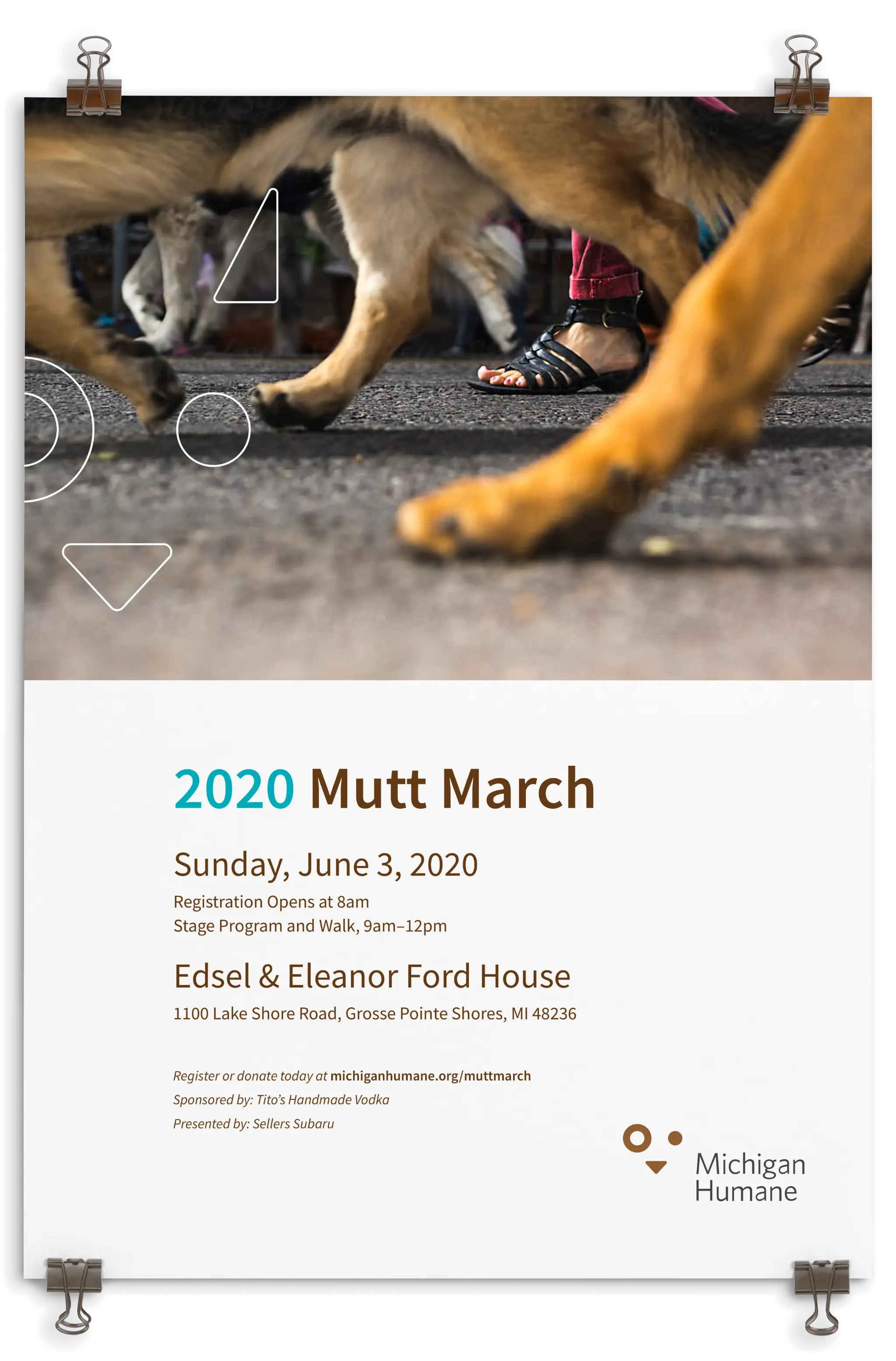
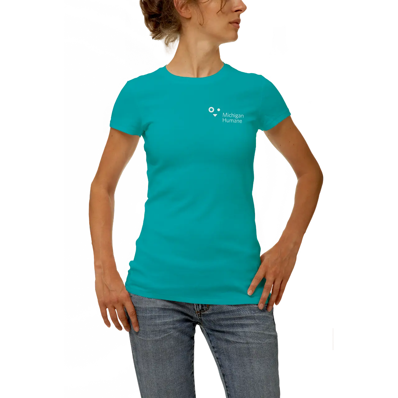
Animal welfare is of vital importance. The health of our pets is often an indicator of the health of our communities. That's why creating a brand that is passionate, collaborative and humane needed to come through visually and verbally in the world. The friendly face in the logo is instantly engaging. Language is heartwarming and uplifting. Michigan Humane is a feel-good story that is changing the lives of pets and people every day.