Jonathan Club
Los Angeles’ largest and second oldest social club looks to our Detroit studio to evolve its brand identity and attract the next generation of members.
Jonathan Club is really two Clubs in one: the original club, the Town Club, in downtown Los Angeles, steeped in 100 years of history, and the Beach Club, newer, set on the ocean with an informal, relaxed atmosphere. The Town Club has been the domain of notable business leaders, philanthropists and visionaries helping build Los Angeles to what it is today. As the Town Club and deeply traditional, there was a need to evolve this storied image to attract new members with the infusion of a younger demographic. Having seen our work for The Detroit Athletic Club, Jonathan Club believed our team well understood the delicate balance of moving a legendary club forward and engaged us for a full visual and verbal identity.
Strategy
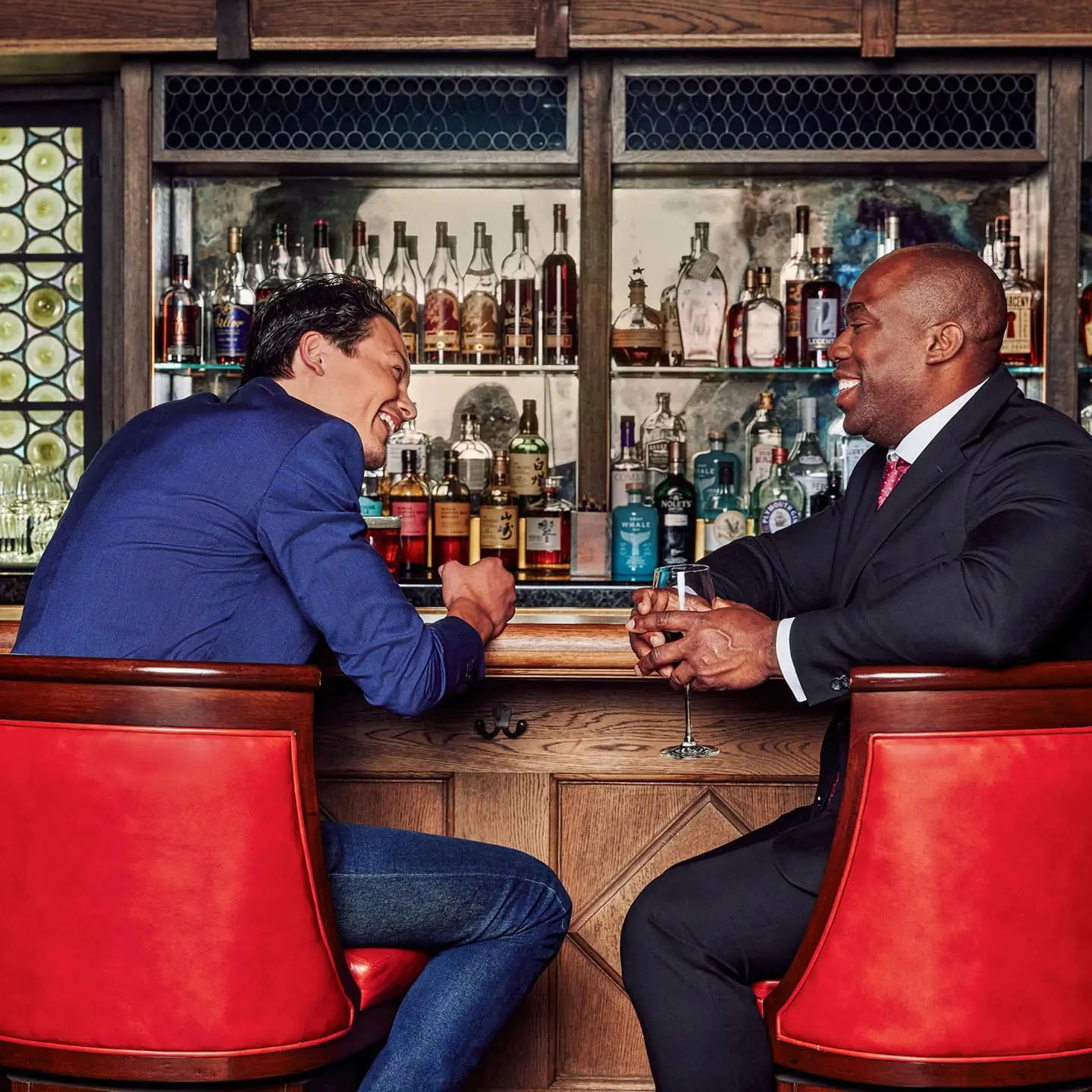
For over 100 years, Jonathans have helped grow the region and serve the Los Angeles community. They’ve been volunteers, soldiers, entrepreneurs, scientists, educators and philanthropists, doing their part to make the world a better place. In fact, they have been so visionary, that UCLA, The LA Times, the 1932 Olympic Games and even the LA Philharmonic were born at Jonathan Club. And the Club continues to take pride in their common commitment to service and the natural bonds they’ve created among family and friends. While members are extremely loyal, there is always a need to attract new membership.
Jonathan Club has recognized the necessity to evolve their culture in order to attract younger members who would become the next generation of Jonathans. They wanted to move the traditional forward, like brands such as Hermes and Gucci have so successfully done. Our team, digging into the history of these high achievers, found the common denominator among members was to live a fulfilling life. Considering all the amenities this Club offered to intrigue and catalyze the experiences of its members, our brand idea perfectly reflected what the Jonathan Club truly offered: “A life inspired.”
Brand Idea
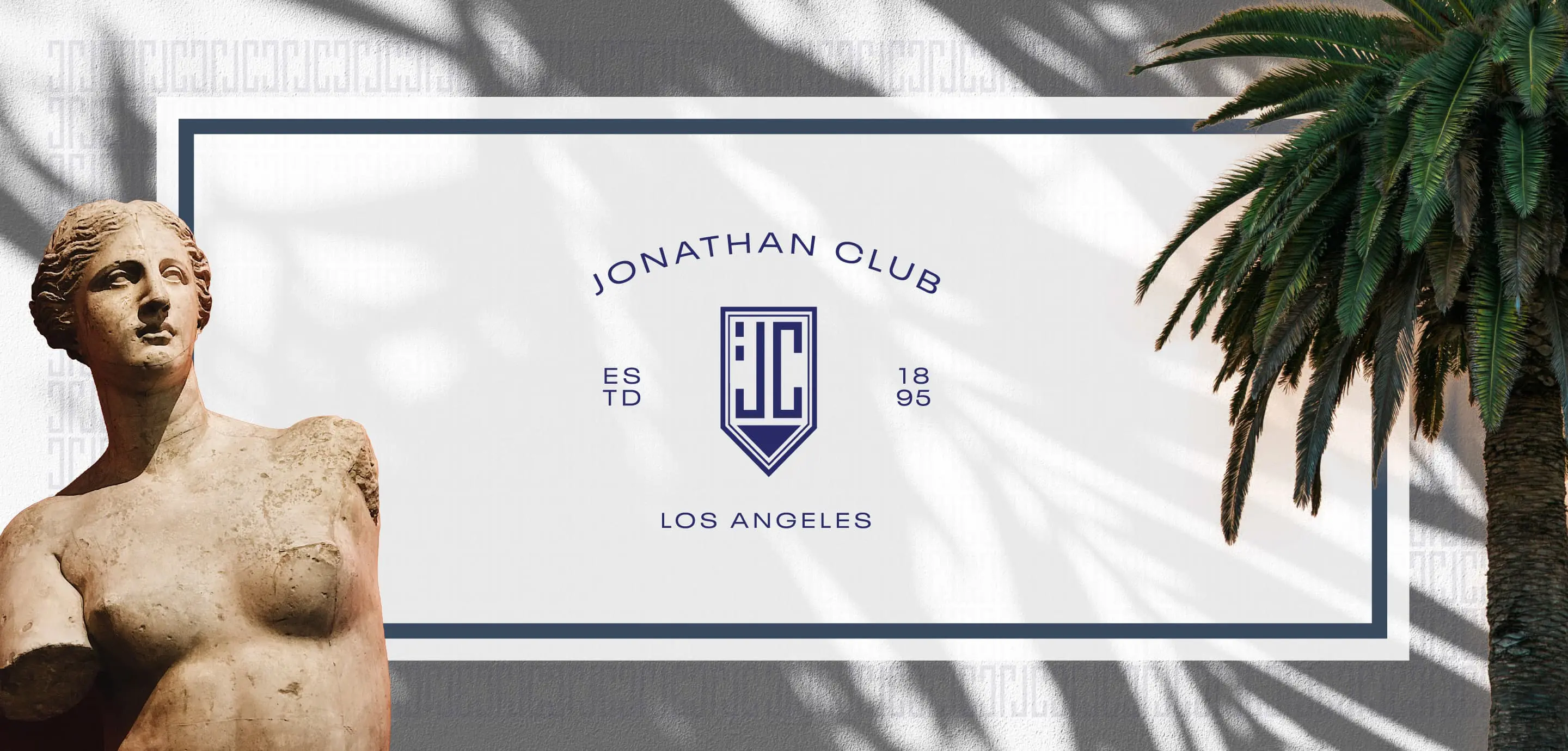
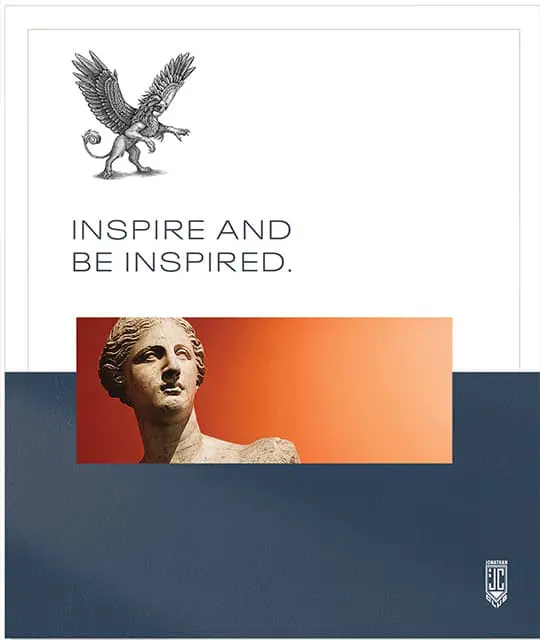
A Life Inspired.
Because legendary never gets old, Jonathan Club is the place where passionate people come to be inspired. This is at the heart of everything we do.
Brand Pillars
- We excite, enliven, and engage.
- We exceed expectations.
- We make a lasting impression.
Brand Character
A Jonathan is:
- Warm
- Positive
- Witty
- Energetic

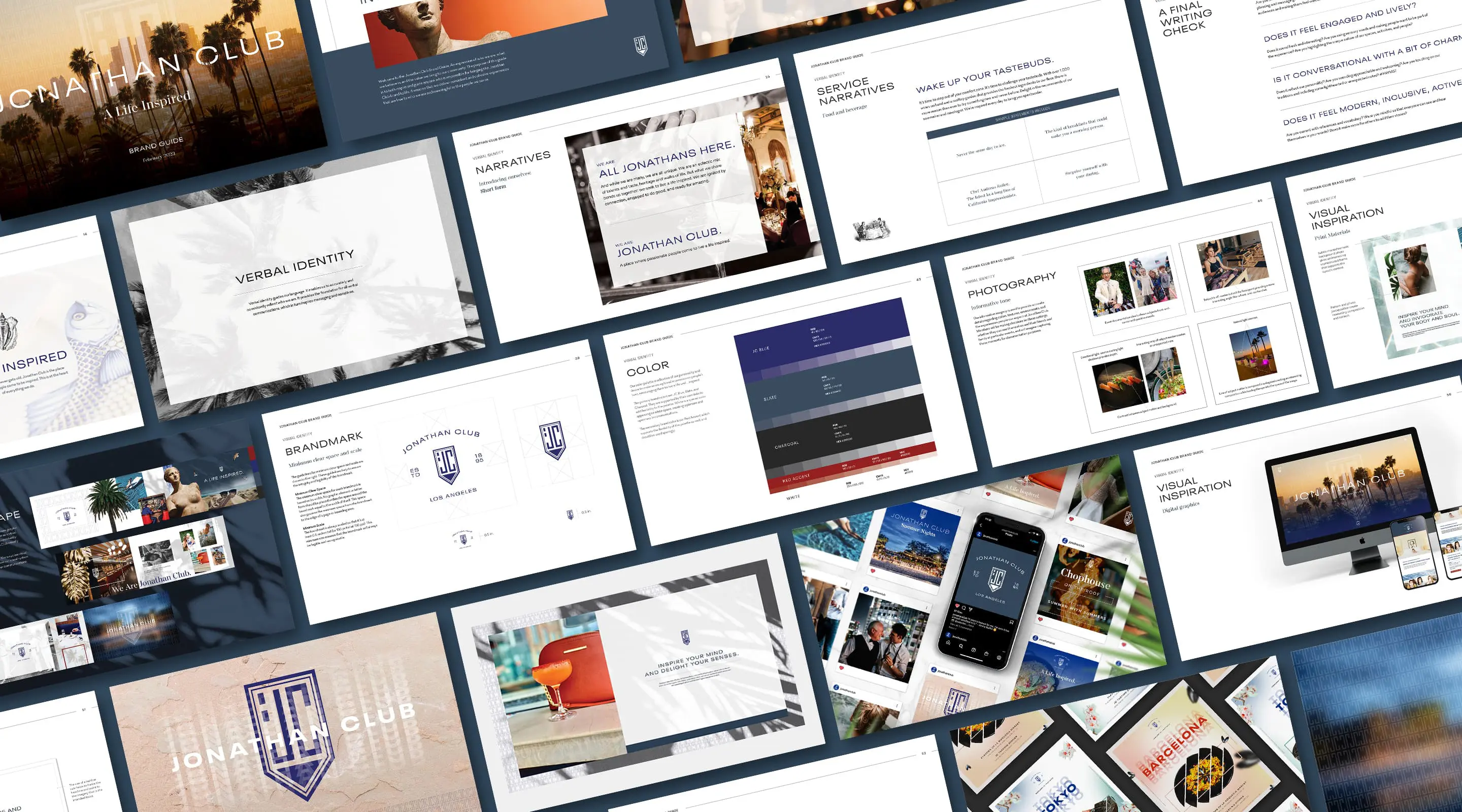
Verbal Identity
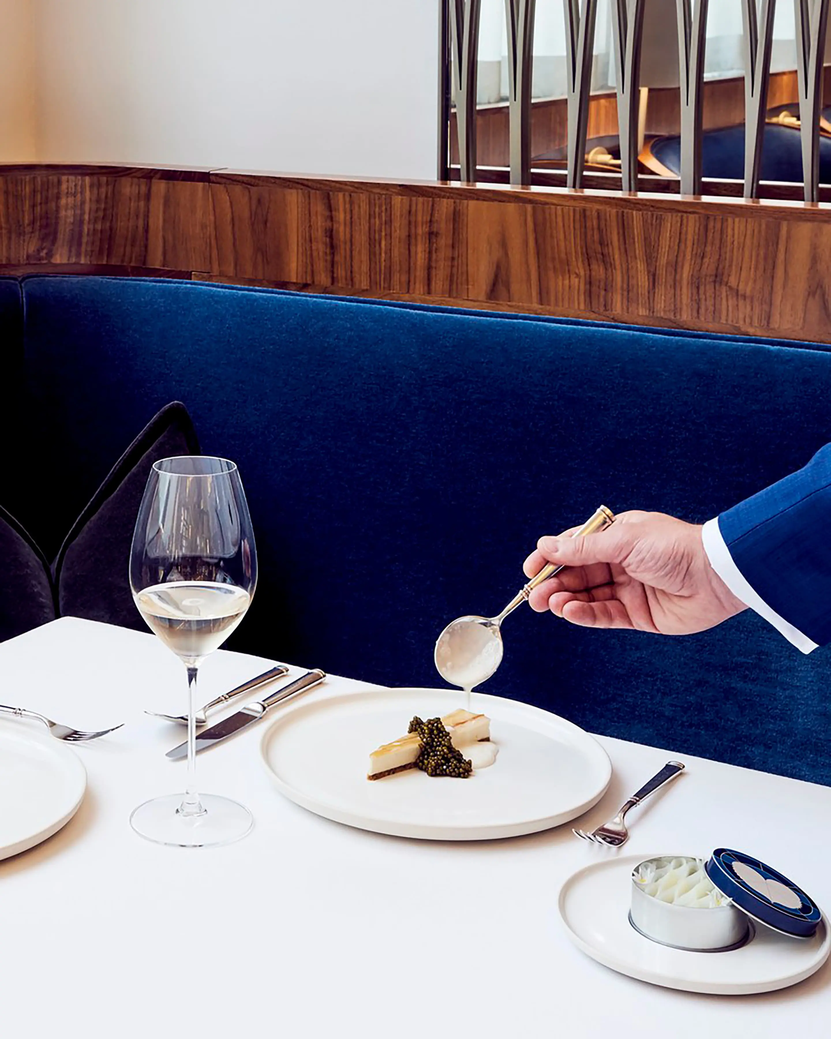
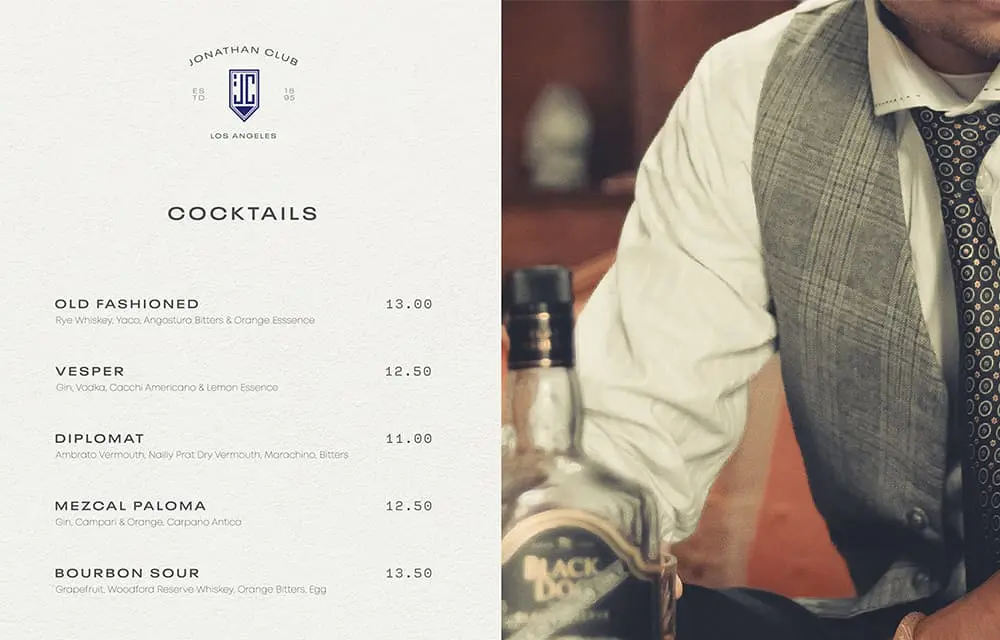
With Jonathan Club embracing “A life inspired,” our team turned their attention to the voice and messaging for the Club. We chose the voice words “confident and intelligent, engaged and lively, conversational and charming” to guide us and direct communications. Next, we struck a balance between the innovative Town Club with its rooftop kitchen garden, state-of-the-art fitness center and traditional luxe, with the fun, relaxed atmosphere and family-oriented fare at the Beach Club. Much of this could be accomplished with voice, as our messaging was created to intrigue and invite, be welcoming and showcase the Club’s personality with a sophisticated wit.
In all, we delivered a full verbal identity with guidelines that included sample applications and headlines, multiple narratives for various departments, and developed messaging for staff. Messaging covered renovations, innovations and offerings for food and beverage, events and catering, athletics and wellness, staffing and recruitment. Our team developed communications largely intended to drive discovery, exploration, trial and experiences—inviting everyone to enjoy every element of both Town and Beach to the full.
Our Voice Is
- Confident and intelligent
- Engaged and lively
- Conversational and charming
Surprise Yourself With Your Daring.
It’s time to step out of your comfort zone. It’s time to challenge your tastebuds. With over 1,000 wines on hand and a rooftop garden that provides the freshest ingredients to our floor, there is more reason than ever to try something new and never before. Delight in the recommends of our sommelier and mixologist. We're inspired every day to bring you spectacular.
Legendary
Never
Gets Old

This is Life at a
Landmark.
people come to be inspired

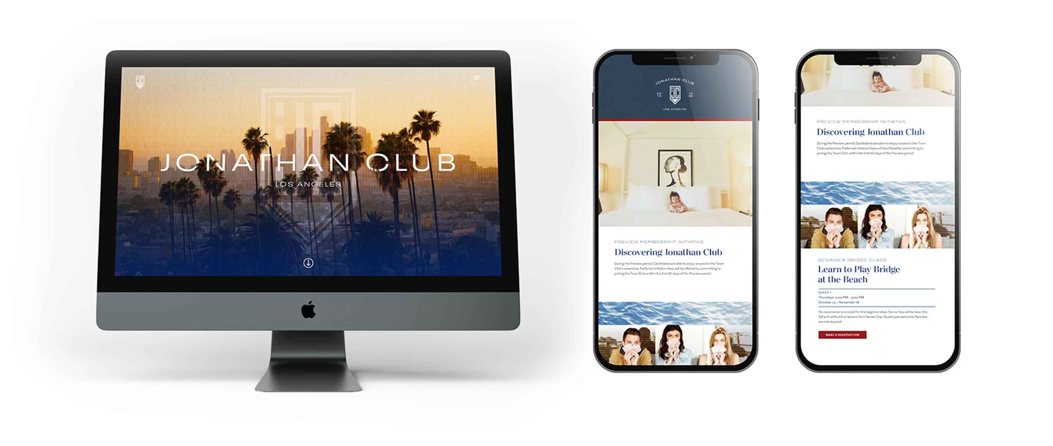
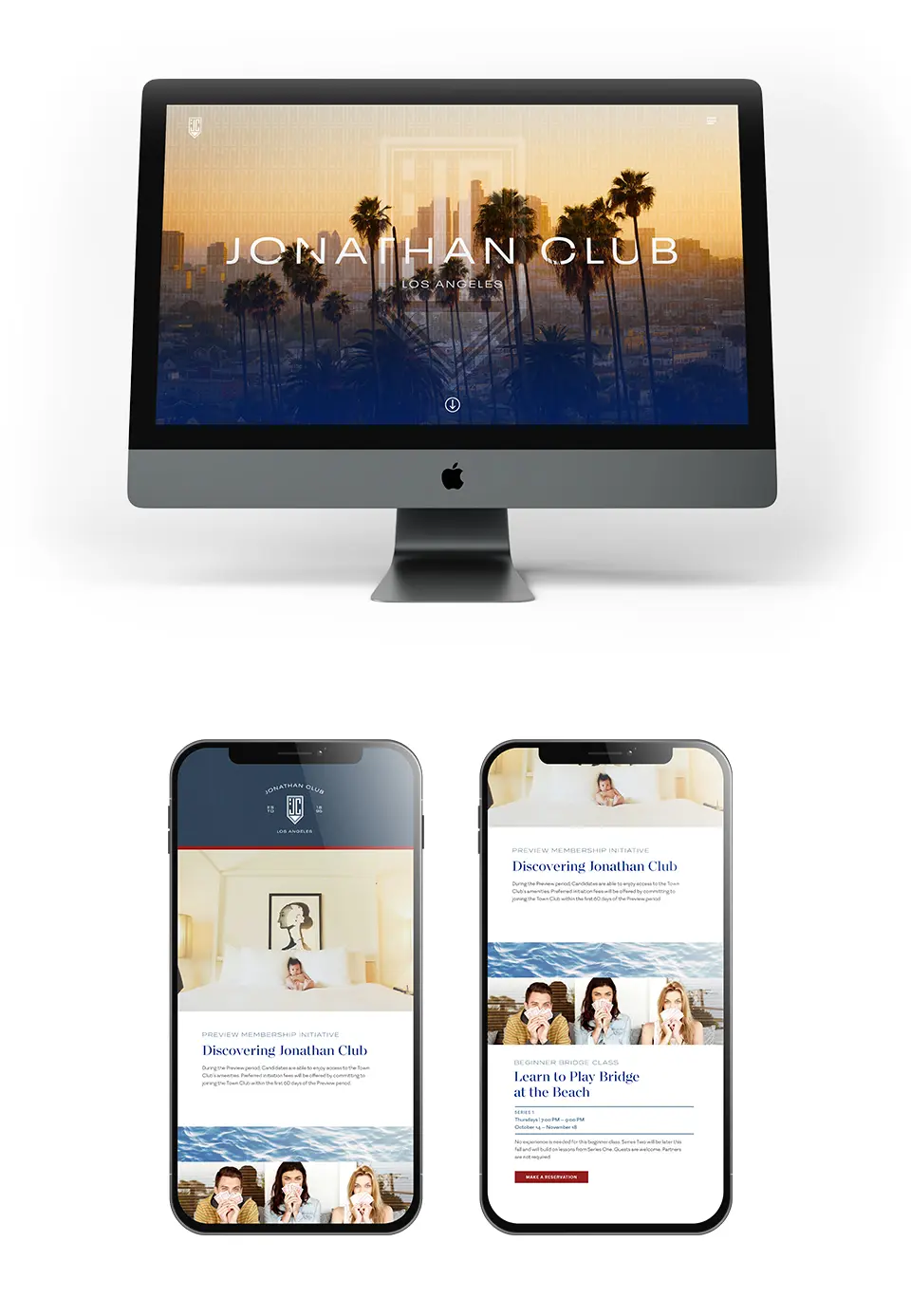
Visual Identity
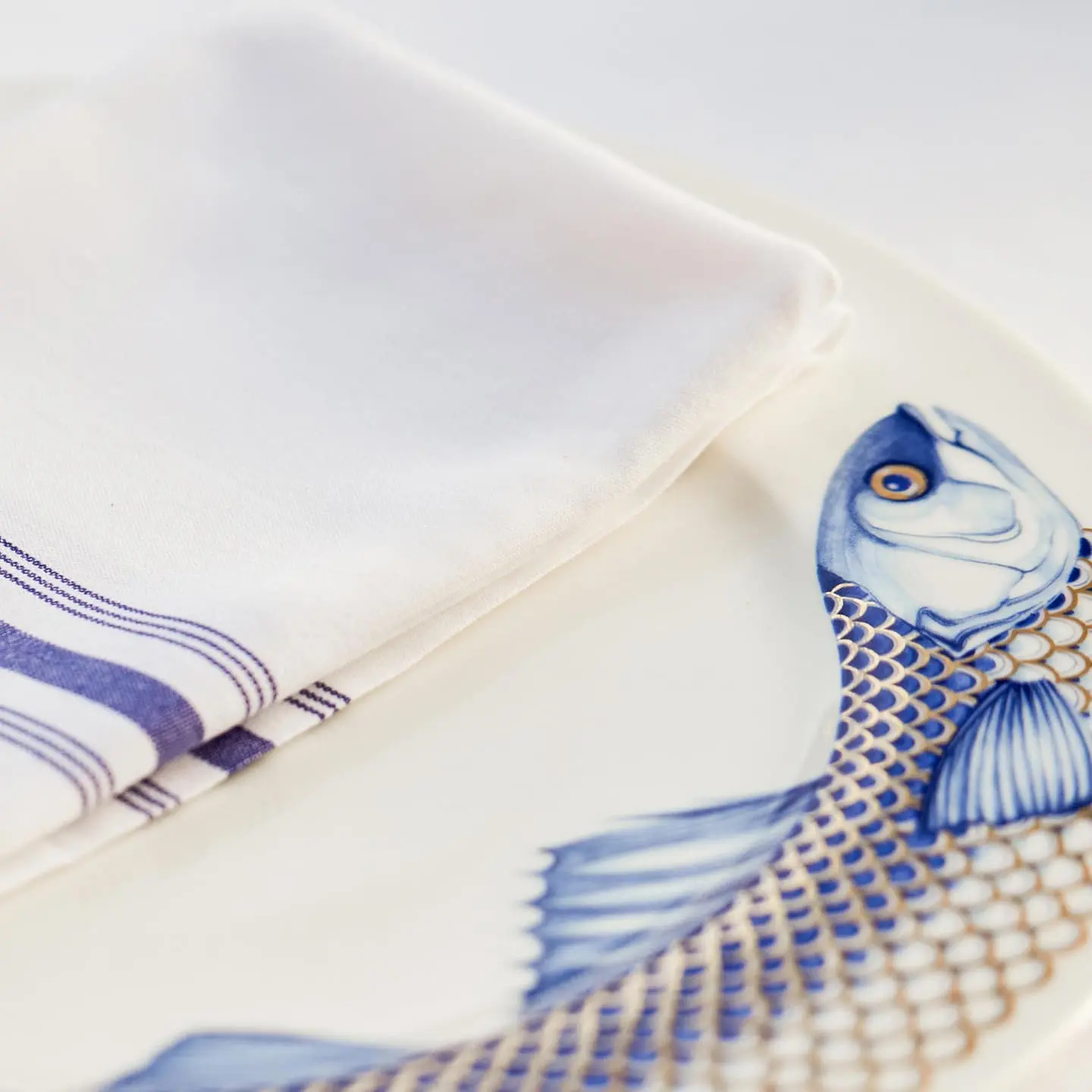
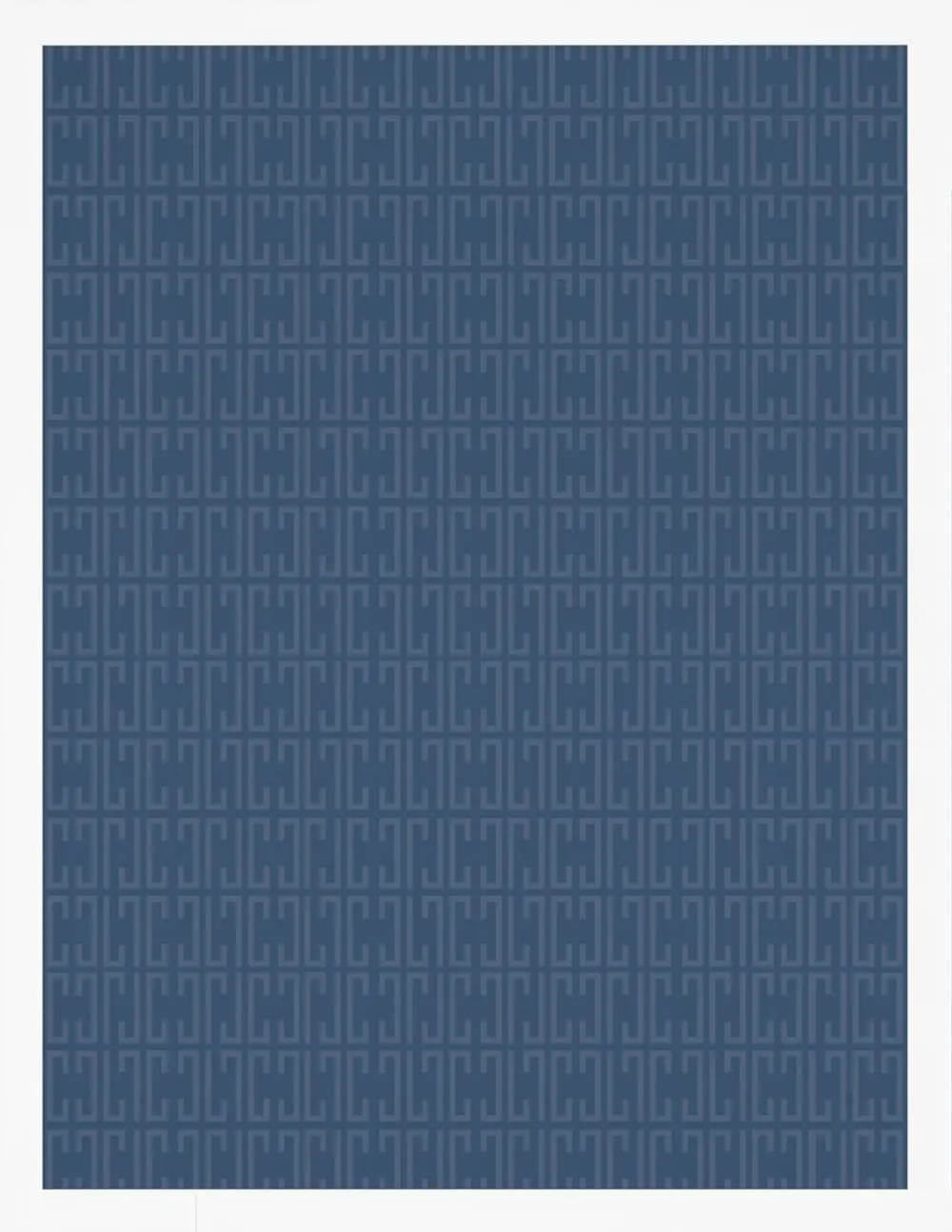
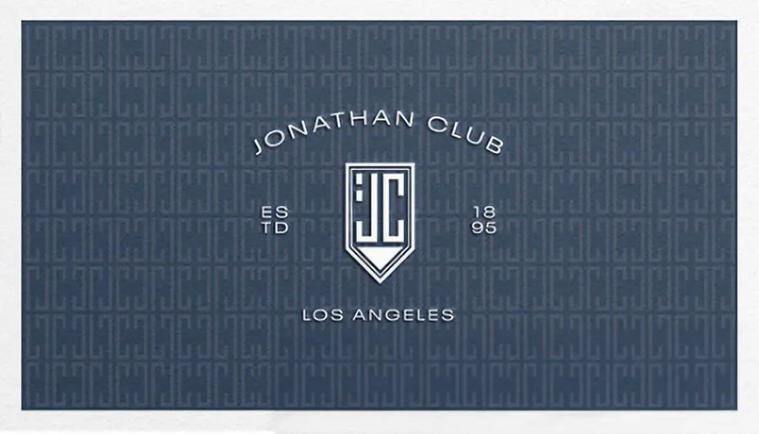
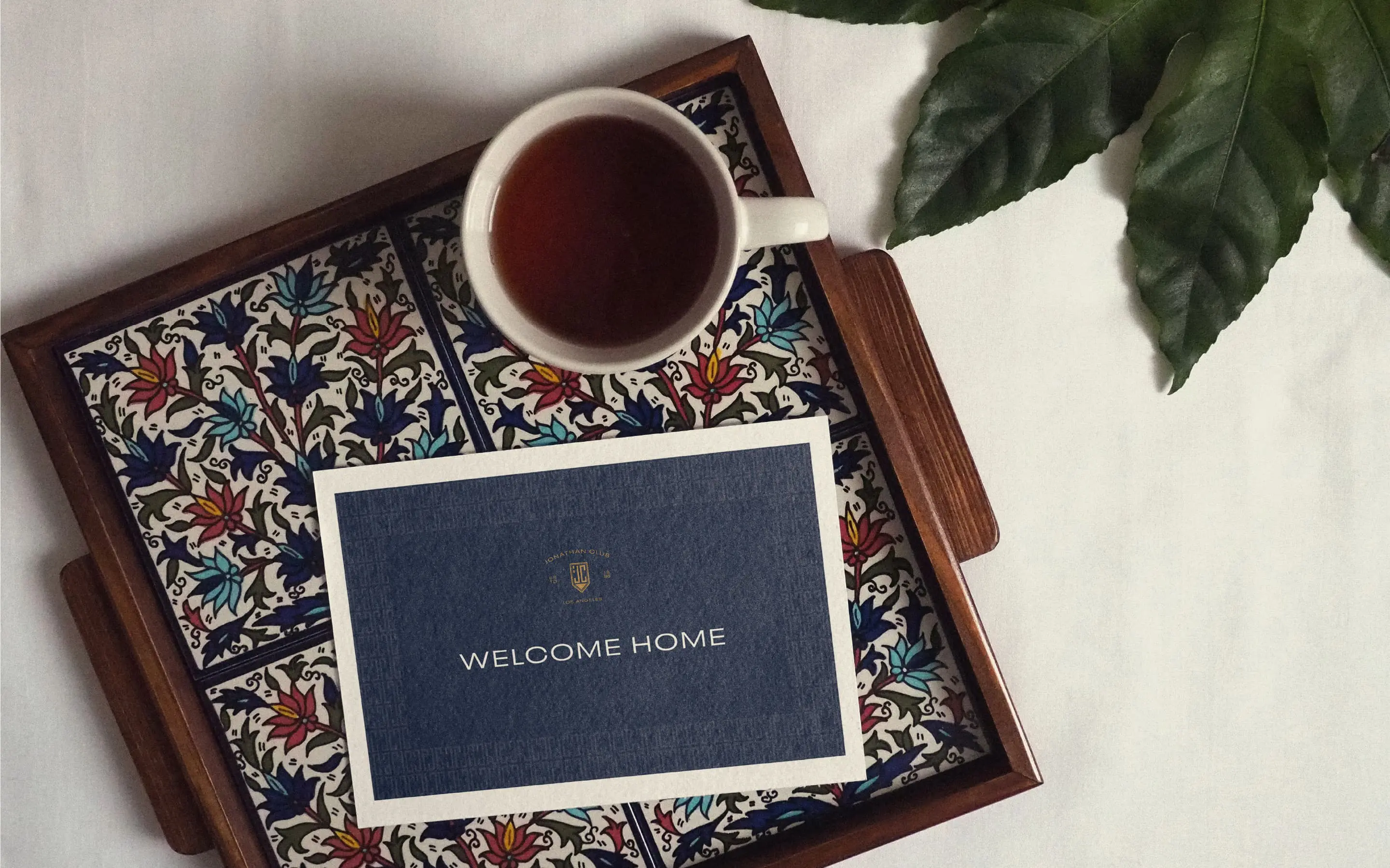
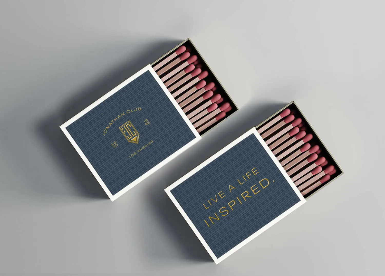
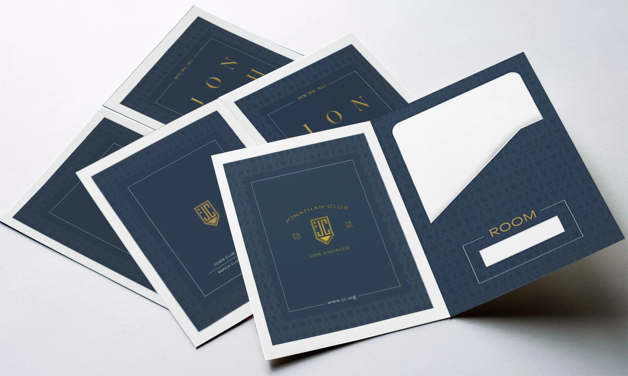
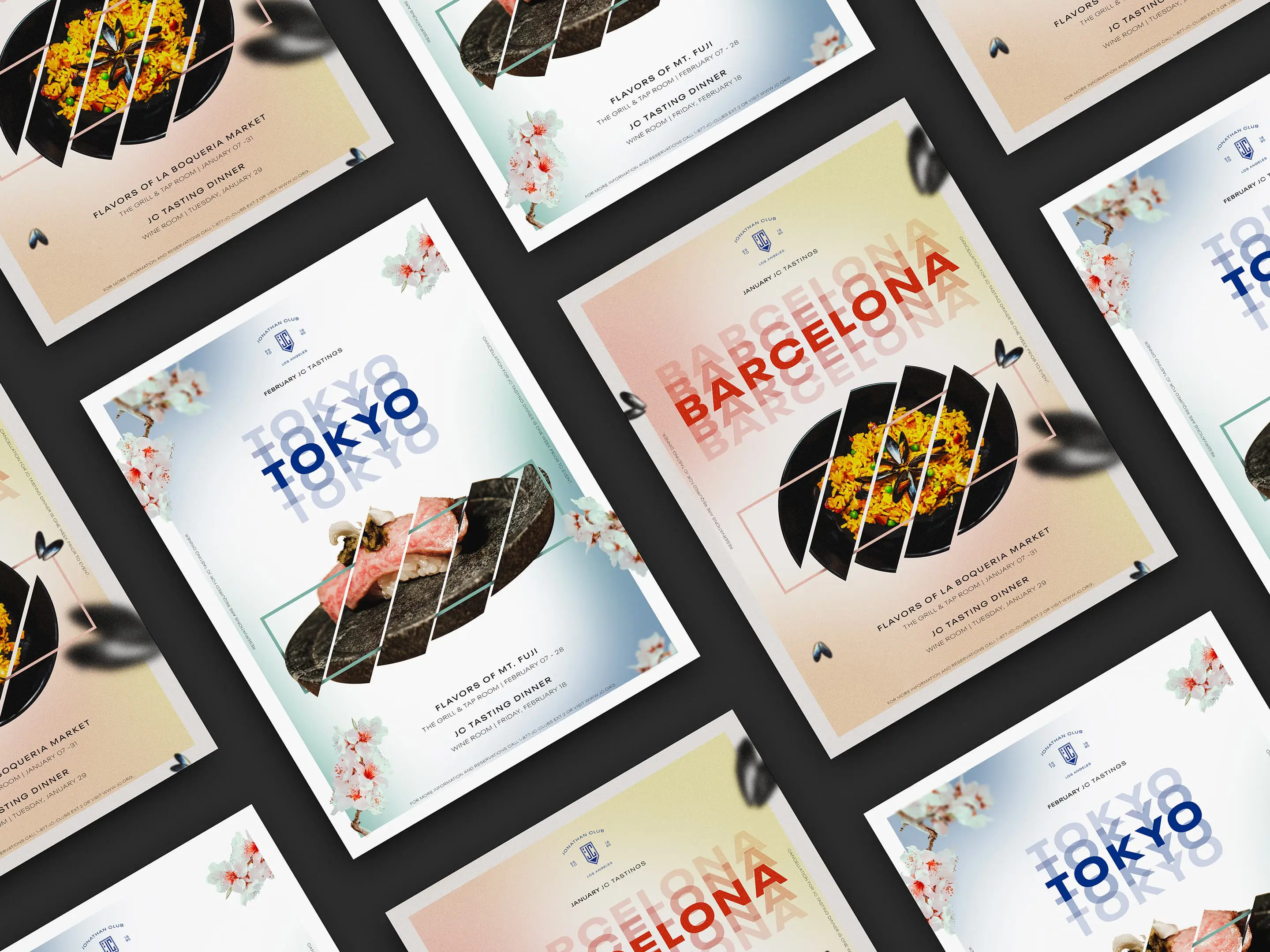
The visual identity is classic but clever. There are a lot of classic, formal design elements: rules, borders, engravings. The blue color and the shield signal a classic brand, but there is a clever vitality that makes it more modern. The reverberating wordmark, unusual imagery angles and cropping, and asymmetrical layouts give the brand energy. Imagery is also a big part of the storytelling. Again, to add interest, our team used unique or unusual perspectives and cropping to set the tone. Color, signifying leadership, trust, tradition, and longevity, was used with pops of bright, lively color.
For the bigger picture, contemporary, asymmetrical layouts were paired with traditional elements like engraved illustrations to create an unexpected mix. Meanwhile, the typography is an elegant, high-contrast serif combined with a contemporary, wide sans-serif. Our team found juxtaposing a classical and timeless look with elements that were modern and clever created the standout identity that Jonathan Club was looking for.


Summary
Working with Jonathan Club on this beautiful project was extremely rewarding for the team. A chance to engage all aspects of design to create an impactful, modern identity (with respect for tradition) full of aspiration for A Life Inspired. Two Clubs were successfully merged into one, feeling of the same ilk even if the vibe they generated was very different—two places of distinction versus two different places. Similarly, our team created messaging that was equally cohesive with the creation of a voice that could run through all communications, reinforcing the identity. BasedOn brought an infusion of energy to the club through the look and feel with new lifestyle photography and bold graphics guidelines as well as a voice that is somewhat playful, with headline quips that are sophisticated and clever.
Jonathan Club.