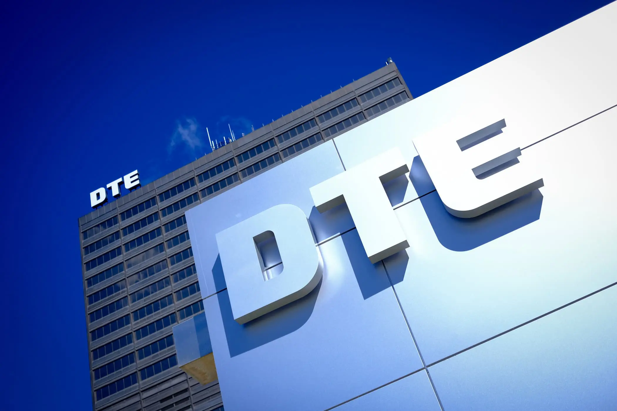
DTE
Michigan’s leading energy company looks to BasedOn for brand strategy and new identity.
When DTE Energy approached BasedOn to evolve their brand they knew they had a strong purpose and mission but also realized they had yet to fully establish their voice in the world. A 120+ year old company that had evolved beyond a utility company, DTE wanted to share how they evolved and the good they generate within the community they serve. Their aspiration is: “to be the best-operated and a force for growth and prosperity in our community.” Being heavily invested through philanthropy already, now it was time to communicate their purpose through a strong brand and reposition DTE for a future of impact and meaning.
“People know we are a good company, but they have no sense of what we stand for.”
Strategy
During the discovery phase, we uncovered that the core essence of the DTE brand was diluted. With multiple divisions all sending their own messaging out into the world, the main identity was weakened by sub-brands. We recommended turning this “house of brands” into a “branded house”; leadership agreed, setting the stage for us to embark on a series of interviews, exercises and workshops to uncover the soul of the brand.
We designed and facilitated a series of workshops, working with leadership to uncover the core attributes and unique truths that motivate an entire company. DTE leadership worked through various archetypal expressions to inform the brand concept and brand strategic framework. We uncovered that DTE is a strong leader who cares about success and prosperity—not only for themselves but for all the communities it serves. At the company’s core is a strong sense of responsibility for the millions of customers who rely on it as well as its large network of employees all over the state, truly embracing “A Force for Good.”
Next, we set about simplifying the brand through its architecture. With a complex hierarchy of dozens of products and services, we advised that everything going forward must be clearly related to the master brand. Leadership agreed with our approach and recommendations, positioning us to develop a “master brand” strategy that could cascade up and down from the brand to customers and internal audiences.
Pillars
To Lead, Serve And Transform With Our Energy
DTE Architecture
First we simplified the name of the master brand [DTE Energy] by eliminating the word "Energy." This allowed for a cleaner structure that could work more easily with the sub brands. Then we simplified the sub brands to keep messaging consistent with the attributes of the master brand. In this way, as new platforms were conceived and named, they were branded with DTE immediately. We had moved them from being product driven to being platform driven. It was clearer to the customer, clearer internally and helped their media buys and messaging have more impact through the repetition of the shared brand and sub-brand ideas. Everything became instantly cohesive.
Brand Architecture
Simplification helped their messaging have more impact through the repetition of the shared brand and sub-brand ideas. everything became instantly cohesive.
Visual + Visual Identity
abcdef
123456
Before
After
Visual Identity
With an inspiring brand idea at its core and a strong need for simplified brand connections, our BasedOn design team set to work evolving the DTE brandmark and visual identity elements. By simplifying the artwork, removing the word “Energy” and refining the letterforms, the logo became easily adaptable to both physical and digital environments. The result is a forward-looking and strong brandmark.
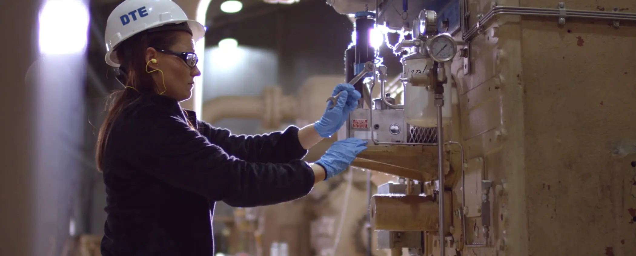
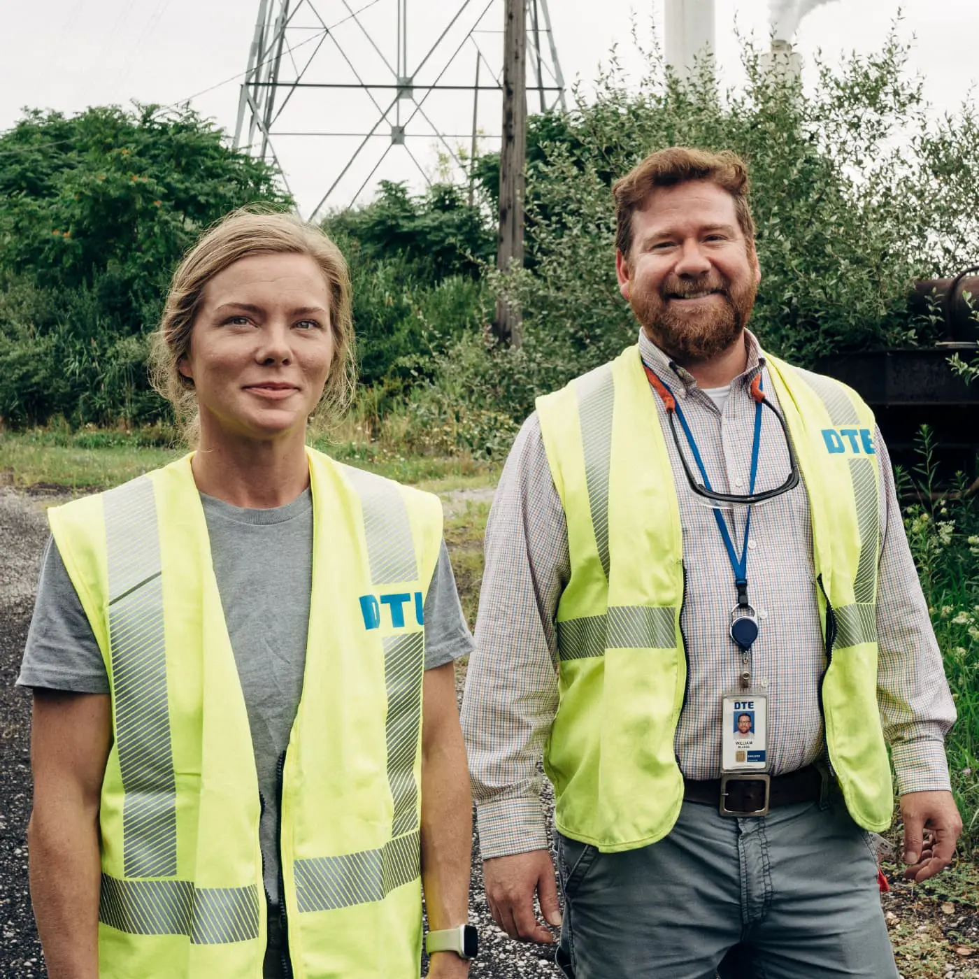
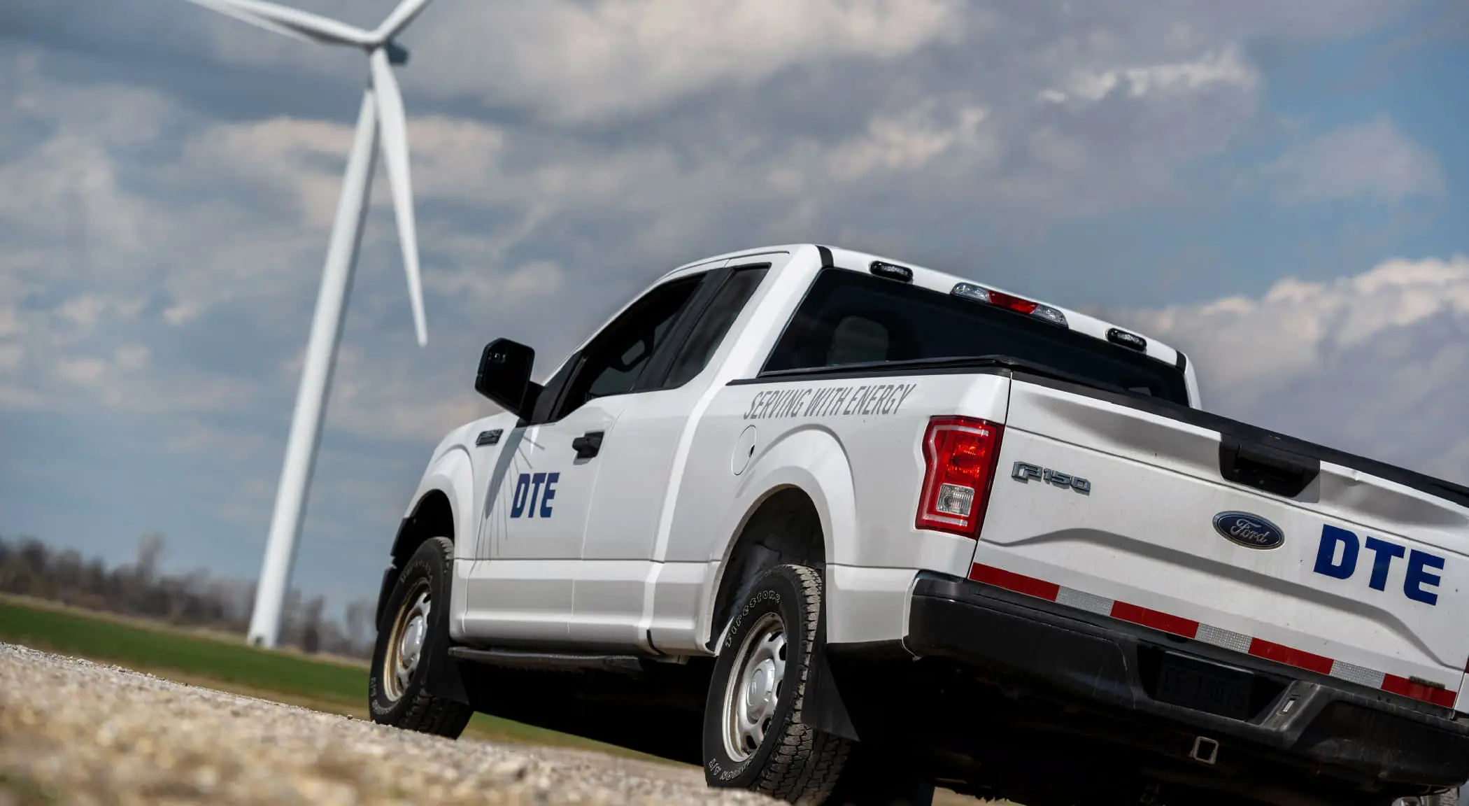
BasedOn also developed a visual language of graphic elements capturing the idea of energy. Lines radiating outward symbolically power people and things, reinforcing the pillar “transforming with energy.” The DTE font projects strength and the blue of the palette is a well established color for leadership. Our studio also guided DTE with ideas for photography with images rooted in real life—warm, accessible and representing diversity well. Taken together, the DTE visual identity is a system that is able to capture humanity in stories that resonate, act as a framework for big ideas, project a clean future in inspiring ways and always position DTE as a caring leader.
Verbal Identity
DTE lacked a central, unified voice and tone. This inconsistency in voice led to a multitude of campaigns, programs and groups that each developed their own recognition, while draining the brand equity from DTE itself. Their two main audiences are customers who expect DTE to provide their families with life's essentials today and those expect them to protect their communities and the environment for future generations. Keeping these audiences in mind, we tailored messaging for each, all under the umbrella of the brand idea and aligned with the strategic brand framework.
We developed everyday language to help the company and their communities connect. Through approachable language, we helped transform a faceless utility company into an energy company that cared. Leveraging the brand attributes of “vision, strength, connection, radiance and service,” our messaging built a story of new frontiers for energy and shone a spotlight on the people behind our products. In this way, everyone could feel a part of the DTE journey.

Summary
What began as a rebranding project evolved into a brand architecture assignment, creating platforms, naming new products and services, continuing to streamline their offerings and make them more relatable to the public. Together, we forayed into messages for health and wellness, clean energy and renewables, across videos, posters, newsletters, events and more. We had provided a fresh perspective from which to view their large and somewhat complex product offering and were inspired to position them in the right light. Since our relationship began in 2017, we continue to work with this innovative company that cares about its people and the residential and business customers it serves.