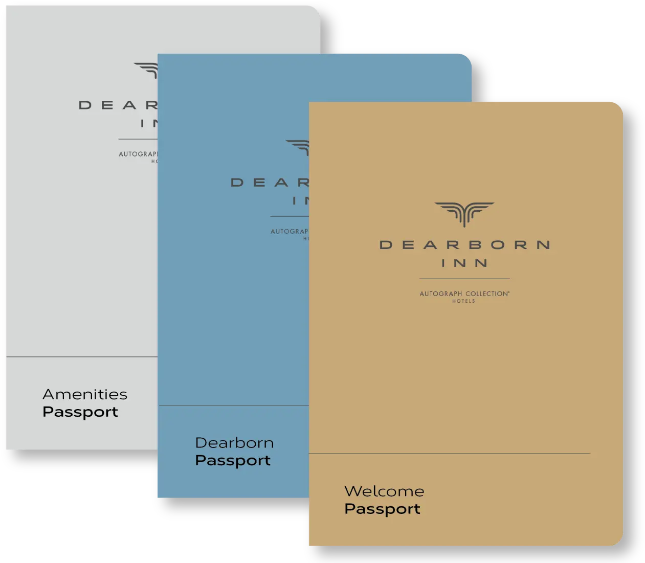
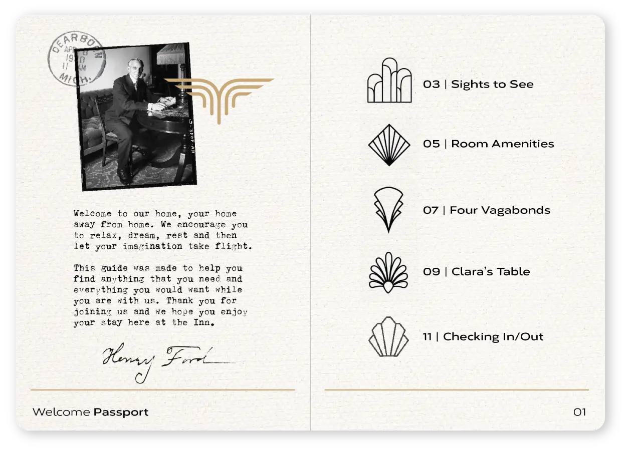
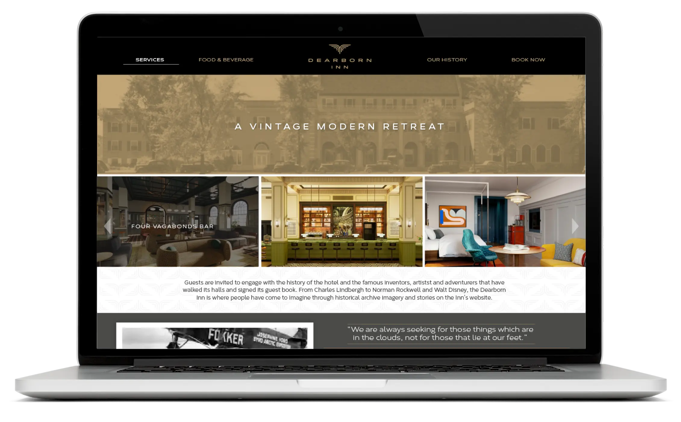
Dearborn Inn
Rebranding Dearborn Inn: Honoring History, Elevating Experience
A Historic Flight Reimagined
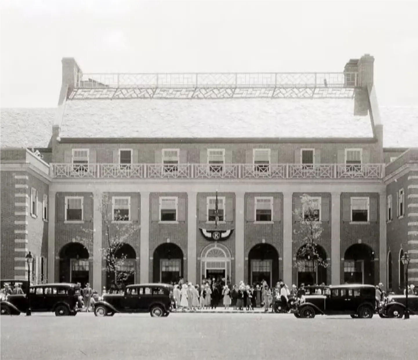
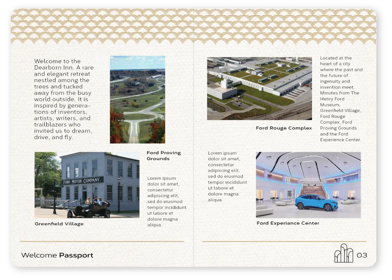
Built by Henry Ford in 1931, The Dearborn Inn was among the nation’s first airport hotels—a visionary blend of innovation and hospitality. Deeply tied to the legacy of Ford and the Dearborn community, the hotel is both a cultural landmark and a symbol of forward thinking.
As Ford Motor Company and Marriott set out to modernize this storied property, they aimed to preserve its historic charm while elevating the guest experience for a new era. With a leading interior design team, BasedOn was brought on to lead the rebranding. Our role was to reimagine the brand through the lens of Henry Ford’s deep fascination with early aviation. From brand storytelling to naming and design for the hotel’s signature dining concepts—The Four Vagabonds and Clara’s Table—we helped shape a hospitality experience rooted in history, innovation and a sense of place.
The Dearborn Inn reopened in the spring of 2025, ready to welcome the next generation of travelers.
“We are always seeking for those things which are in the clouds, not for those that lie at our feet.” Henry Ford
Strategy
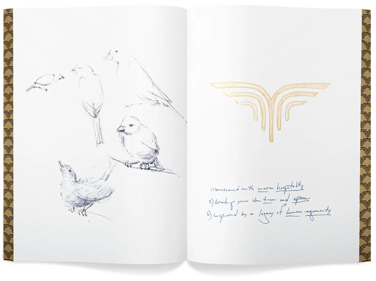
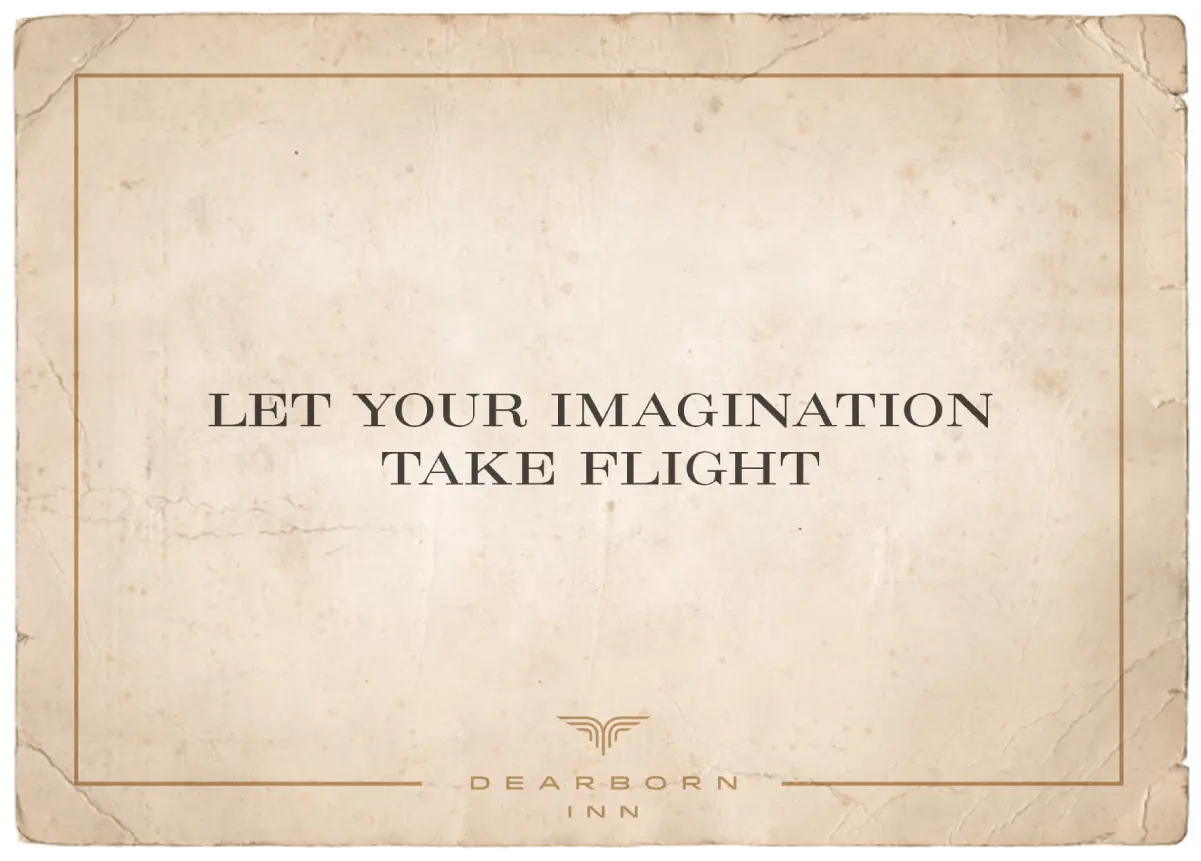
In reimagining the brand for this historic hotel, the BasedOn team embarked on a journey of discovery—unearthing stories, insights, and connections that would shape its future. Through archival research, conversations with the community and staff, and in-depth discussions with Ford’s Global Design Team, company leadership, and members of the Ford family, a powerful theme emerged. Henry Ford’s inventive spirit and fascination with aviation weren’t just relics of the past: they were part of a living legacy. That same drive for innovation continues to define Ford’s culture today, inspiring a brand story that invites guests to let their imaginations take flight.
Let Your Imagination Take Flight
Verbal Identity
The Dearborn Inn has always had a story to tell. Our task was to give it a voice. A voice shaped by nearly a century of travelers, dreamers, and conversations in quiet corners. A tone rooted in elegance and warmth, clarity and care—guiding how the Inn speaks, welcomes and responds. We developed language to carry its legacy forward: key phrases to support the guest experience, principles to protect its personality, and verbal cues that signal who they are without ever having to say so. Because words, like places, make lasting impressions.
Narrative
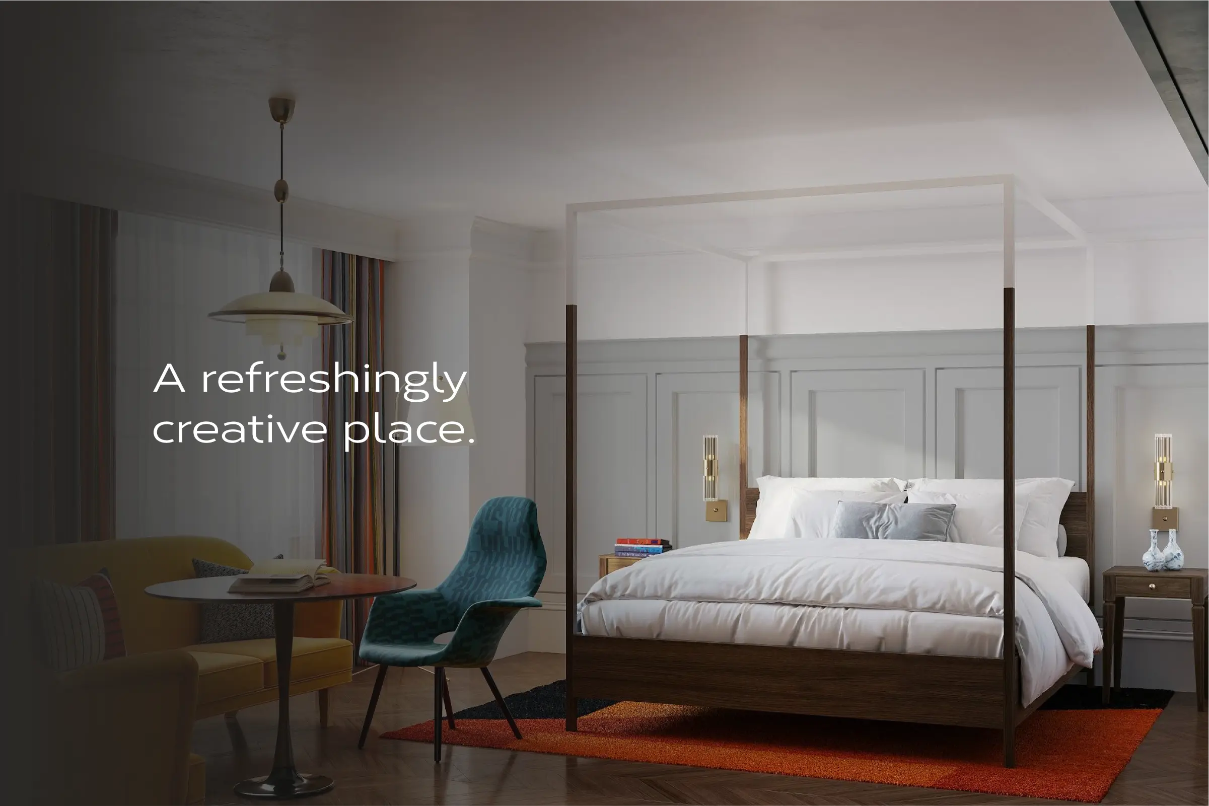
Welcome to Dearborn Inn. An unexpected retreat tucked away from the busy world outside.
This is where the warm hospitality of the past merges with modern amenities thoughtfully designed to give you the space to let down your guard, let in fresh ideas and feel stirred to start something new.
It is inspired by some of America’s greatest inventors, artists, writers and trailblazers, from Babe Ruth and Henry Ford to Walt Disney and Bette Davis, who stayed here. People who invited us to dream, drive and fly.
In this storied place, you can taste something fresh and imaginative from the garden. Mix it up with an artfully crafted cocktail. Roam the grounds that surround and soak up the sun. This is the place to enjoy downtime, quiet time, real time or dreamtime. So, set your mind on autopilot and let your imagination take flight.
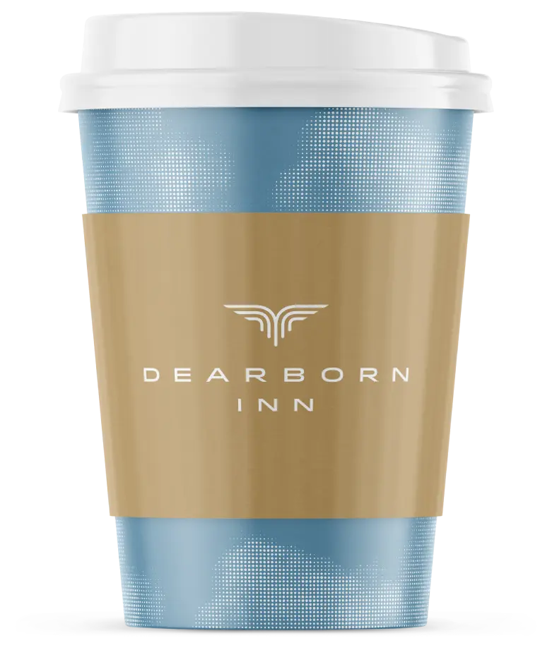
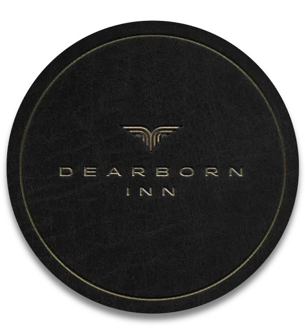
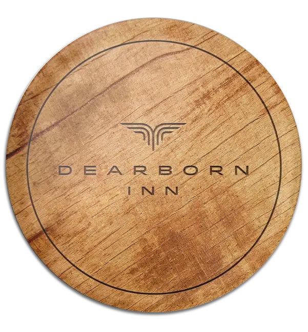
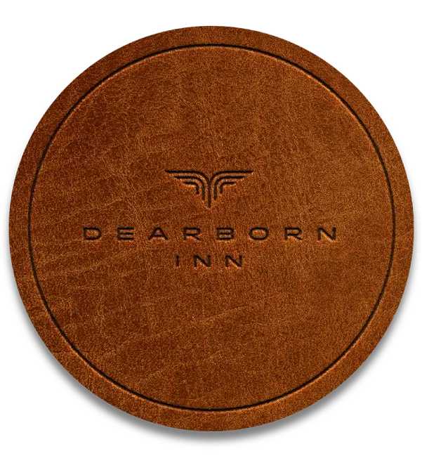
Visual Identity
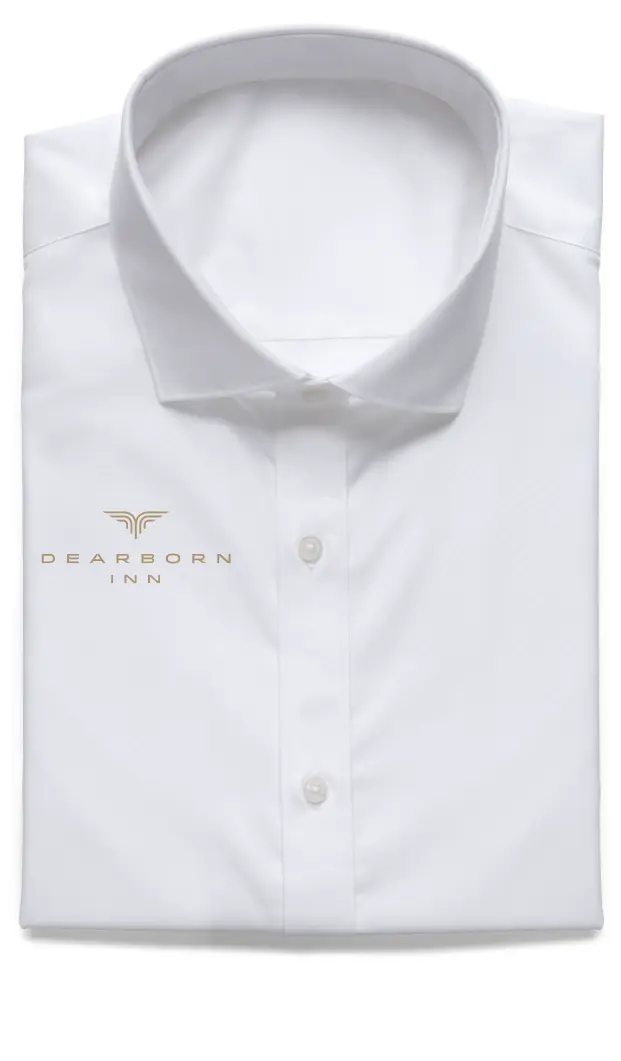
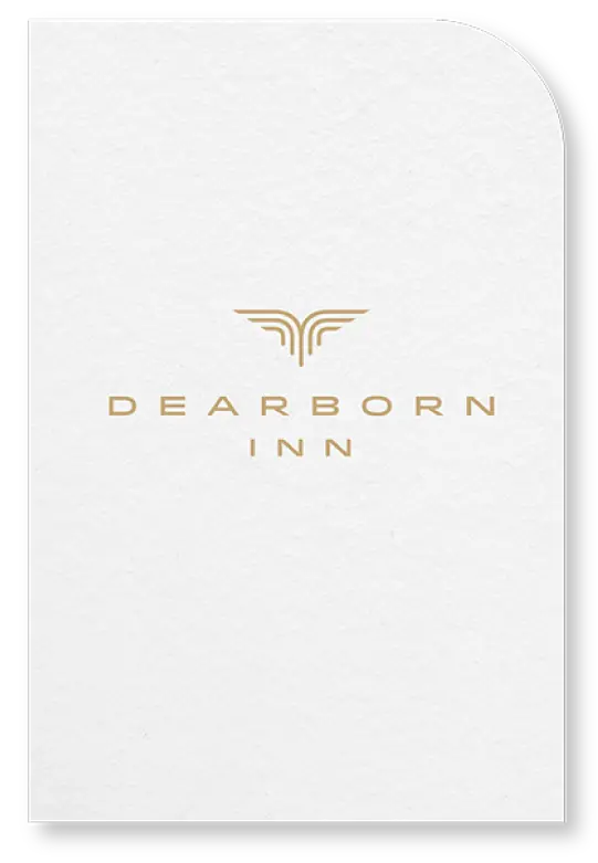
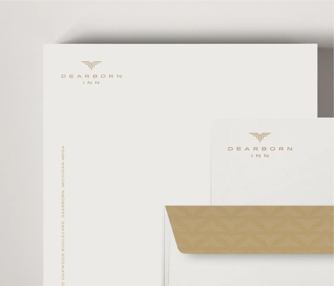
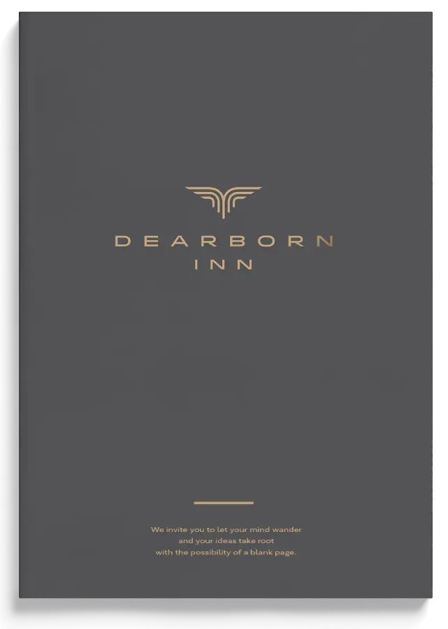
The Brandmark
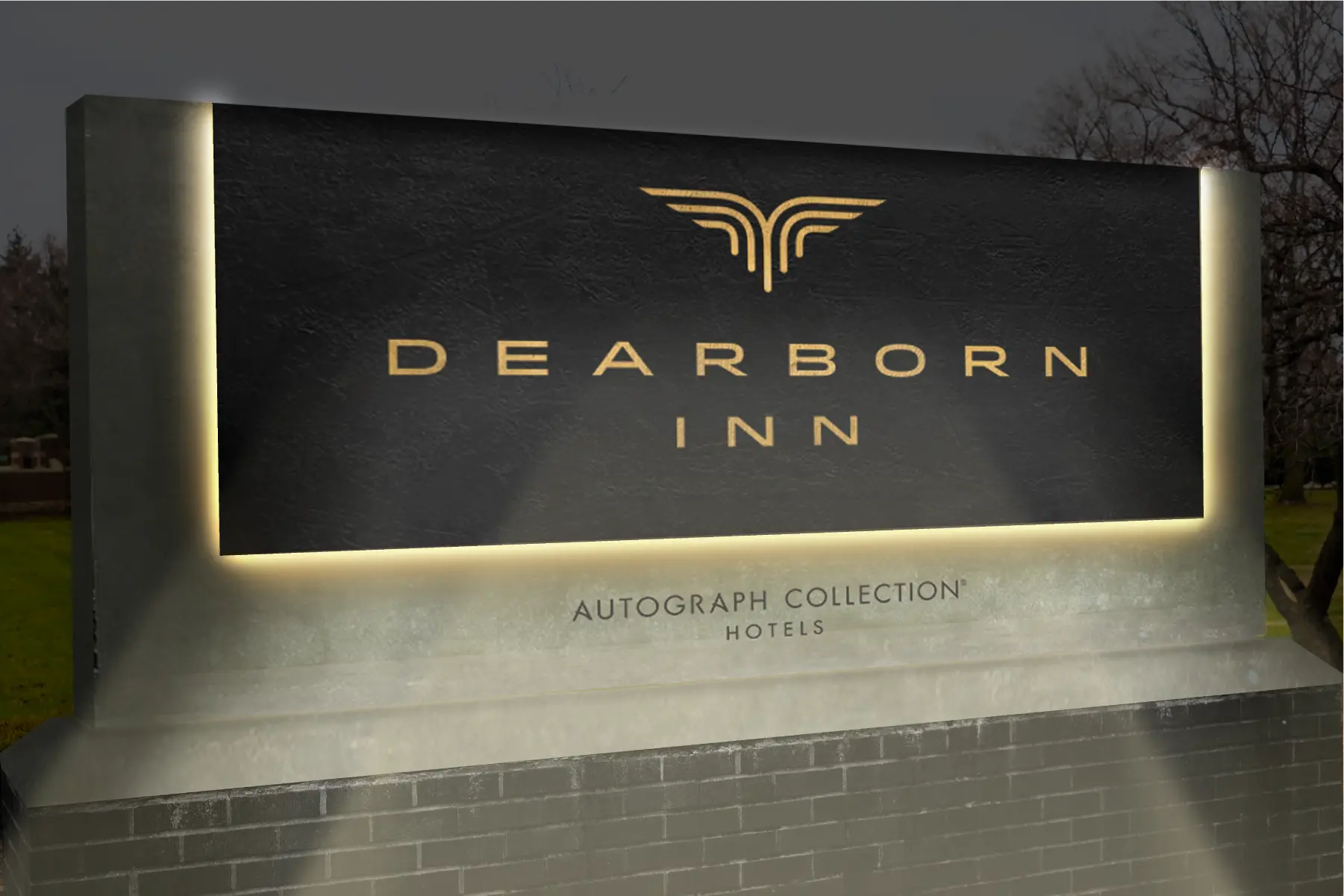
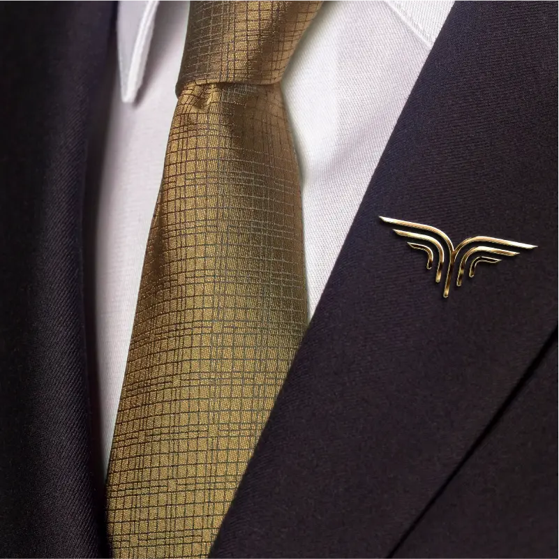
Inspired by Dearborn Inn’s storied past and reimagined future, the visual identity marries precision with possibility. At its heart is the brandmark—a modern emblem that captures the spirit of flight, both literal and metaphorical.
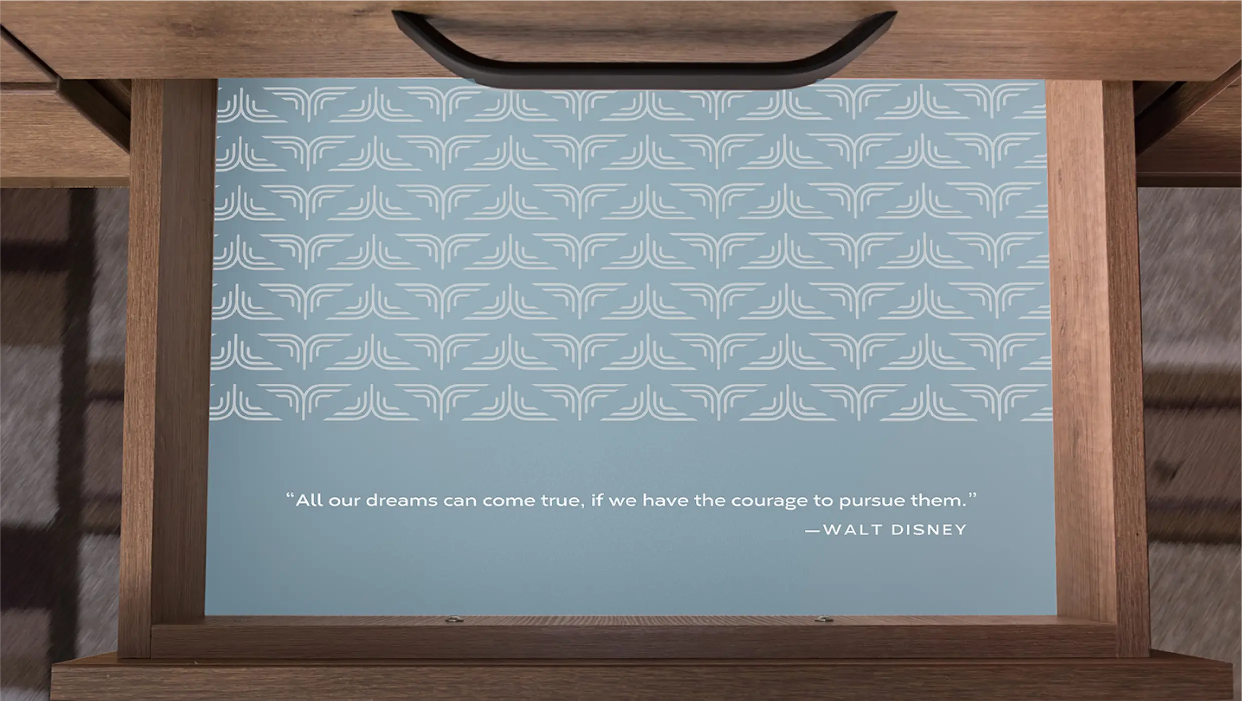
A nod to the Art Deco era in which the Inn was born, the icon features a symmetrical arrangement of concentric lines that curve upward into wings in motion. It evokes the flight of imagination, a symbol of departure and arrival, of new ideas taking off.
Anchoring the icon is a custom wordmark set in wide, geometric capitals—offering a grounded foundation from which the brand takes flight. Strong yet elegant, the typography reflects the balance of innovation and tradition that defines the Dearborn Inn today.
Before
After
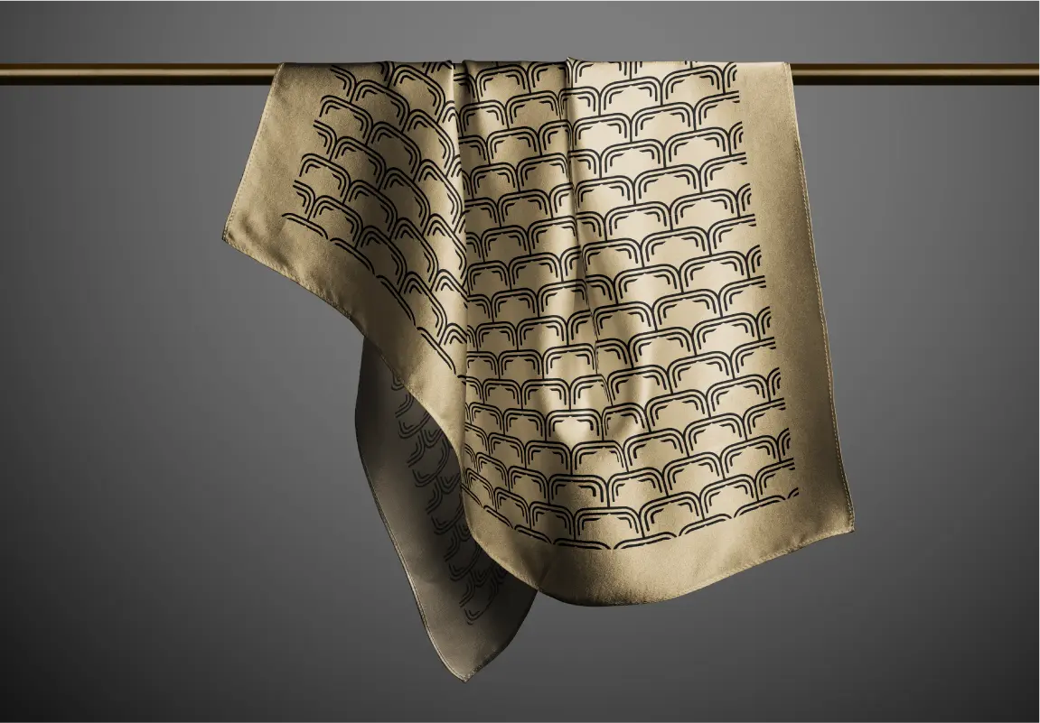
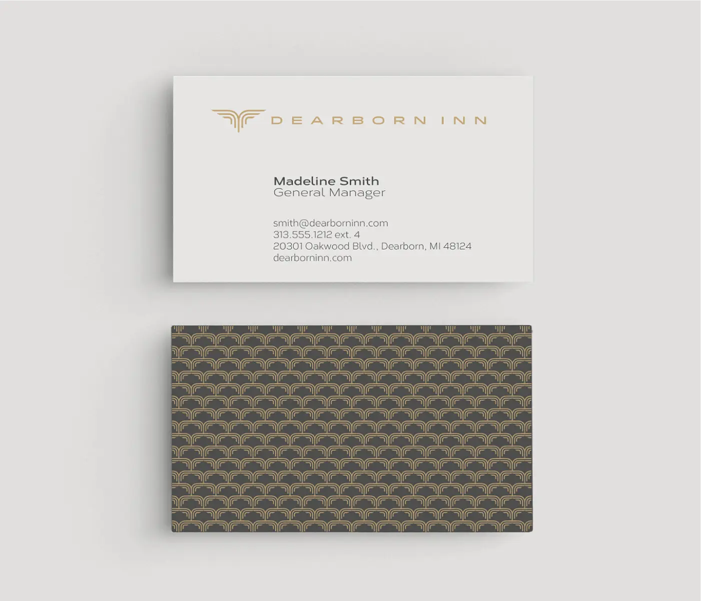
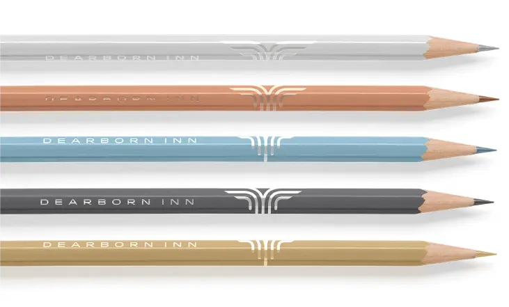
Color Suite
The color suite begins with a signature shade of brass—elegant, timeless, and quietly confident. Long associated with classic interiors and warm welcomes, brass becomes the grounding tone of the identity, evoking both excellence and approachability.
Supporting hues draw from a cooler, more tranquil palette: soft neutrals that nod to early morning skies. These tones provide a calming backdrop, allowing the Inn’s service, setting, and storytelling to take center stage.
Visual rhythm is introduced through a trio of custom patterns, each derived from the icon. Scaled, repeated, and reinterpreted, the patterns create a sense of elegant movement—like the quiet hum of an engine preparing for takeoff. Used across print, textiles, and interiors, they add texture and energy without overwhelming the space.


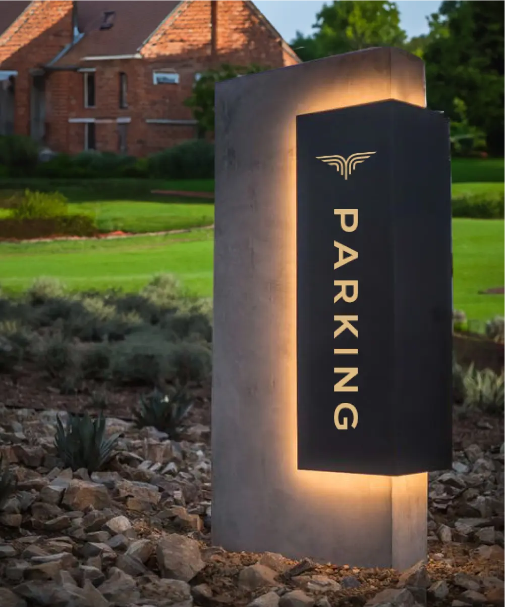
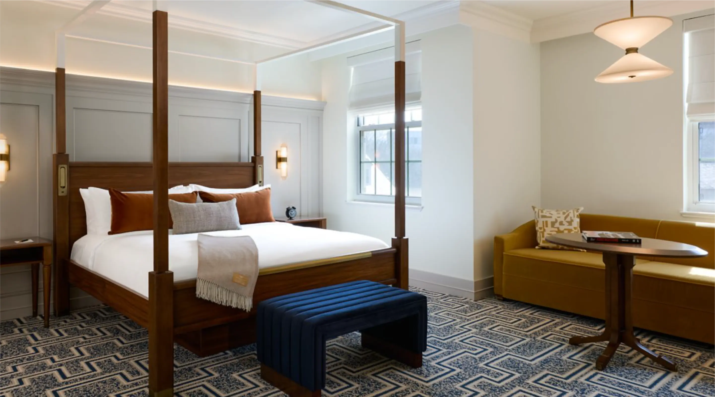
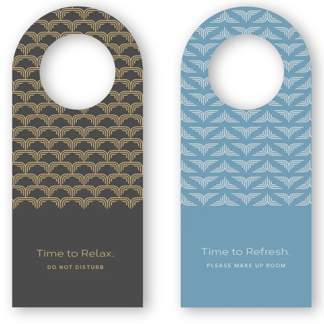
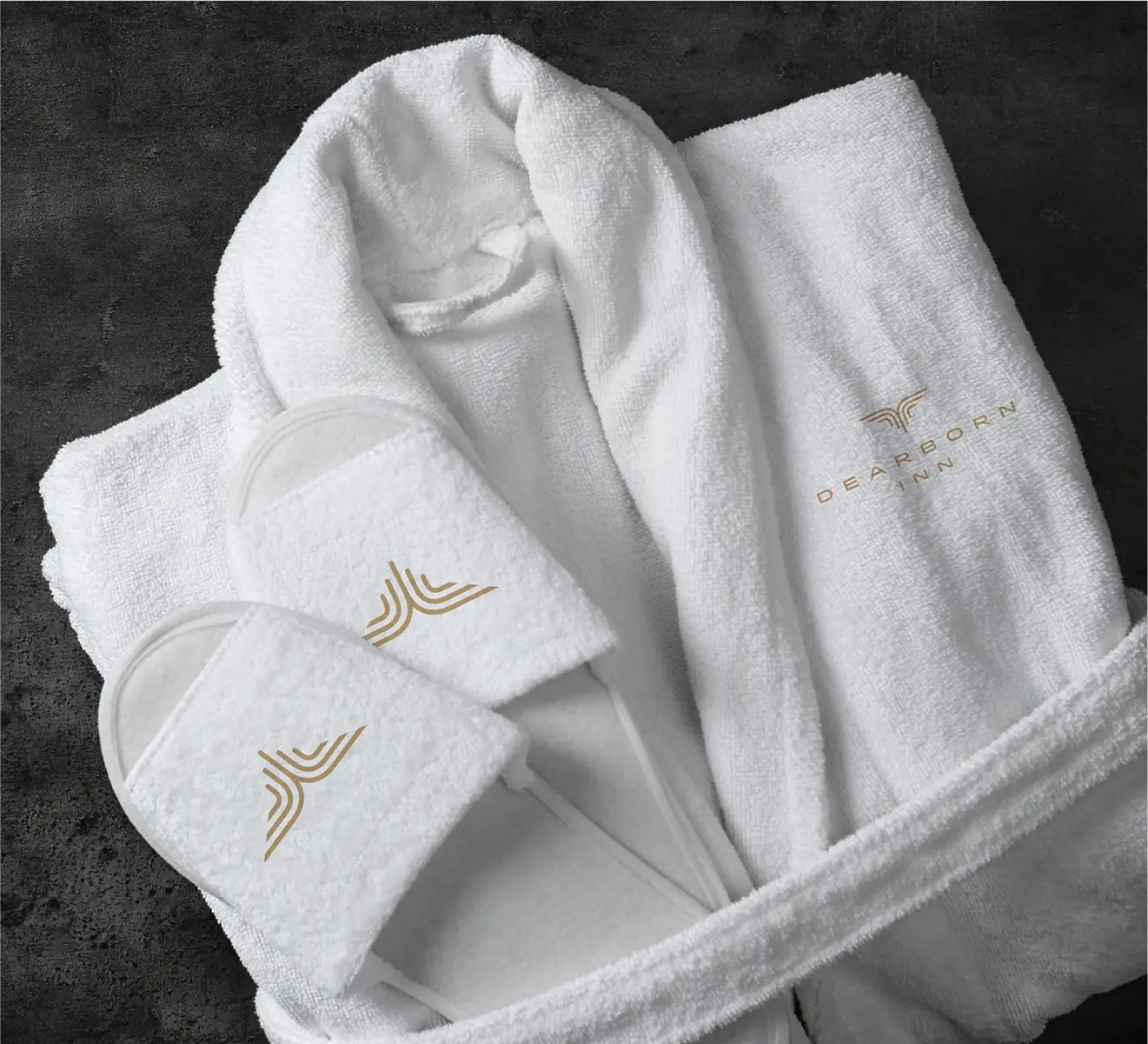
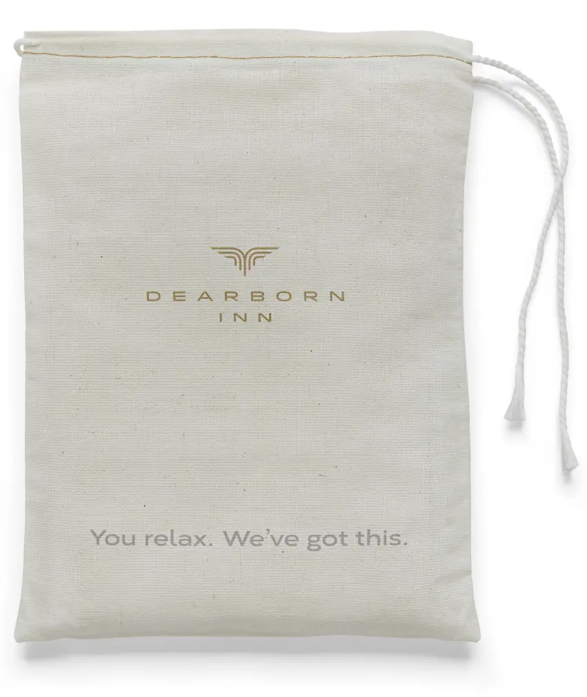
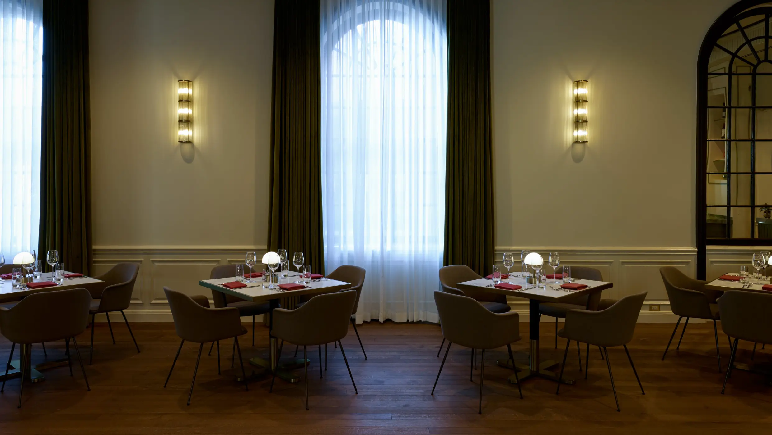
Hotel Experience Touchpoints
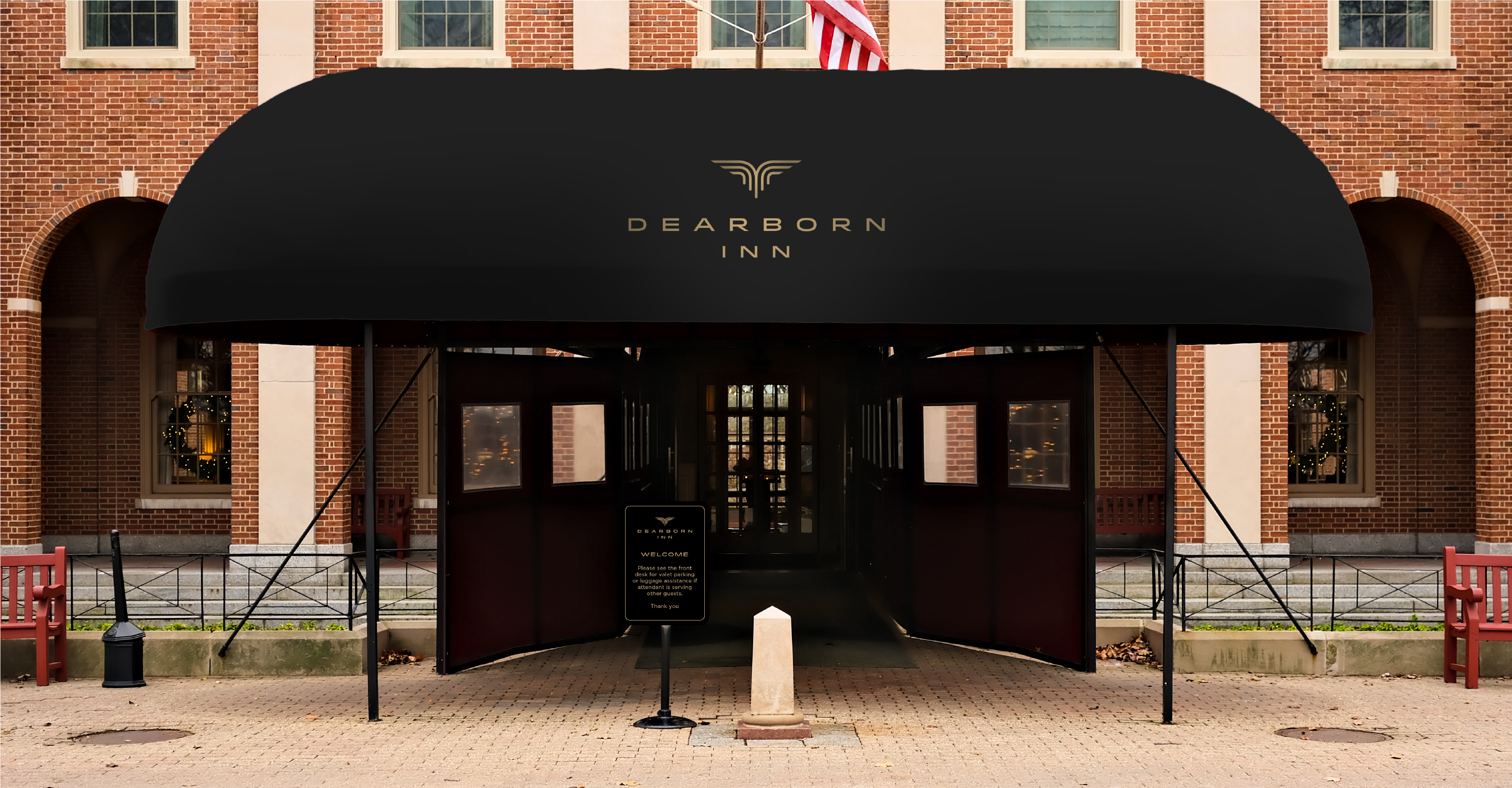
From the monument signage to the welcome mat beneath your feet, the Dearborn Inn greets guests with quiet elegance at every turn. The awning that extends from the porte-cochère offers a moment of pause—a graceful gesture of arrival.
Inside, thoughtful touchpoints reinforce a sense of place. From the uniforms of the guest service team to the keycard in your hand, each detail reflects the Inn’s renewed identity. Nothing shouts, but everything speaks. It’s the feeling of having landed exactly where you’re meant to be.

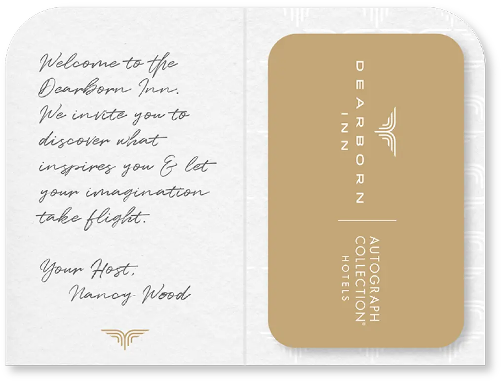


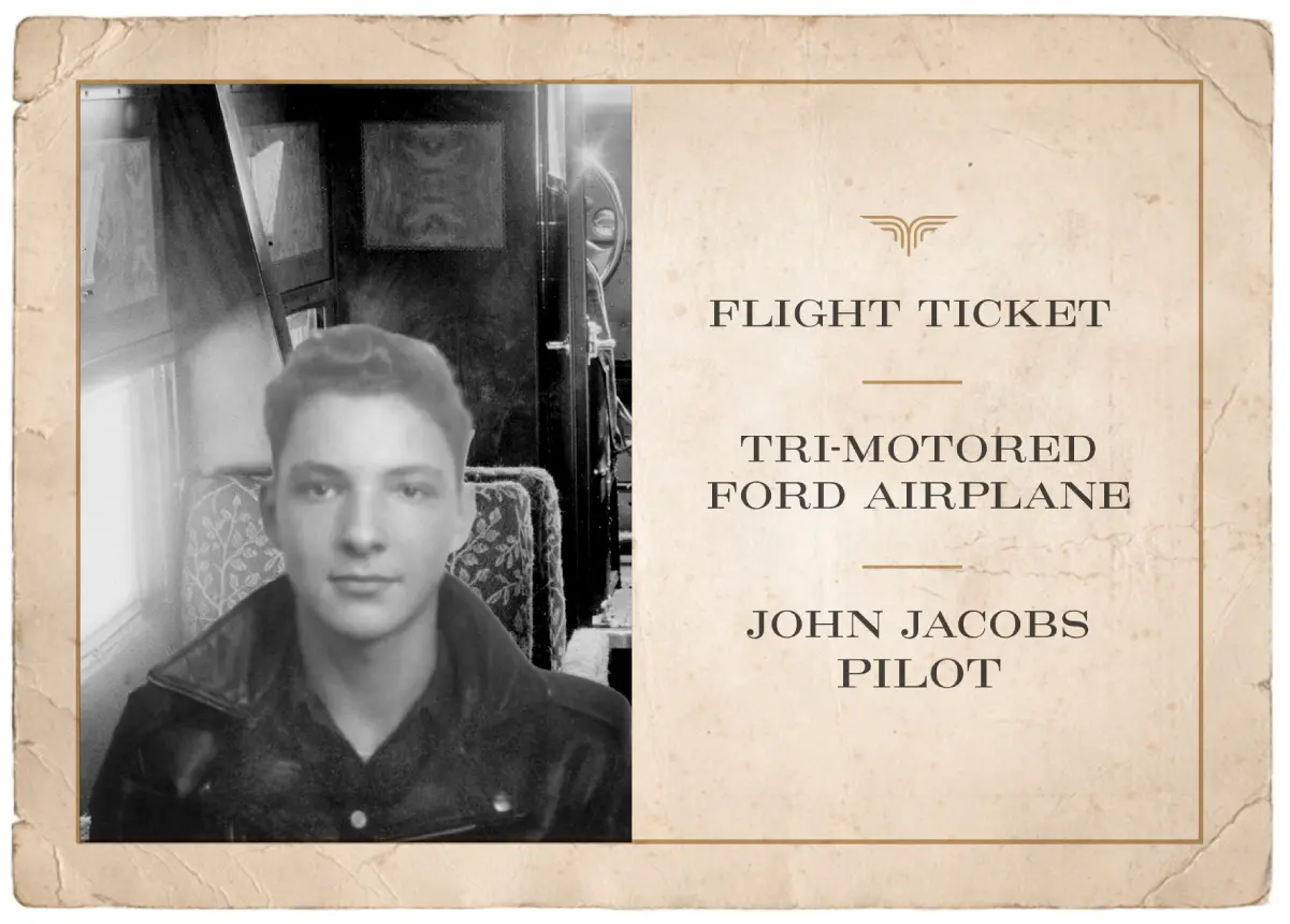
The Mark
Autograph Collection Hotels each have their own signature guest experience that is known internally as ‘The Mark’. The Dearborn Inn presents a unique experience of your "Flight Ticket" photo—a tangible reminder of a memorable experience, perfectly encapsulating the Inn’s ethos: “Let Your Imagination Take Flight”—making it Exactly Like Nothing Else.

Food and Beverage Concepts
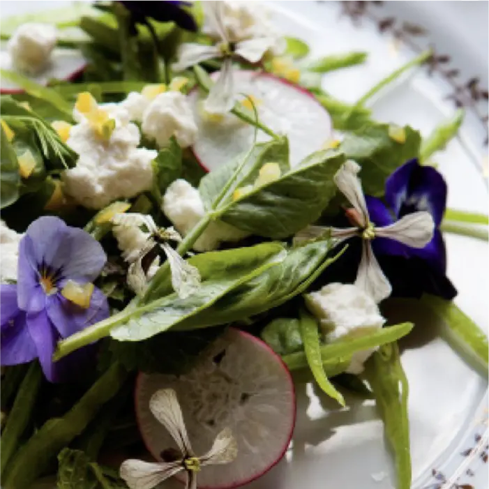
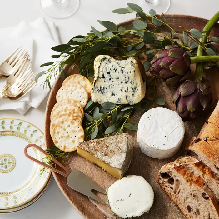
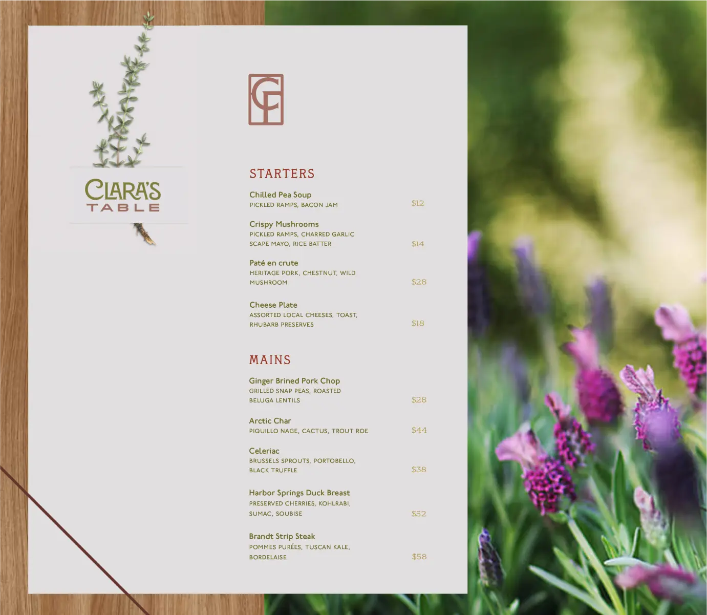
Clara’s Table
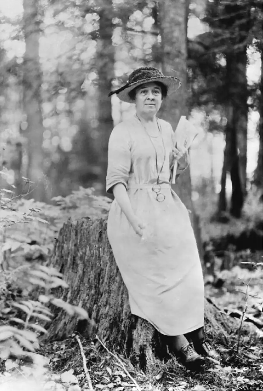
Clara Ford was more than the wife of Henry Ford—she was a visionary in her own right. A devoted gardener and pioneering advocate for women’s agricultural enterprise, Clara championed the power of fresh food and flowers to uplift communities and connect people. Her “Roadside Market” initiative empowered rural women to bring their harvests to the world, one roadside stand at a time.
Clara’s Table is a tribute to that legacy—a dining experience rooted in generosity, seasonality, and joy. Here, fine food is paired with effervescent conversation, and every meal is a celebration of the senses. The setting evokes a modern conservatory, where sunlight and greenery mingle with the aromas of freshly baked bread and garden-picked herbs.
This is a place where nourishment is both literal and symbolic, where the tables are welcome to guests and the community. And where the spirit of Clara lives on—in every bloom, every bite, and every warm exchange.

The visual identity of Clara’s Table strikes a graceful balance between nature and structure—much like Clara herself. The logo pairs organic flourishes with architectural form: Clara is drawn in sinuous, Art Nouveau-inspired curves with unexpected angles, while Table grounds the mark in wide, sturdy letterforms that evoke the strength of community and place. Like vines on a trellis, one supports the other.
The monogram, built from Clara Ford’s initials, is enclosed in an ornamental frame reminiscent of wrought iron garden gates. It evokes the intimacy of a conservatory, the elegance of handcrafted metalwork, and the enduring presence of a woman who cultivated beauty in all its forms.
A warm, garden-inspired green serves as the signature hue—lush and inviting. It’s complemented by softened reds and a palette of cool, shaded neutrals, all together conjuring the ambiance of a late afternoon in a blooming courtyard.

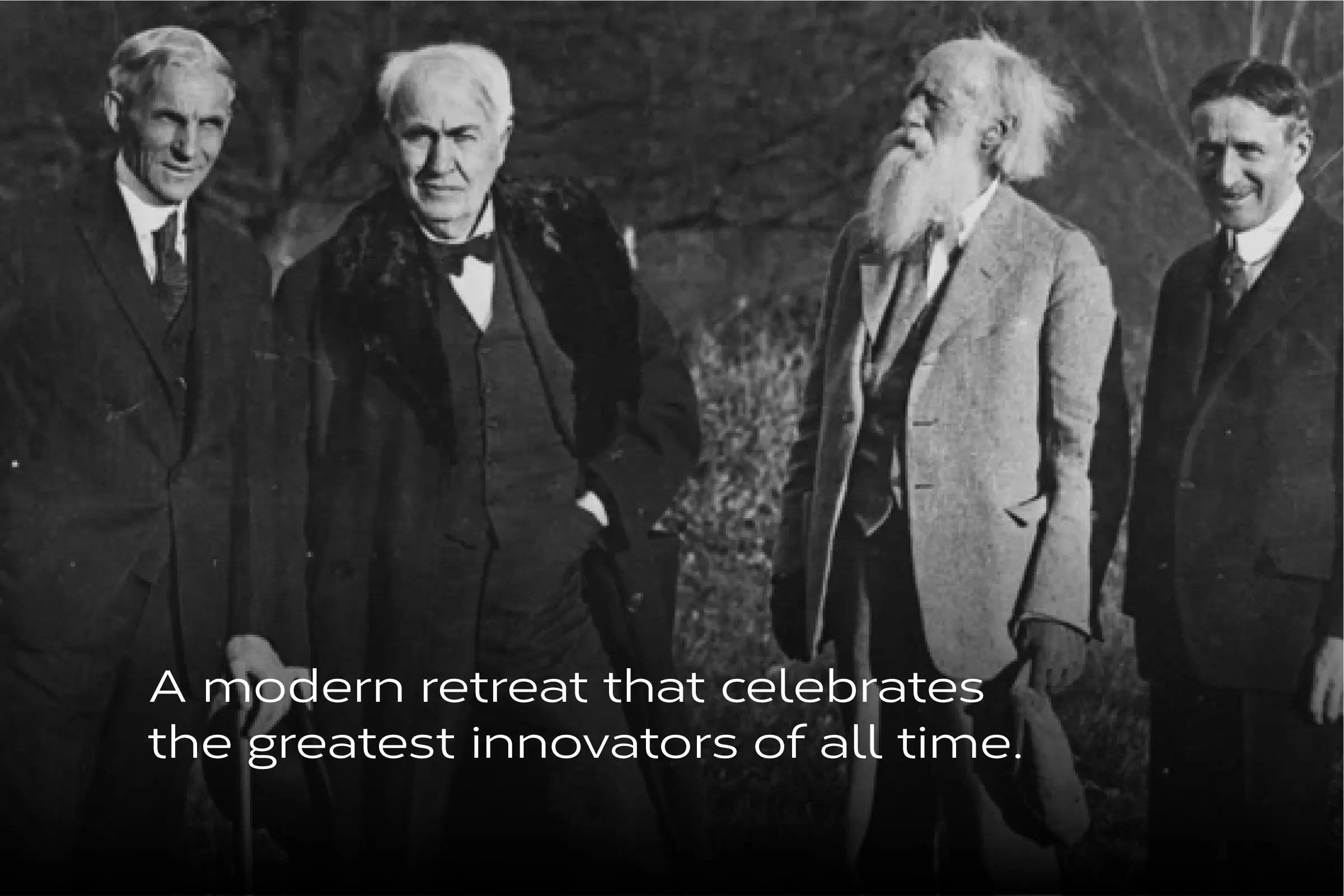
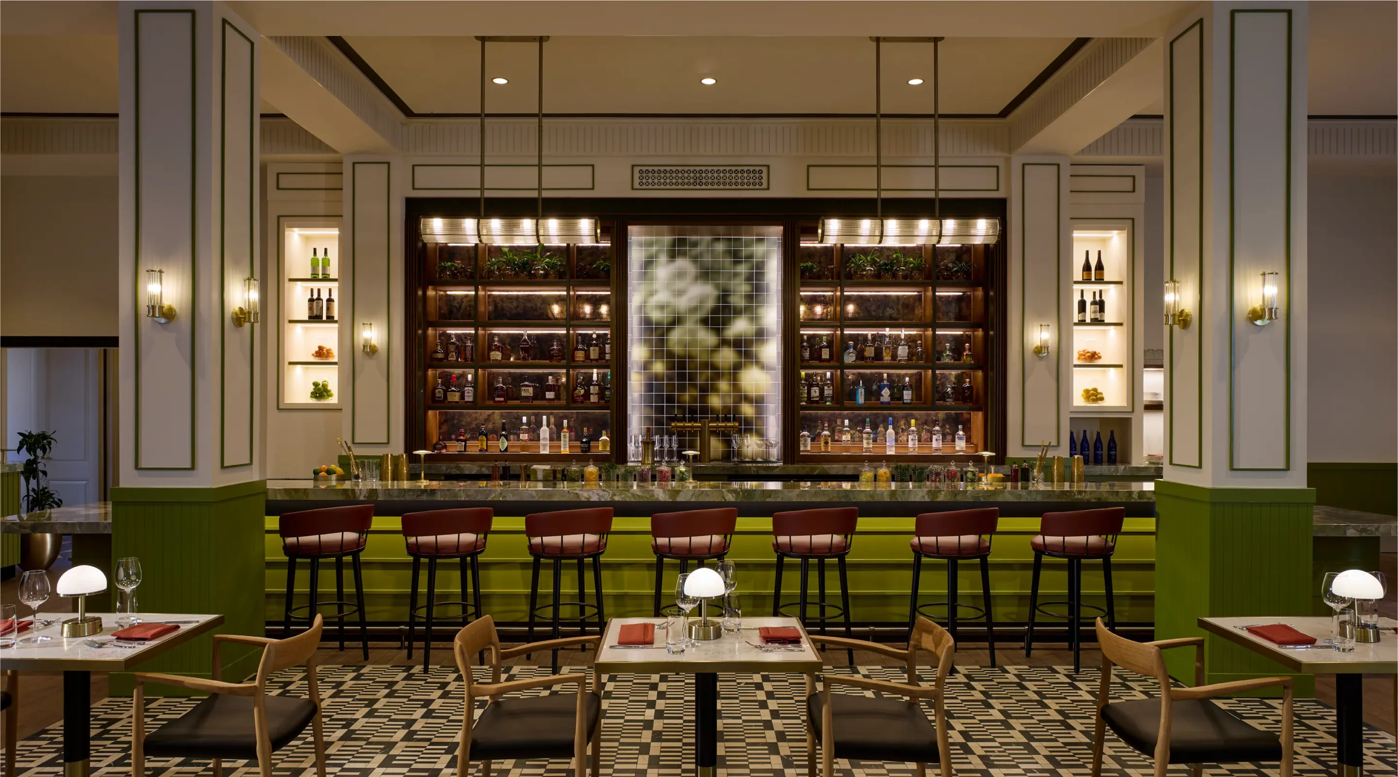
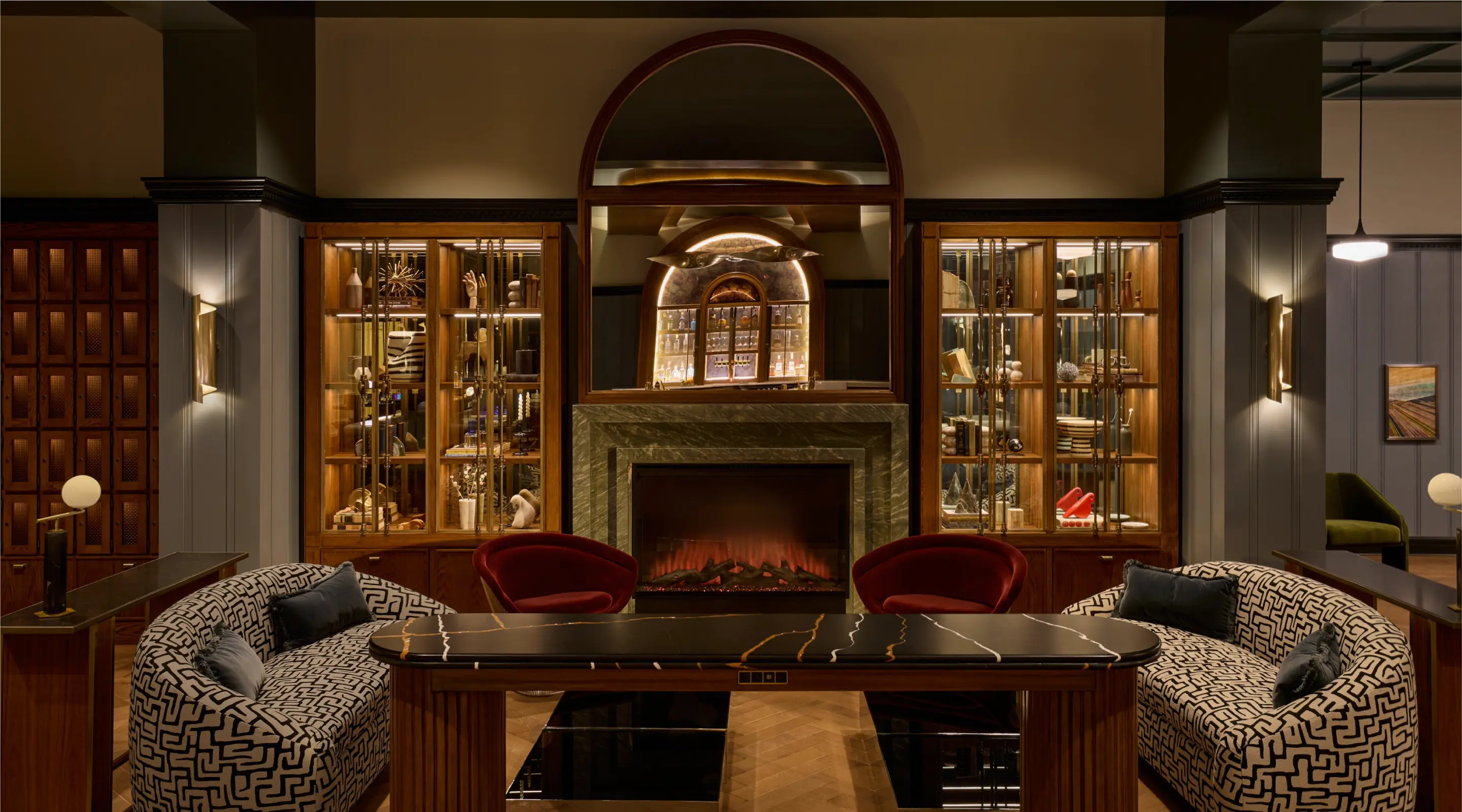
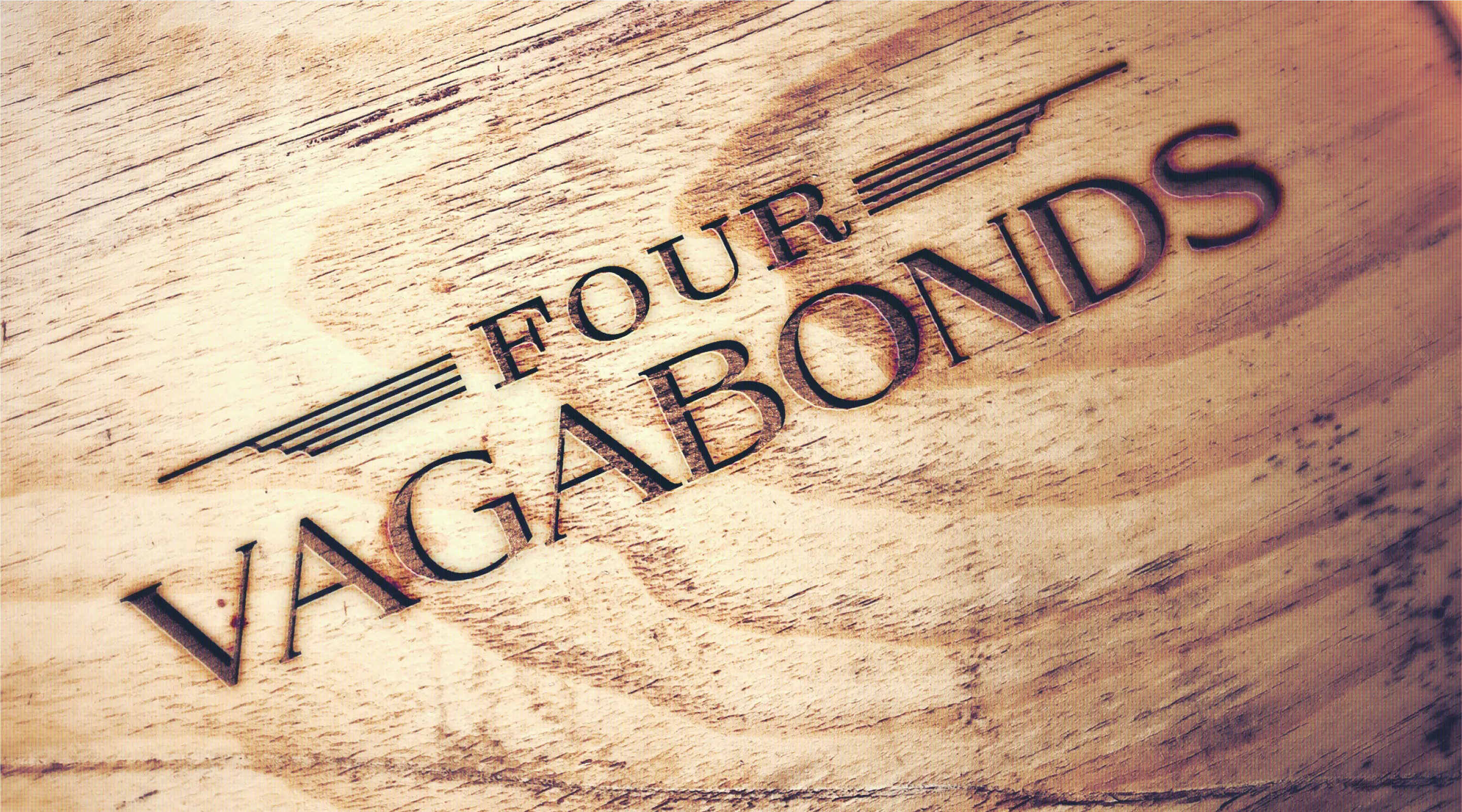
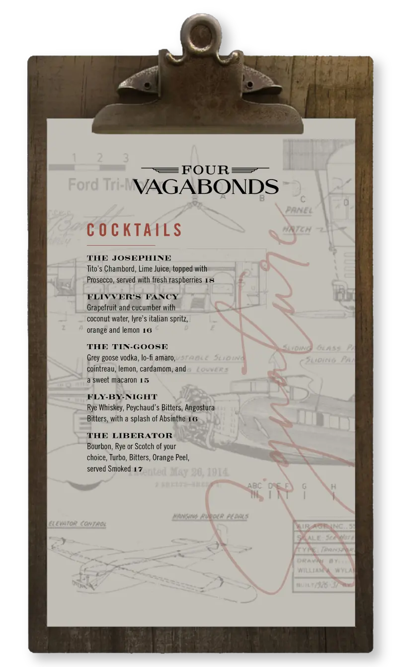
The Four Vagabonds
“Not all who wander are lost”—and certainly not Henry Ford, Harvey Firestone, Thomas Edison, and John Burroughs. These four icons of American ingenuity called themselves The Vagabonds, setting off on lavish road trips complete with tents, kitchen cars, chauffeurs, and long conversations under open skies. They roamed not to escape, but to dream—to stoke invention with friendship and firelight.
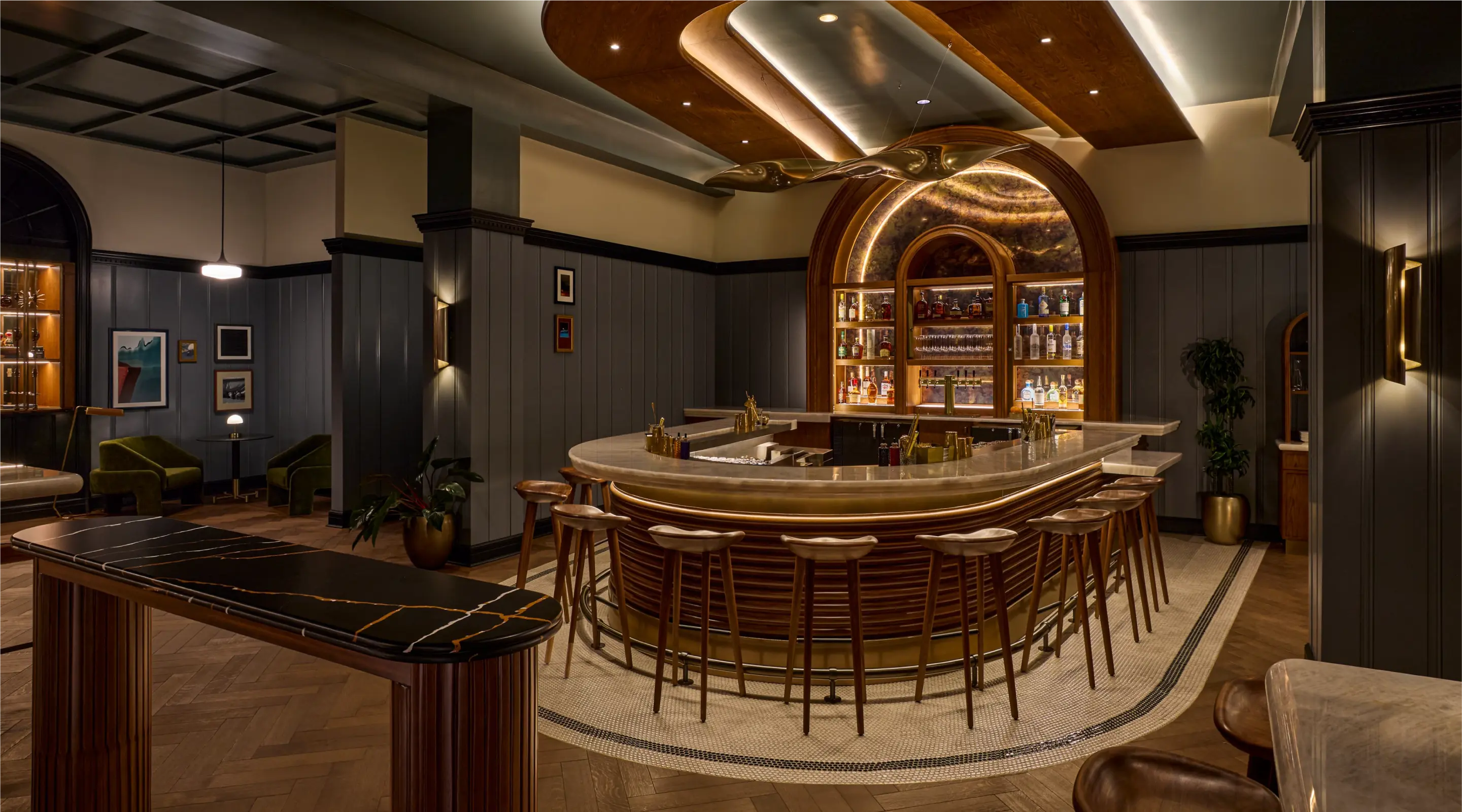
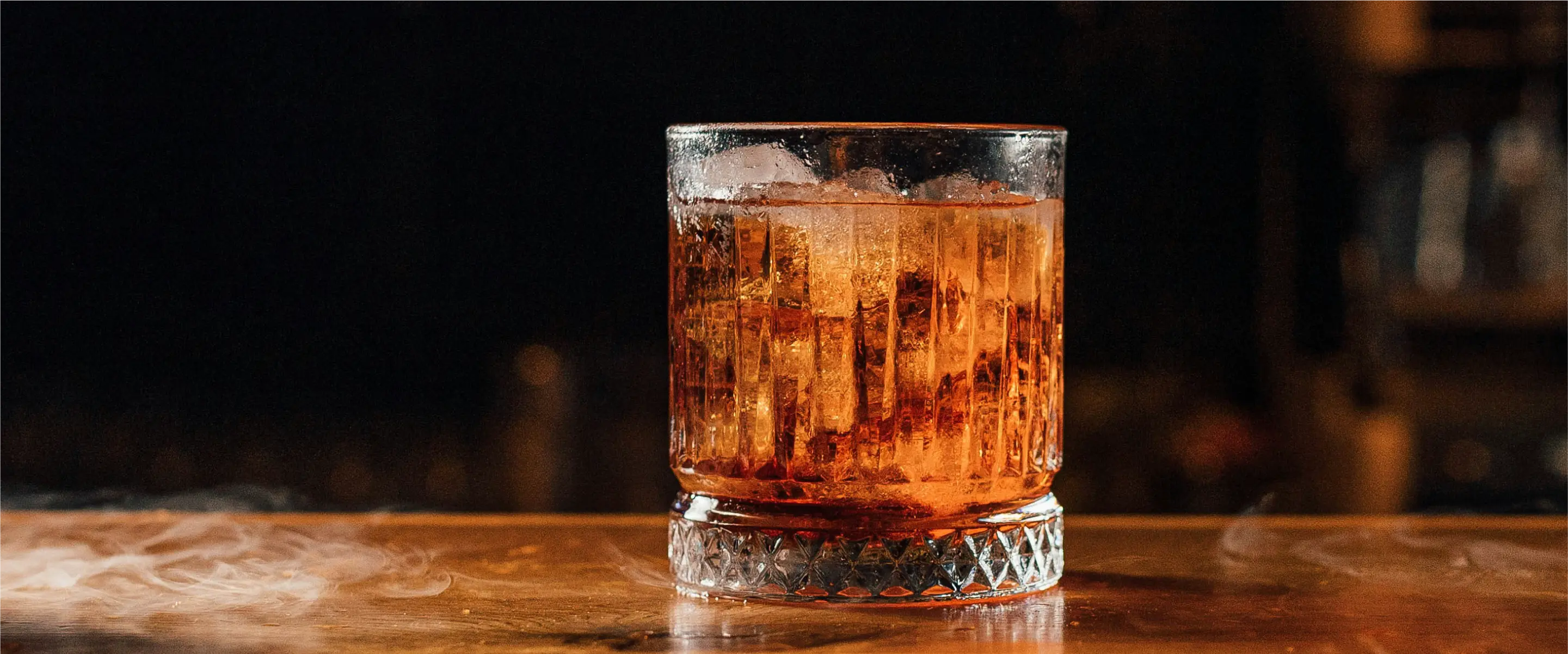
The Four Vagabonds lounge at Dearborn Inn channels that same spirit of camaraderie and curiosity. A relaxed refuge for modern wanderers, it’s where signature cocktails meet imaginative appetizers, and where no one stays a stranger for long. Cozy corners invite quiet reflection, while the horseshoe bar encourages stories to be shared between sips.
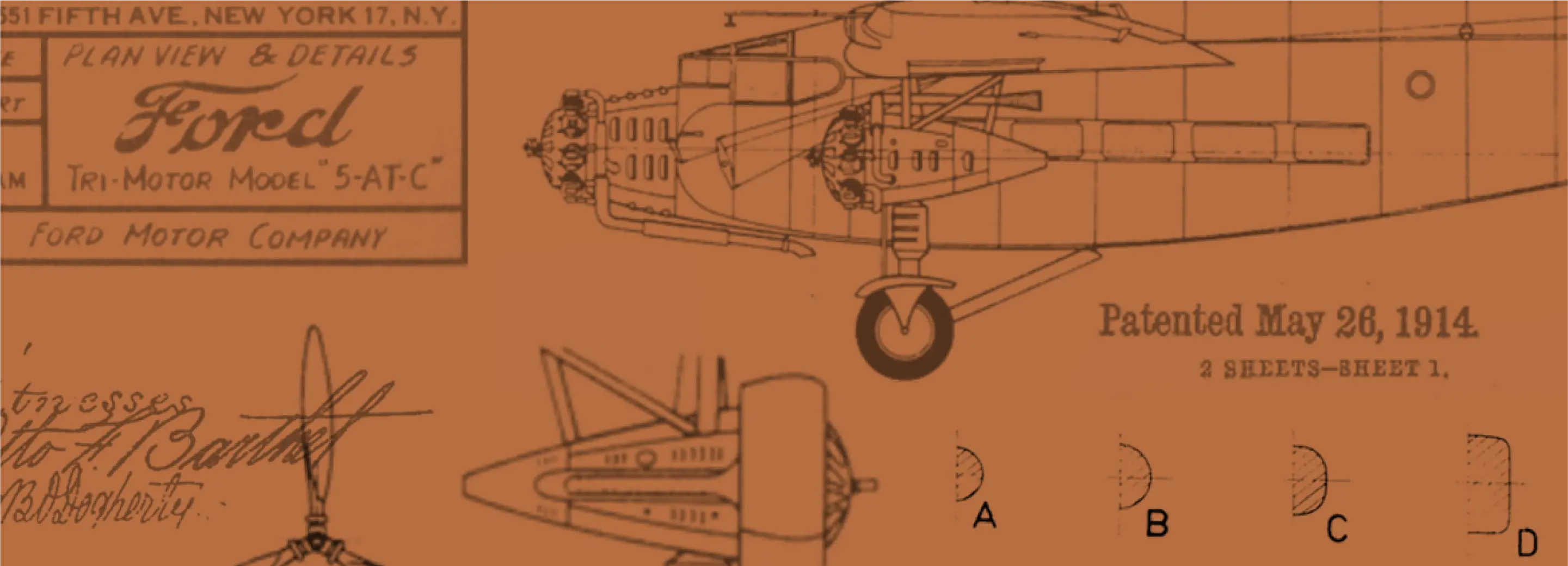
The space itself is intimate and tactile—moody upholsteries, surprising colorways, and vintage aviation sketches woven into custom patterns. Artifacts displayed in glass curio cabinets celebrate Ford’s role in the history of flight and the heritage of the Inn itself, offering guests a quiet window into the past.
The logo captures the essence of exploration with a graphic style that nods to the golden age of travel while reaching confidently toward the horizon. A palette of deep cognac, reminiscent of worn leather and warm spirits, is paired with softened, earthy tones—inviting guests to settle in, unwind, and let time slow down.


Summary
The revitalization of Dearborn Inn is more than a restoration—it’s a reinvention rooted in respect. Every detail, from the soaring icon to the stories behind each dining concept, invites guests to connect with a legacy of innovation, hospitality, and place. Past and present meet here with purpose, offering travelers not just a place to stay, but a place to belong.