Clek
A Canadian child safety seat manufacturer selects our independent, creative studio to build a brand identity to share with the world.
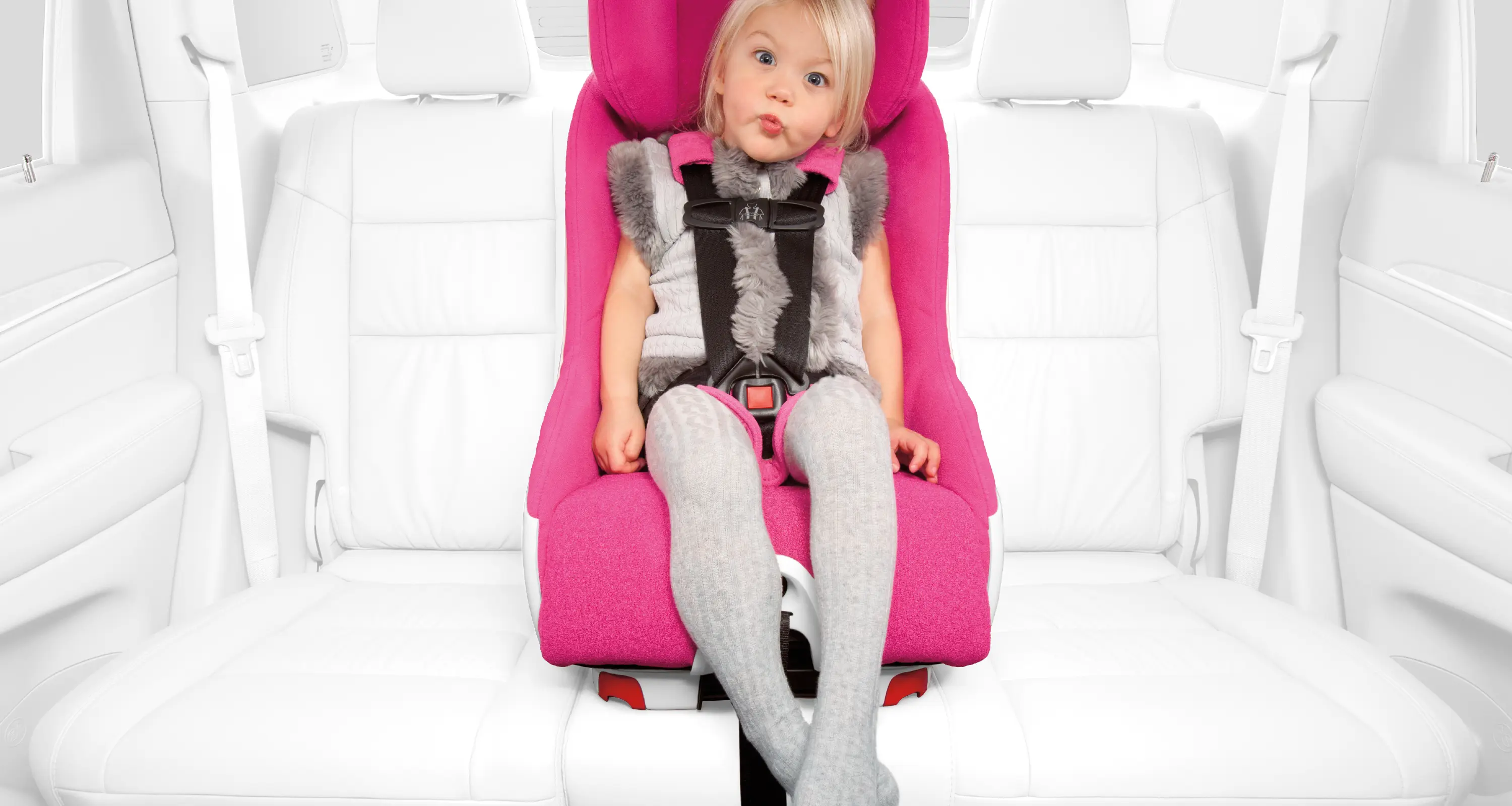
Clek knows vehicle seating. They also know parents. As a company founded by a couple who wanted the best safety for their children, they understood the tradeoffs most parents face when it comes to safety and style. With roots at one of the world's largest automotive seating manufacturers, Clek's founders knew they could design and manufacture an advanced child safety seat that gave parents safety without compromising good design. Our team created a name, a visual and verbal identity, and later design inspiration and packaging, to help them live their brand fully.
Strategy
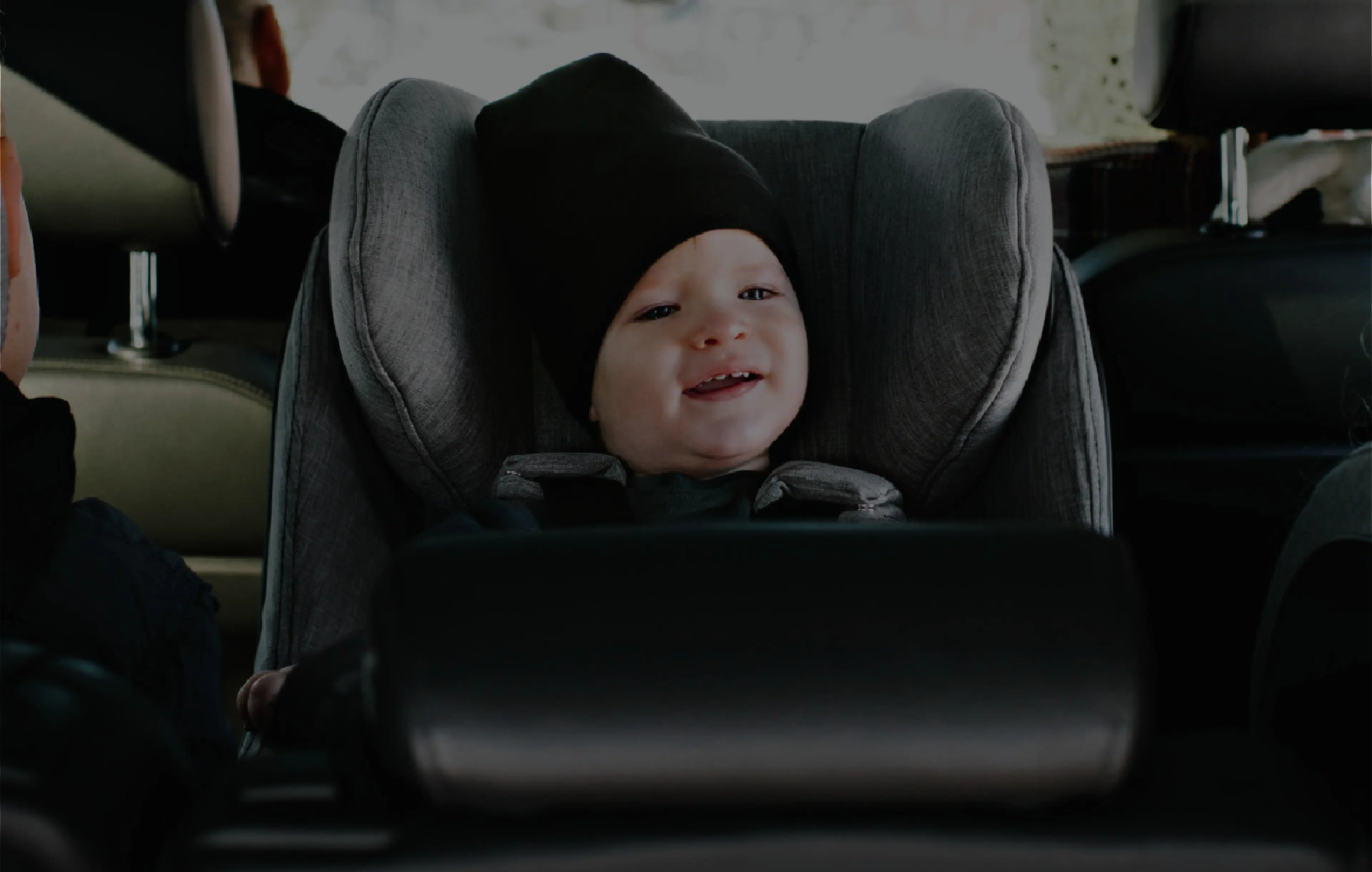
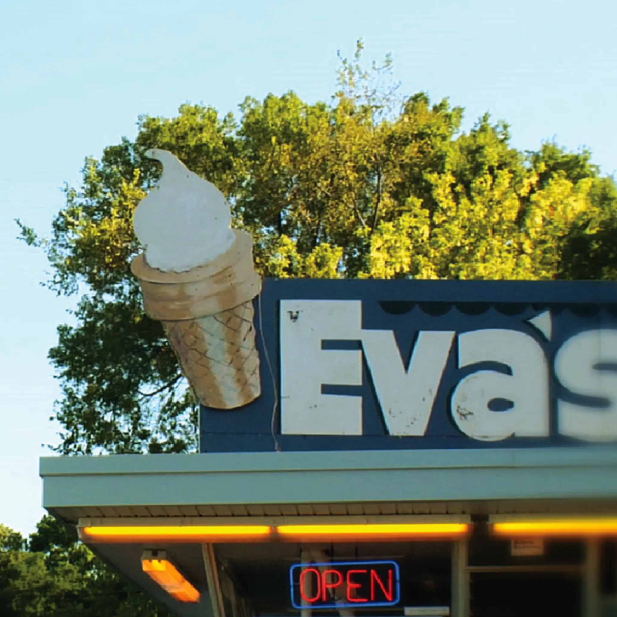
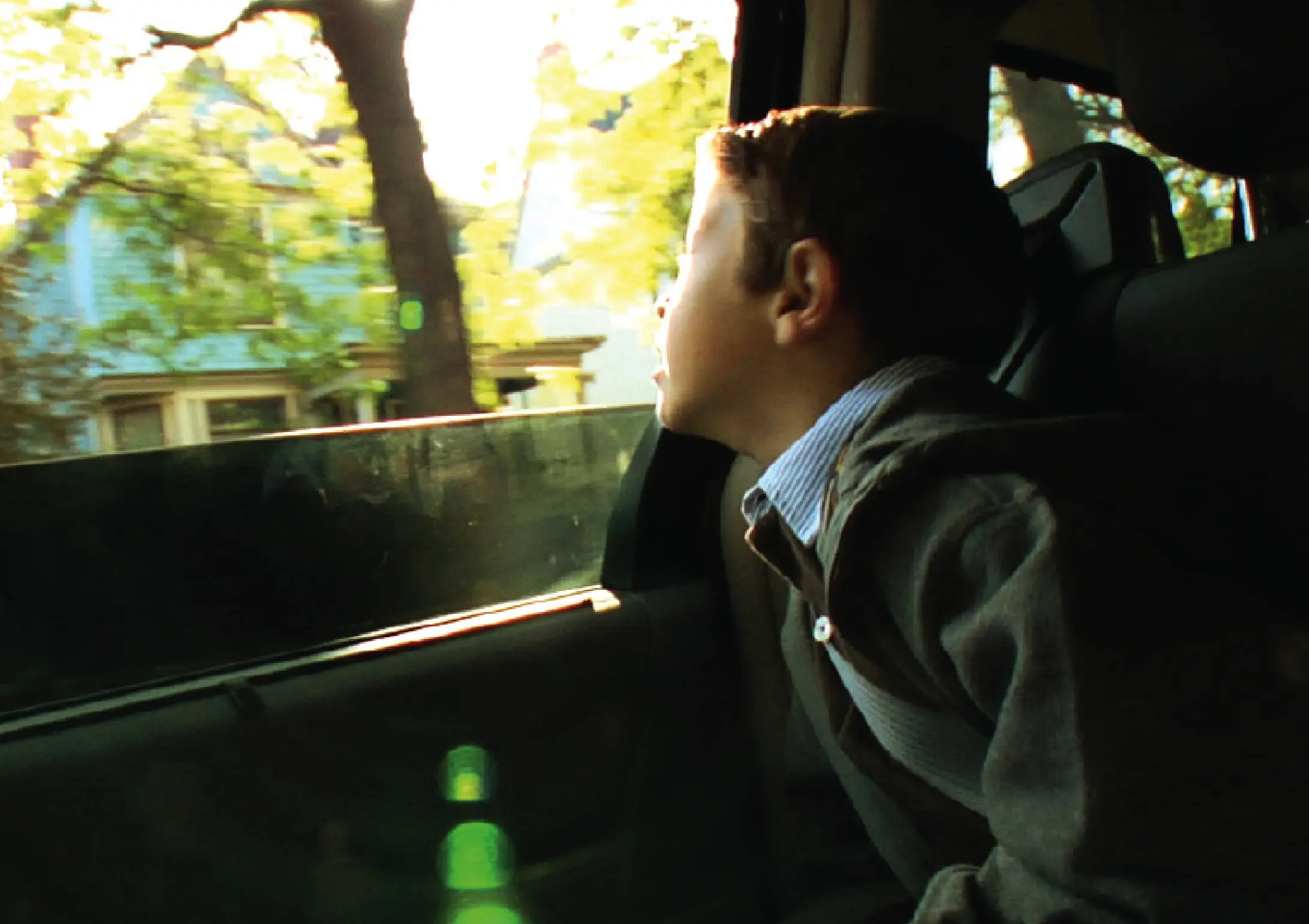
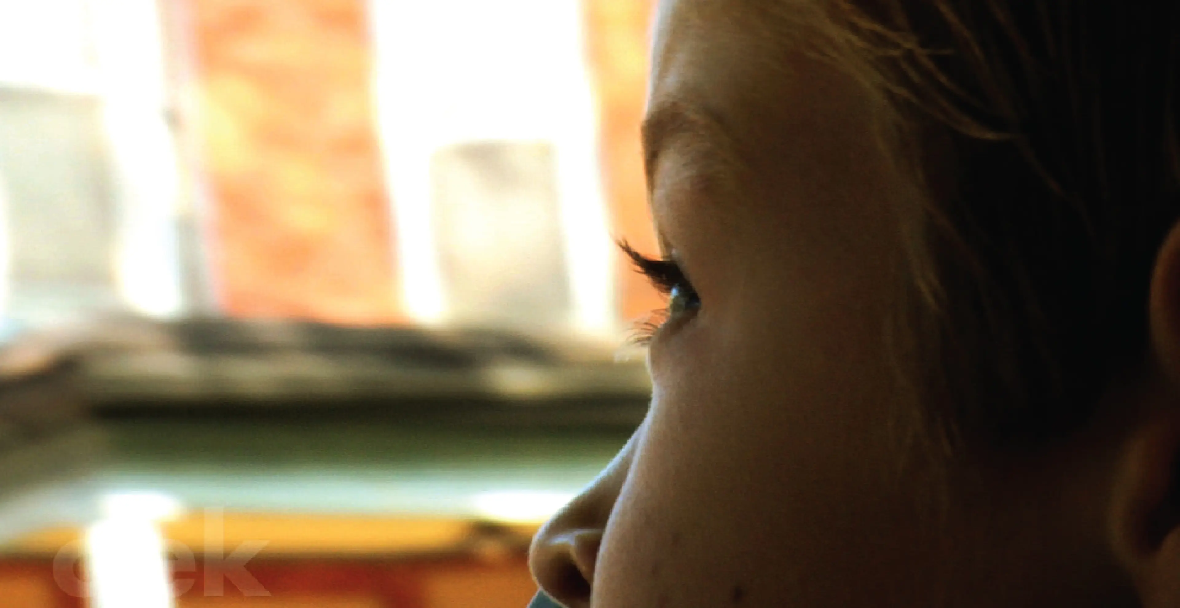
Clek revolves around kids and keeping kids safe. So why not interview kids to learn everything you want to know about how they interact with your product? When we needed a new name for their first booster seat, instead of starting with adults, we started with kids. We asked them, “What sound does a seatbelt make when you lock it?” While most said “Click,” one kindergartener said “Clek!” and suddenly a brand was born.
Next we defined the brand idea and framework. We knew this brand was an innovator, being one of the first child safety seats that latched with a lower anchor system. Clek leadership, former automotive industry leaders, knew well safety and comfort Technology; they now wanted to bring that same technology, backed up by crash test studies, to children's child safety seats. They made no compromises on safety, but also wanted their brand to be approachable and fun like other kids' products. And they were looking for something sophisticated, with a simple elegance and a touch of modern style.

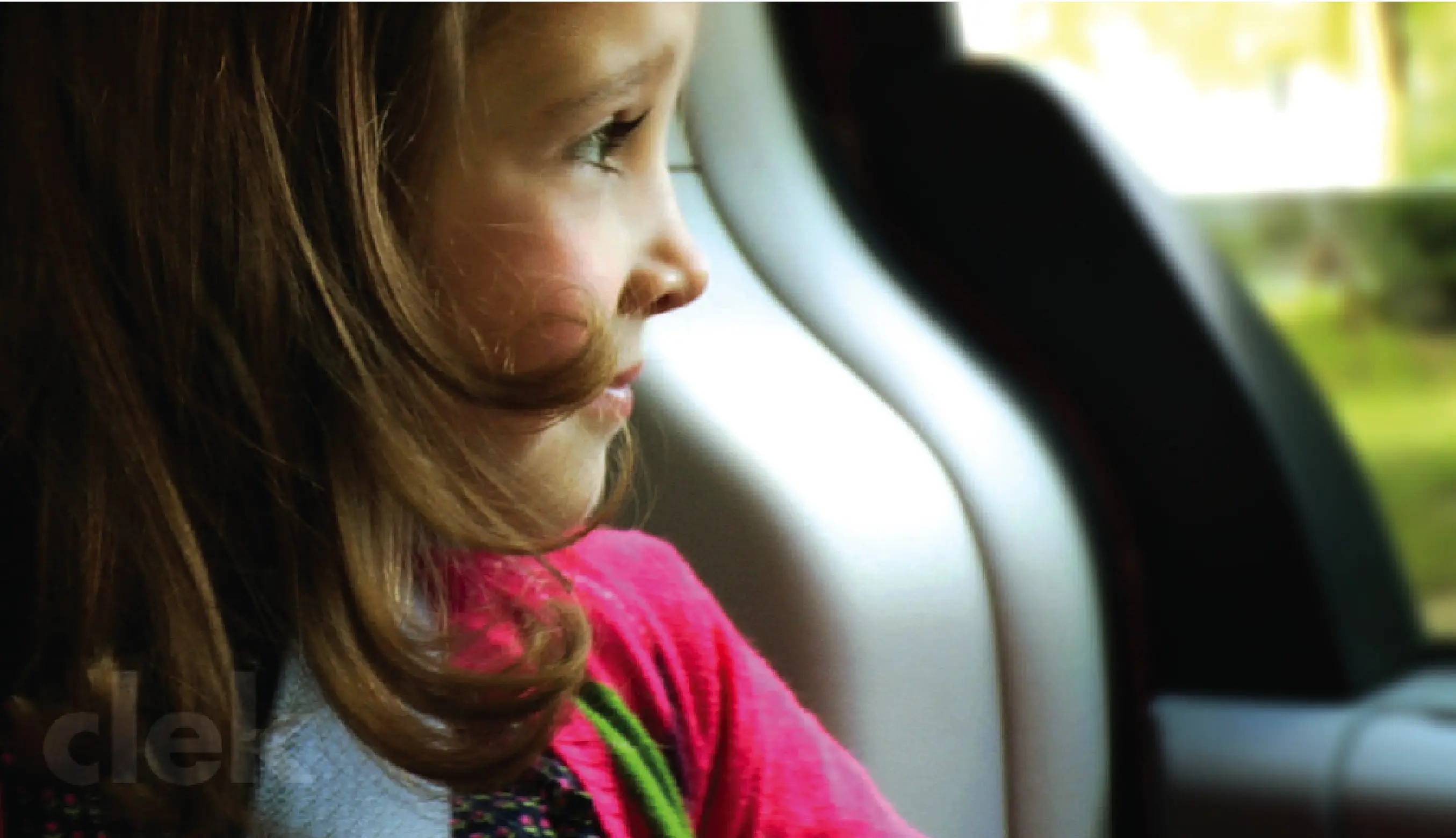
sit-by-the-
window-ones,

Verbal + Visual Identity
Design began with the brandmark. Our team crafted a mark that was clean, easy to read and approachable. Even though Clek is based in Toronto, they looked to European brands as benchmarks.
They believed that the consumer who liked a modern aesthetic was underrepresented in the child safety seat market and they wanted to fill that void. To appeal to them, Clek created a verbal identity system with its own brand vocabulary that had a global sensibility.
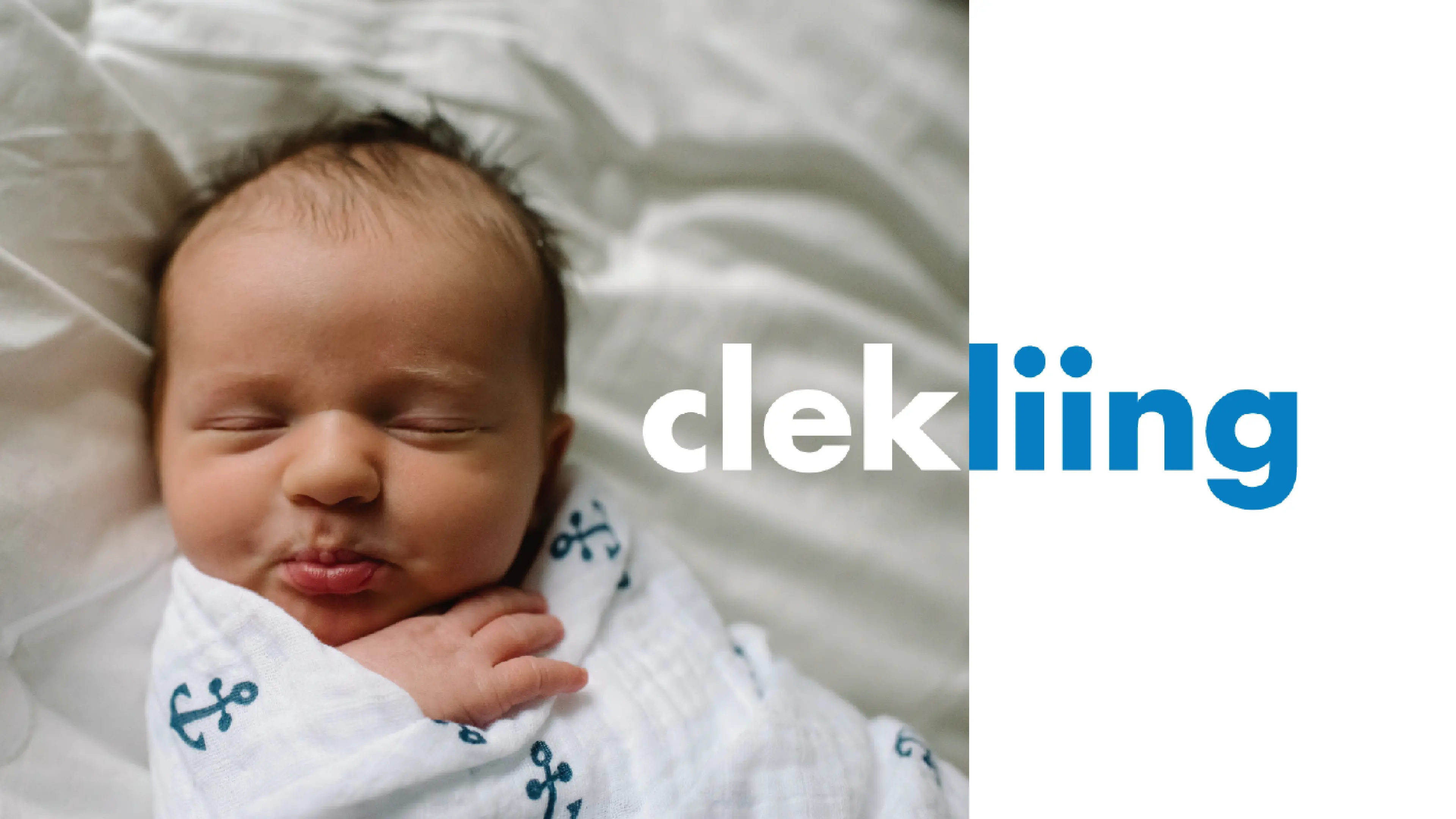
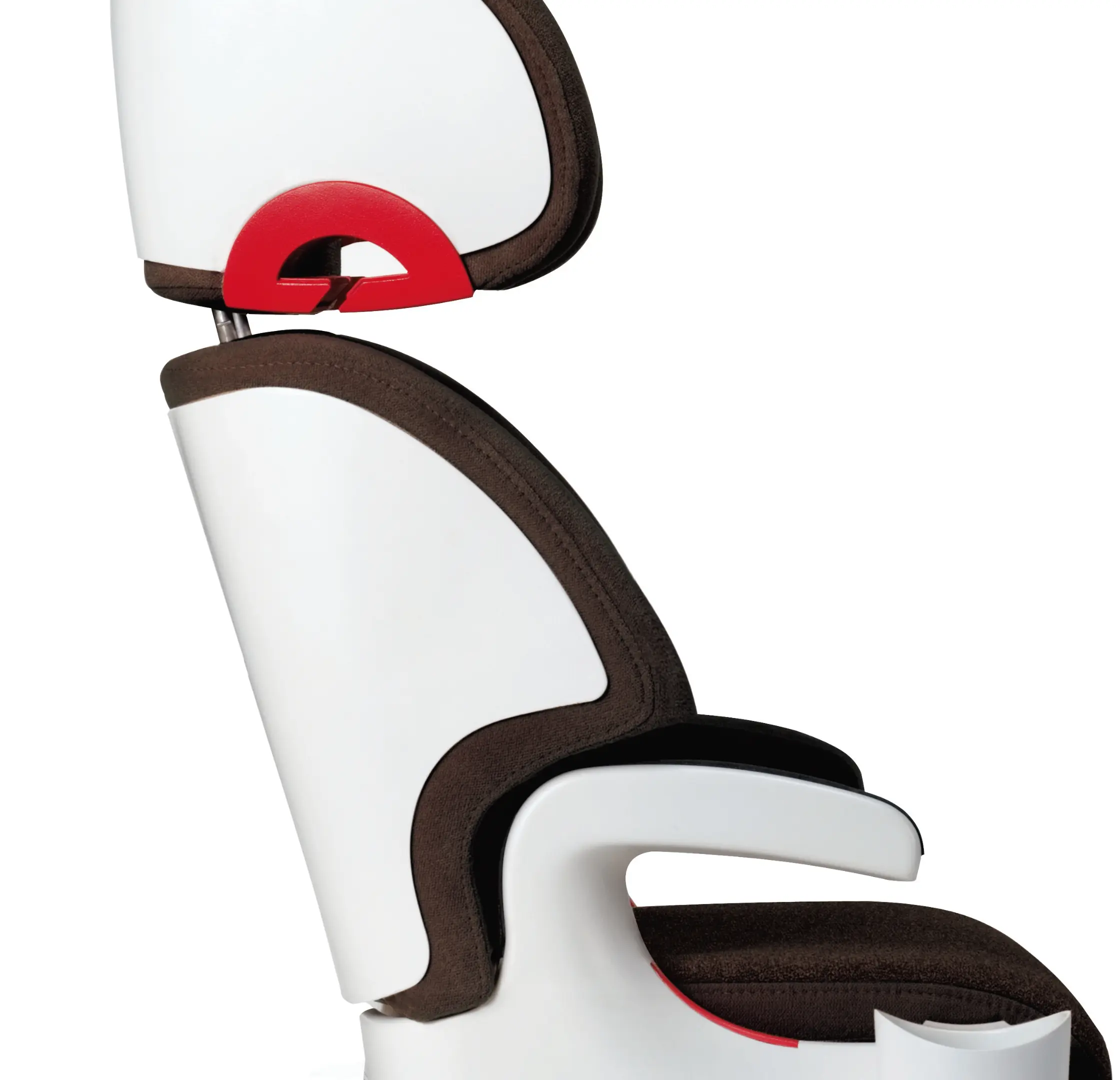
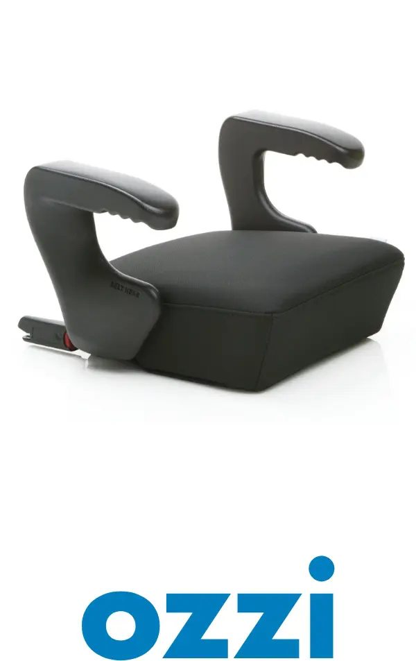
Inspired by the kindergartener who gave Clek its unique sounding name, our team pushed those language boundaries with more words that were simply fun to say—especially for kids. We created a Clek lexicon of words and names that had a global sensibility, sounding like they could be native to any country in the world. Child safety seat names included Oto, Olli, Oobr, Liing and Foonf—the latter inspired by the German “fünf” for five, denoting the 5-point safety harness.
What followed was a whole language that was fun, easy to remember and kid approved. Even descriptions for highly engineered seats used phrases like “no numb bum.” With our team's verbal system, Clek takes “user-friendly” to a whole new level and defines itself amongst discerning parents and caregivers.
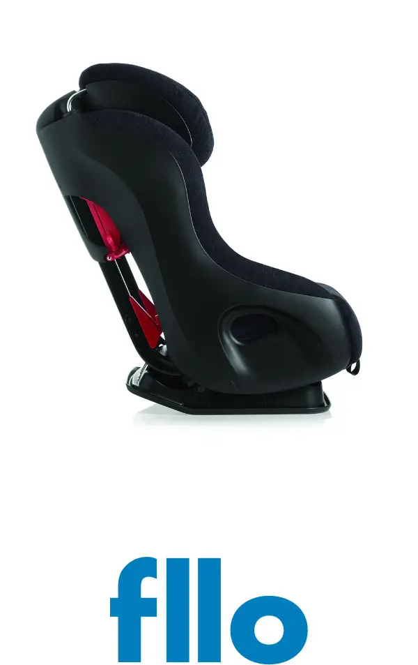
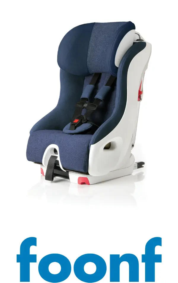
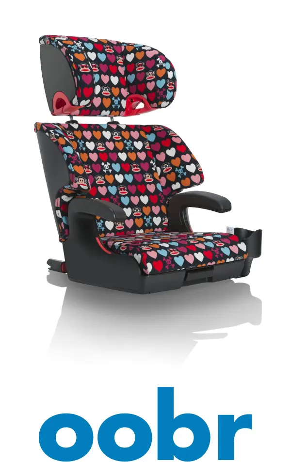
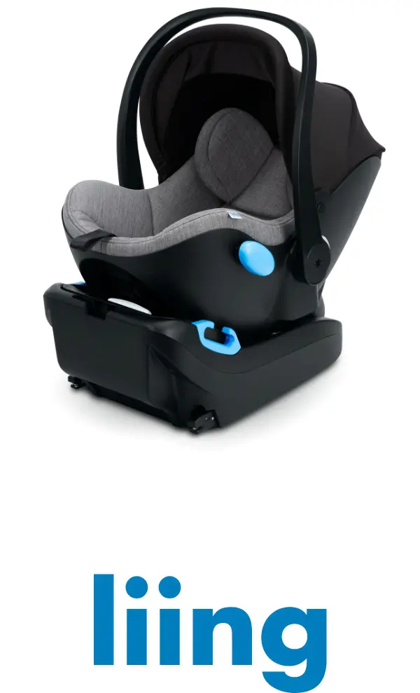
* made you look!
Iconography is also important to Clek. After all, this is a functional brand. It's a thoughtful brand too. Our team set out to simplify, codify and organize all the items that would have to represent people and things our audiences would be interacting with. It was a system within our greater visual system designed to support main messaging ideas with quick, eye-catching clarifiers. Easy to understand at a glance, it was another way to help make parents' lives easier.
To conclude this initial phase of work, our team drafted and delivered comprehensive brand guidelines with a wide range of sample applications, positioning Clek’s marketing and communications team for years of growth and success.
Summary
Telling the Clek story in all mediums and across all touch points involved being engaging and stress-free for parents. It involved demystifying the child safety seat shopping experience and making parents feel confident in their purchase. With a comprehensive, distinctive verbal and visual identity in place, our team has since supported Clek over the years in a communications design function, developing everything from a Clek brand book, brand video, website and event materials. And that was just the half of it.
